shopify collection page design

Your Shopify collection pages can make or break your sales. These pages help customers browse your products by category, price, or other filters, acting as the bridge between your homepage and product pages. A well-designed collection page ensures a smooth shopping experience, guiding users from browsing to buying.
Key Takeaways:
- Organized Layouts: Use grid or list formats depending on your product type. Display 12–24 products per page to avoid clutter or sparse designs.
- Effective Navigation: Include breadcrumb trails, sticky menus, and search bars for easy browsing.
- Smart Filters: Offer options like price, size, color, or material to simplify searches.
- Visual Design: Use high-quality, uniform images, consistent typography, and neutral colors to maintain a clean, professional look.
- Mobile Optimization: Ensure touch-friendly buttons, collapsible menus, and fast-loading images for a seamless mobile experience.
- Faster Load Times: Compress images, limit third-party apps, and use lazy loading to keep pages quick.
By organizing your products, improving navigation, and optimizing performance, you can build collection pages that boost customer satisfaction and drive conversions.
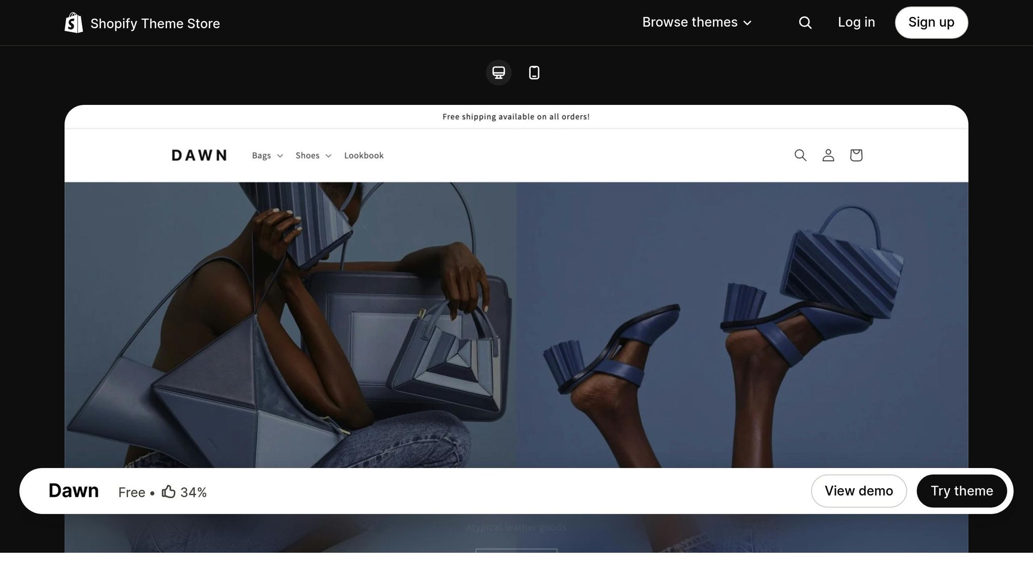
Designing a Clothing Store COLLECTION Page [Shopify Dawn Theme]
Key Elements of High-Converting Collection Pages
Creating collection pages that drive sales means nailing down a few critical components. These elements work together to create a seamless shopping experience, encouraging visitors to move from browsing to buying. Here’s how to design pages that truly convert.
Product Organization and Layout
How you arrange your products can significantly impact how customers interact with your site. For visually driven items, grid layouts work best, while list layouts are ideal for products that require more detailed descriptions. Choose the format that complements your product type.
Aim to display 12–24 products per page. Too few can make the page feel sparse, while too many can overwhelm shoppers and slow down loading times, creating frustration.
Navigation Features That Work
Smooth navigation keeps shoppers engaged and reduces bounce rates. Breadcrumb navigation is invaluable - it shows users exactly where they are in your store and allows them to backtrack easily without starting over.
Sticky navigation menus are another great addition. These menus stay visible as users scroll, so they can quickly access filters or category links without needing to scroll back to the top.
For larger collections, organize your categories with simple, intuitive names and include a search bar to help customers find what they’re looking for quickly.
Smart Filters for Better Product Search
Filters make finding the right product easier. Start with the essentials like:
- Price filters: Shoppers often have a budget in mind, so let them narrow down options by price range.
- Size and color filters: Show only available options to avoid frustrating customers with out-of-stock choices.
- Material or feature filters: These can be tailored to your store’s niche. For example, a furniture store might include filters for "Wood Type", while a clothing store could offer "Fabric Type."
Keep filters simple and avoid overwhelming customers with too many options. On desktop, sidebar filters are easy to use, while collapsible menus work better on mobile screens.
Visual Design Best Practices
Your collection page’s visual design can make or break a customer’s trust. A polished, cohesive look shows professionalism and builds confidence in your brand. Here’s what to focus on:
- High-quality product images: Use consistent lighting, backgrounds, and angles to create a uniform and appealing display.
- Uniform image sizes: Mixed image dimensions can make your page look cluttered and unprofessional.
- White space: Allow breathing room between products and sections to reduce visual clutter and help customers focus.
- Consistent typography: Stick to the same fonts, sizes, and colors for product names, prices, and descriptions across all pages.
- Neutral color schemes: A simple background ensures that your products remain the focal point.
Mobile Responsiveness
With so many shoppers using smartphones, mobile optimization is non-negotiable. Here’s how to enhance the mobile experience:
- Touch-friendly buttons: Make sure buttons are large enough to tap without accidentally hitting nearby elements.
- Simplified navigation: Use collapsible menus and prioritize key navigation elements at the top of the page.
- Optimized images: Compress images to maintain quality while speeding up load times. Progressive loading for items below the fold can also help.
- Mobile-specific features: Add swipe gestures for image galleries and thumb-friendly filter controls to make browsing more intuitive.
Lastly, page loading speed is critical, especially on mobile connections. Compress files, minimize plugins, and use lazy loading for products further down the page to ensure a smooth and fast experience.
How to Improve Collection Page Usability
Designing collection pages isn't just about making them visually appealing - it’s about ensuring they work seamlessly for every visitor. When customers can quickly find what they need without frustration, they’re far more likely to complete their purchase. Here’s how to make collection pages more effective for your shoppers.
Clean Layouts and Minimal Clutter
A cluttered page can overwhelm shoppers and make decision-making harder. Keeping things simple can turn casual browsers into buyers.
Stick to the essentials. Display only the most important details, like the product image, name, and price. Avoid crowding the page with too many promotional badges, long descriptions, or unnecessary text.
Use white space wisely. This doesn’t mean leaving large blank areas, but rather ensuring there’s enough space between product cards, sections, and navigation elements. Proper spacing helps guide the eye smoothly from one product to the next.
Simplify your sidebar. If your page has a sidebar, keep only the most relevant filters and categories visible upfront. Secondary filters can be hidden within collapsible sections to maintain a clean and organized look while still offering advanced options.
Once your layout is simplified, thoughtful sorting options can further enhance the shopping experience.
Sorting and Categorization
Smart sorting and categorization make it easier for customers to find what they’re looking for without endless scrolling. Default sorting options like Best Selling, Price (low-to-high or high-to-low), and Newest are effective because most shoppers stick with the default setting.
Seasonal and campaign-specific collections are a must. Create dedicated pages for holidays, sales, or special promotions instead of burying these products within general categories. For instance, a “Back to School” collection in August will perform better than expecting customers to hunt down school supplies scattered across various sections.
Think beyond basic categories. Organize collections based on customer intent, like “Gifts Under $50,” “Work-Ready Outfits,” or “Starter Kits for Beginners.” These intent-based groupings help shoppers who know what they want to achieve but aren’t sure which product fits their needs.
Boost product discovery by cross-merchandising within collections. For example, if someone is browsing kitchen appliances, include a “Complete Your Kitchen” section with complementary items like utensils or recipe books. This not only enhances the shopping experience but can also increase the average order value.
Performance Improvements
Page speed plays a huge role in conversions - just a one-second delay can lead to a noticeable drop in sales. Collection pages, which typically display multiple product images and data, are particularly prone to slower loading times.
Optimize images. Compress image files and use modern formats like WebP to reduce load times. Features like lazy loading ensure that only visible images load initially, while additional products load as the customer scrolls, keeping the experience smooth even on slower connections.
Limit third-party apps and widgets. Each app you add to a collection page increases loading time and potential points of failure. Regularly review your installed apps and remove anything that isn’t critical to the page’s functionality.
Use a Content Delivery Network (CDN). A CDN speeds up image delivery for customers across different regions. Most Shopify themes handle this automatically, but if you’re using custom setups, ensure all media files are served through a CDN.
Optimize database queries. For stores with large catalogs, loading too many product variants or options on a single page can slow things down. Instead, provide full product details on individual product pages. Features like pagination or infinite scroll can also prevent overwhelming page loads while allowing customers to browse extensive collections.
Leverage caching strategies. Browser caching for static content and server-side caching for dynamic elements can significantly improve load times for returning visitors. This ensures a faster, smoother experience for repeat shoppers.
Tools and Services for Collection Page Optimization
Improving collection pages requires a detailed, data-driven strategy. This approach blends thorough analysis, customized solutions, and constant testing to deliver noticeable results. Clean Commit's services are designed to make this process as effective as possible.
Clean Commit's CRO Services
When it comes to collection pages, Clean Commit follows a three-phase process aimed at removing obstacles and increasing conversions. Their method begins with a 148-point Shopify CRO Audit. This audit identifies problem areas like difficult navigation and poorly displayed products.
In the Dig phase, Clean Commit dives into user behavior using tools like heatmaps, session recordings, and surveys to uncover where visitors are struggling. Next comes the Test phase, where they apply specific improvements - such as repositioning filters, optimizing product grids, and enhancing the mobile experience - directly within your Shopify theme.
Finally, the Learn phase focuses on analyzing real revenue data to make ongoing adjustments. Clean Commit’s track record speaks for itself: their 60+ successful experiments have resulted in over $7.3 million in additional revenue. On average, clients see a 14% boost in conversion rates and an 11% increase in revenue per visitor. With a promise of delivering at least a 4x return on investment, Clean Commit ensures that every dollar you invest in optimization translates into meaningful gains for your business.
Step-by-Step Guide to Designing Collection Pages
Start by selecting a Shopify theme that truly represents your brand’s identity. Look for a design that not only matches your brand’s style but also prioritizes user experience, fast loading times, mobile responsiveness, and marketing features. Once you’ve chosen the right theme, focus on customizing it to suit your needs and ensure it performs well.
Choosing and Customizing Templates
Pick a template that complements your brand’s aesthetic and functionality goals. Adjust colors, fonts, and layouts to create a cohesive look that resonates with your audience. Don’t forget to preview your changes to ensure they align with your vision.
Setting Up Collection Elements
Organize your products into collections that make browsing easy for your customers. Add clear titles, compelling descriptions, and high-quality images to showcase your products effectively. Include filters and sorting options to improve navigation and help users find what they need quickly.
Testing Pages Before Launch
Before going live, test your collection pages thoroughly. Check for any layout issues, broken links, or slow load times. View the pages on different devices to ensure they work seamlessly across desktops, tablets, and smartphones. This step is crucial for delivering a polished and professional shopping experience.
Conclusion
Creating effective Shopify collection pages is all about striking the right balance between eye-catching design and practical functionality. The goal? To make it easy for customers to find what they need and feel confident enough to hit that "Buy" button.
Start with smart organization: group your products in a way that makes sense, and use features like filters, sorting options, and search tools to keep the shopping experience smooth and frustration-free. Earlier sections of this guide outline proven methods to streamline navigation and layout.
A clean design paired with high-quality images and consistent branding not only builds trust but also encourages conversions. And don’t forget about mobile! With so many shoppers browsing on their phones, your pages need to look and work just as well on smaller screens.
Speed is another crucial factor. Slow-loading pages can drive customers away, and every second of delay could mean lost sales. Keeping your pages fast and clutter-free is key to reducing bounce rates and keeping shoppers engaged.
This guide provides a clear, step-by-step plan: pick a theme that suits your brand, customize it to fit your needs, organize your products thoughtfully, and test everything before going live. By following these strategies, you’ll create collection pages that not only look great but also perform well.
Take it step by step - start with navigation and organization, then focus on visuals and performance. This approach ensures you’ll see noticeable improvements in both customer satisfaction and sales.
FAQs
How can I choose the best layout for my Shopify collection page based on my products?
When designing the layout for your Shopify collection page, it’s all about matching the design to the type of products you’re offering. For instance, a grid layout is ideal for showcasing fashion items, while a detailed list format might be a better fit for electronics or products with more complex specifications.
Make sure to include high-quality images and organize your products in a way that's easy for customers to navigate. Features like filters, sorting options, and category-specific templates can make browsing more intuitive and enjoyable. By aligning your layout with the needs of your product categories, you can create a streamlined shopping experience that encourages customer engagement and drives sales.
How can I make my Shopify collection pages load faster?
To make your Shopify collection pages load faster, start by focusing on your images. Compress large image files to reduce their size and enable lazy loading, so images only load as users scroll down the page. This approach can cut down the initial load time significantly.
Next, simplify your page design by reducing the number of apps and sections. Too many elements on a page can slow it down. Opt for a lightweight theme and steer clear of oversized images, as they can drag down performance. A good target is to have your pages load in under 2 seconds on mobile. This not only creates a smoother shopping experience but can also boost your conversions. Small tweaks like these can have a noticeable impact on speed and customer satisfaction.
Why is it important to optimize Shopify collection pages for mobile, and how can I make them mobile-friendly?
Optimizing Shopify collection pages for mobile is crucial since so many shoppers now browse and buy straight from their smartphones. A well-designed mobile experience means faster load times, easier navigation, and a smoother shopping journey - all of which can lead to higher engagement and more sales.
To make your collection pages mobile-friendly, start with responsive themes that adapt to any screen size. Compress images to keep loading times quick, and regularly test your site on mobile devices to catch any issues. Prioritize touch-friendly navigation by ensuring filters, buttons, and product details are easy to tap and interact with on smaller screens. These adjustments can make a big difference in delivering a hassle-free shopping experience for mobile users.


