shopify product page template

Your Shopify product page is the key to turning interest into sales. A well-structured template ensures your products are presented effectively, helping customers make quick and confident decisions. Here's what you need to know:
- What is it? A Shopify product page template is a pre-designed layout that organizes product images, descriptions, pricing, reviews, and call-to-action buttons for a consistent and user-friendly shopping experience.
- Why does it matter? Optimized product pages improve conversions, especially in the U.S., where customers expect mobile-friendly designs, clear pricing in USD, and detailed product information. Even small improvements can double your revenue.
- Key elements: Strong descriptions, high-quality images, standout "Add to Cart" buttons, trust signals like reviews, and fast-loading, mobile-friendly designs are essential.
- Tools to improve: Use Shopify analytics, A/B testing, and personalization features to refine your pages based on customer behavior.
Taking a data-driven approach to your Shopify product pages ensures you’re not just showcasing products but actively driving sales.
I analyzed 983 Shopify product pages, This is What Works!

Core Elements of High-Converting Product Pages
The backbone of a successful Shopify store starts with nailing the essentials. These core elements set the stage for layouts that make shopping easy and turn casual browsers into paying customers.
Product Descriptions That Drive Sales
A great product description doesn’t just list features - it shows how the product solves a problem or makes life better. Think about what your customer truly needs and lead with that. For instance, if you’re selling a wireless charging pad, open with something like, "Say goodbye to tangled cables forever." This approach connects with everyday frustrations and immediately grabs attention.
Keep the structure simple and scannable. Use short paragraphs and bullet points to highlight key details, especially since most US shoppers are skimming on their phones. Don’t forget to use local measurements and display prices in USD with the dollar sign in front ($29.99).
Address common questions upfront. For clothing, talk about the fabric, fit, and care instructions. For electronics, mention compatibility, warranties, and what’s included in the box. This builds trust and reduces hesitation.
And yes, keywords matter - but they should feel natural. Instead of overloading your description with "wireless bluetooth headphones", sprinkle in variations like "cordless earbuds" or "bluetooth audio." This keeps your writing smooth while boosting search visibility.
High-Quality Product Images
When customers can’t touch or try your products, images do the heavy lifting. Start with a crisp shot of the product on a clean, white background to keep your catalog consistent.
Go beyond the basics. Include multiple angles, close-ups of textures or key features, and lifestyle shots showing the product in action. For example, clothing should be shown on a model and as a flat lay. Electronics? Show every port, button, and accessory.
Enable Shopify’s zoom feature so shoppers can inspect details like stitching, material textures, or small design elements. This attention to detail often prevents returns caused by unmet expectations.
Add context to help shoppers understand size. For instance, show a laptop sleeve next to an actual laptop or jewelry next to a quarter. This gives customers a clear sense of scale.
Finally, ensure images load quickly without sacrificing quality. Aim for 1024x1024 pixels or larger but compress files to stay under 500KB for faster load times.
Clear Call-to-Action Buttons
Your "Add to Cart" button should stand out. Use high-contrast colors that pop against your page’s background. If your site is mostly white and gray, try bold shades like orange, green, or blue to draw the eye.
Place your primary call-to-action (CTA) above the fold so it’s visible without scrolling. For longer pages, consider a sticky "Add to Cart" bar that stays in view as customers explore reviews or product details.
Make your button text specific and action-oriented. Instead of generic terms like "Submit" or "Buy", go with phrases like "Add to Cart", "Get Yours Now", or "Start Your Order." For higher-priced items, "Add to Cart" feels less intimidating than "Buy Now."
Don’t forget usability. Buttons should be large enough to tap easily on mobile - at least 44 pixels tall - with enough space around them to avoid accidental clicks.
If your product requires choices like size or color, make those options clear and easy to select before customers click "Add to Cart." This prevents errors that disrupt the shopping experience.
Trust Signals and Social Proof
Trust is everything, especially for first-time customers. Customer reviews are one of the most effective ways to build it. Display star ratings prominently near your product title and price. Showing the total number of reviews also signals popularity.
Focus on review quality over quantity. A handful of detailed, authentic reviews often outperforms dozens of generic ones. Encourage customers to include photos with their reviews - these user-generated images add authenticity and give shoppers additional product insights.
Add trust badges near your checkout buttons. Display security certificates, accepted payment methods (Visa, Mastercard, PayPal), and any relevant guarantees like free returns or money-back promises. These small details can make a big difference in boosting confidence.
Create urgency with inventory indicators, but keep it honest. Messages like "Only 3 left in stock" or "12 people have this in their cart" trigger the fear of missing out, but they must be accurate. False scarcity can damage your reputation if customers catch on.
If your product has been featured on Instagram or endorsed by influencers, showcase those posts directly on your product pages. Social proof from third parties carries weight and can sway hesitant shoppers.
Mobile-Friendly Design
With more than half of online sales in the US happening on mobile, your product pages must work smoothly on smaller screens. Ensure buttons, dropdown menus, and image galleries are optimized for touch.
Vertical scrolling works better than horizontal swiping for image galleries on mobile. Make thumbnails large enough for easy viewing, and ensure product details are accessible without excessive zooming or scrolling.
Speed matters. Slow-loading pages lose customers, so keep image file sizes small, reduce unnecessary widgets, and test your pages on actual mobile devices. Aim for a load time of under three seconds.
Simplify the mobile checkout process. Enable mobile payment options like Apple Pay, Google Pay, and Shop Pay. These one-tap methods are increasingly popular and can significantly boost conversions.
By focusing on these mobile-friendly adjustments, you’ll ensure a smooth shopping experience, no matter what device your customers use.
Next, we’ll dive into layout strategies that make these elements shine.
Layout Strategies for Shopify Product Pages
A well-thought-out layout can turn casual visitors into paying customers in no time.
Above-the-Fold Must-Haves
The top section of your product page is prime real estate. It should immediately answer the most pressing questions shoppers have. Key elements like the product title, price in USD, main product image, and a primary CTA button should all be visible without scrolling.
Start with a clear and prominent product title that looks great on any device. Place the price directly below or beside the title, using simple formats like $49.99 or $199.00. Keep promotional badges to a minimum in this area to avoid clutter.
Showcase a high-quality main product image (at least 600x600 pixels) above the fold. Add thumbnail navigation so shoppers can view additional angles or variations easily.
The "Add to Cart" button is another must-have above the fold. Place it close to the price and product options, and use a bold, contrasting color to make it stand out against your page background. Include any selection options (like size or color) right above the button for a seamless shopping experience.
Finally, add a brief value proposition or benefit statement nearby. Statements like "Free shipping on orders over $75" or "30-day money-back guarantee" can quickly build trust and encourage action.
Information Structure for US Shoppers
Once you've nailed the essentials above the fold, organize the rest of the page to meet the expectations of US shoppers. They prefer clear, predictable sections for details like specifications, shipping, returns, and payment options.
Use distinct headings such as "Product Details", "Shipping & Returns", and "Customer Reviews" to make navigation easy. Shoppers often prioritize delivery speed, so place shipping details early on the page. Include clear information like "Free standard shipping (5-7 business days)" or "Express shipping $9.99 (2-3 business days)."
Highlight payment options prominently. US shoppers expect to see major credit cards, PayPal, Apple Pay, and Google Pay. Display these logos near your CTA button or in a dedicated "We Accept" section to build trust and make payment methods obvious.
Organize customer reviews in a separate section below the main product details. Include star ratings, the number of reviews, and filters so shoppers can quickly find relevant feedback.
Design for Quick Decisions
A clean, user-friendly design helps shoppers make decisions faster. Most people scan pages, so keep things simple with short paragraphs, bullet points, and plenty of white space.
Break up product descriptions with subheadings like "Key Features", "What's Included", and "Care Instructions." This makes it easy for customers to find the information that matters most to them.
Use visual hierarchy to guide the eye. Make prices bold and prominent, while secondary details can be smaller. Use color sparingly but effectively - reserve your brightest colors for CTAs and important notices.
Present key features in bullet points, and consider adding icons for extra clarity.
For details like size charts, compatibility information, or technical specifications, use expandable sections or tabs. This keeps the main product area clean while still providing all the necessary information.
If your product page involves multi-step processes like customization or bundle building, include progress indicators (e.g., "Step 1 of 3"). These visual cues help shoppers understand where they are in the process.
Consider using sticky elements on longer product pages. For example, a sticky "Add to Cart" button, price, or product options bar can stay visible as customers scroll through reviews or additional details, improving usability.
The goal is to create an intuitive layout that helps US shoppers find what they need and complete their purchase with ease.
Using Shopify Tools for CRO
Shopify offers a suite of tools designed to help you analyze customer behavior, run experiments, and tailor shopping experiences to improve conversion rates.
User Behavior Analytics and Heatmaps
Shopify Analytics provides a solid foundation for understanding user behavior. By reviewing metrics like page views, bounce rates, and conversion rates, you can quickly pinpoint high-traffic pages that aren't converting well.
For deeper insights, integrating tools like Hotjar or Microsoft Clarity can be a game-changer. These tools provide heatmaps and session recordings, offering a visual breakdown of how visitors interact with your site. For instance, heatmaps can reveal where users are clicking, how far they scroll, or where they drop off. You might discover that people are trying to zoom in on product images or that they’re missing the "Add to Cart" button because it blends into the design. Session recordings take it a step further by showing the entire customer journey, helping you identify pain points like confusing menus or slow-loading pages.
You can also use Google Analytics 4 (GA4) to track specific actions, such as clicks on product images, size chart views, or expanded descriptions. This data can highlight which features your customers find most useful and guide your optimization efforts.
These insights can then inform your A/B testing strategies.
A/B Testing and Experiments
A/B testing takes the guesswork out of improving your product pages. Shopify offers several tools to make experimentation easy and effective.
If you're on Shopify Plus, Shopify Scripts allows you to test variations in pricing, shipping messages, and checkout experiences. For example, you could compare "Free shipping on orders over $75" versus "$7.99 flat rate shipping" to see which resonates more with your audience.
For broader tests, tools like Google Optimize or Optimizely integrate seamlessly with Shopify themes. These platforms let you experiment with high-impact elements such as button colors, headlines, image placements, and call-to-action (CTA) text. For example, you could test whether bullet points or paragraph-style descriptions perform better, or whether technical specs or benefit-focused copy drive more engagement. U.S. shoppers, in particular, tend to prefer scannable formats, so this can be a key area to explore.
Pricing strategies are another area worth testing. You might experiment with showing the original price with a strikethrough next to the sale price or using a "Save $XX" badge to highlight discounts. Urgency messaging like "Only a few left in stock" versus "Limited time offer" can also help you understand what motivates your customers to act.
For reliable results, run your tests for at least two weeks to account for varying shopping behaviors. Focus on statistically significant outcomes to ensure your changes lead to meaningful improvements.
The insights from these tests can then be used to create personalized shopping experiences.
Personalization for US Customers
Once you've gathered data from analytics and testing, you can use Shopify's personalization tools to craft shopping experiences that align with U.S. customer preferences. Personalization goes beyond simple tweaks - it’s about delivering content that feels relevant and timely.
For Shopify Plus users, Shopify Flow automates personalization workflows. For example, you can show different product recommendations to first-time visitors versus repeat buyers or offer special discounts to customers who have abandoned their carts multiple times.
Geolocation features allow you to tailor experiences based on a shopper's location. Highlighting winter coats for visitors from northern states or promoting summer gear for those in the south can make your store feel more relevant. You can also display region-specific shipping options, like "Free 2-day shipping to California", to enhance the shopping experience.
Customer tags in Shopify let you segment shoppers based on their purchase history, order value, or preferences. This segmentation enables you to showcase targeted product recommendations or exclusive offers, such as loyalty discounts for frequent buyers or special deals for first-time customers.
Dynamic pricing is another effective strategy. Whether it’s wholesale pricing for B2B clients, discounts for loyal customers, or introductory offers for new visitors, dynamic pricing can drive conversions. Apps like Bold Pricing or custom development can help you implement this feature.
Personalized product recommendations also work well. Apps like LimeSpot or Searchspring analyze customer behavior to suggest complementary items or alternatives, often increasing the average order value.
Finally, customize opt-in offers based on product categories. For example, you could offer a skincare discount for beauty products or a downloadable sizing guide for clothing items. These strategies not only improve product page performance but also help you grow your email list.
Start simple by personalizing based on geography or device type, and gradually incorporate more advanced triggers as you gather additional customer data. The more tailored the experience, the more likely you are to see an increase in conversions.
Practical Tips for Ongoing Optimization
Keeping your Shopify product pages in top shape requires regular updates and a close eye on performance metrics. By staying proactive and making data-informed adjustments, you can ensure a smooth shopping experience and maintain strong conversion rates.
Regular Audits and Updates
Make it a habit to audit your product pages consistently. Check key performance indicators like page load times and conversion rates, and don’t forget to test features like image loading and the checkout process across devices. This regular maintenance helps you catch and fix issues before they can hurt your sales.
Leverage Customer Feedback
Your customers are a goldmine of insights. Use reviews, surveys, and customer inquiries to pinpoint common pain points or suggestions. Apply this feedback to fine-tune your product descriptions, images, and overall user experience. Combining these insights with expert conversion rate optimization (CRO) services can help you see results faster.
Clean Commit's CRO Services
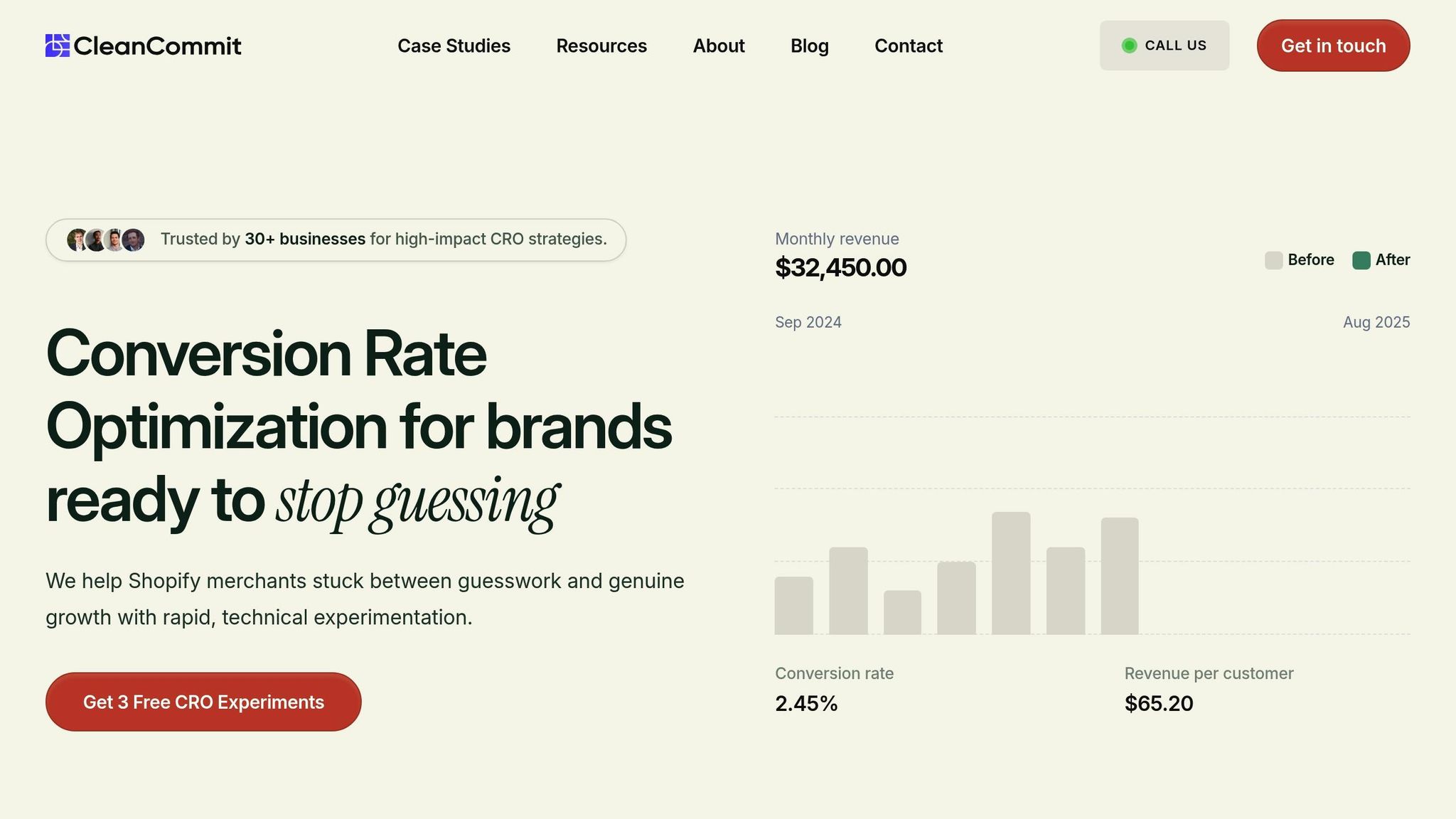
If you're looking for expert help, Clean Commit offers a hands-on approach to improving your product page performance. They provide a 30-day free trial, which includes up to three experiments designed to show measurable improvements in your conversion rates.
Their process starts with a CRO audit to identify problem areas, followed by a customized 90-Day Conversion Roadmap. Using A/B and multivariate testing, they aim to deliver actionable results that can drive sales.
With a monthly fee of $6,000, Clean Commit focuses on delivering revenue increases that exceed the investment. Plus, the 30-day trial comes with no obligation, allowing you to explore their services risk-free.
For U.S. ecommerce businesses ready to maximize their product page potential, Clean Commit’s data-driven strategies can be a game-changer for growth.
Conclusion
Crafting a product page that converts isn’t just about making it look good - it’s about creating an experience that turns casual visitors into paying customers. Every component, from engaging product descriptions to well-placed calls-to-action, plays a part in guiding shoppers toward making a purchase.
The difference between an average product page and one that performs well can translate into thousands of dollars in extra revenue each month. Fine-tuning your pages isn’t just helpful - it’s essential for staying competitive and growing your business. The strategies we’ve covered highlight the key steps to building high-performing product pages.
Key Takeaways
- Optimization is an ongoing process. High-quality visuals, persuasive descriptions, clear calls-to-action, and trust-building elements all work together to create a smooth and effective shopping experience. These elements need constant attention to keep them working at their best.
- Mobile-first design is non-negotiable. With mobile commerce leading U.S. shopping trends, it’s crucial that your product pages load fast and perform seamlessly on any device. A mobile-friendly experience captures more sales opportunities.
- Let data guide your decisions. Using Shopify’s analytics tools, A/B testing, and user behavior insights allows you to pinpoint what resonates with your audience. This approach takes the guesswork out of optimization and helps you focus on what drives results.
- Consistent updates keep your pages competitive. Regularly reviewing customer feedback, conducting performance audits, and adapting to current design trends ensure your pages remain effective as your business evolves.
These takeaways are a roadmap to better performance. Now, it’s time to put them into action.
Next Steps for U.S. eCommerce Owners
Begin by implementing the strategies outlined in this guide, focusing on one area at a time. For instance, start with refining your product descriptions or upgrading your images, and monitor the results before moving on to another aspect.
If you’re looking to speed up your progress, consider working with experts in conversion optimization. Clean Commit offers a 30-day free trial with a proven approach to help you achieve measurable results.
The most important step is to start today. Every moment spent without optimizing your product pages is a missed opportunity for revenue. Make every visit count by ensuring your pages convert effectively.
FAQs
How can I make my Shopify product page template mobile-friendly?
To make your Shopify product page work well on mobile devices, focus on building a responsive design that adapts smoothly to smaller screens. Ensure that all elements, like buttons and links, are large enough to tap easily, and keep the text short and to the point for better navigation.
Speed is crucial - compress images, trim down unnecessary code, and cut back on redirects to make the page load faster. A quicker page not only improves the shopping experience but also keeps visitors from leaving too soon. Also, aim for a clean, straightforward layout where key product details are easy to spot, so mobile shoppers can find what they’re looking for without hassle.
By focusing on speed, simplicity, and ease of use, you’ll create a product page that works beautifully for mobile users.
How can I effectively use customer reviews and trust signals on my Shopify product pages?
To increase trust and drive more sales, make sure to display genuine customer reviews and star ratings prominently on your Shopify product pages. These act as powerful social proof, giving potential buyers the confidence they need to make a purchase. Position reviews close to product descriptions or call-to-action buttons to ensure they're easily noticed.
Add trust badges - like secure payment icons - and verified reviews to reinforce credibility. Including user-generated content, such as customer photos or testimonials, can also highlight real-life experiences with your products. Placing these trust-building elements near critical decision points, such as the 'Add to Cart' button or checkout section, can help ease doubts and encourage conversions.
By using these trust signals effectively, you can create a more dependable shopping experience that boosts sales and reduces cart abandonment.
How does A/B testing help boost conversions on Shopify product pages?
A/B testing is a smart way to boost conversion rates on your Shopify product pages. By experimenting with different versions of key elements - like layouts, product images, headlines, or call-to-action buttons - you can figure out which setup clicks best with your audience.
This method relies on real data, helping you make decisions that improve the shopping experience and, in turn, increase sales. In fact, many businesses report conversion rate jumps of 10–25% just by regularly testing and fine-tuning their pages. Even small changes, like adjusting a CTA's wording or reordering product images, can make a noticeable difference in performance.


