Building Our New Branding - The Process To Follow
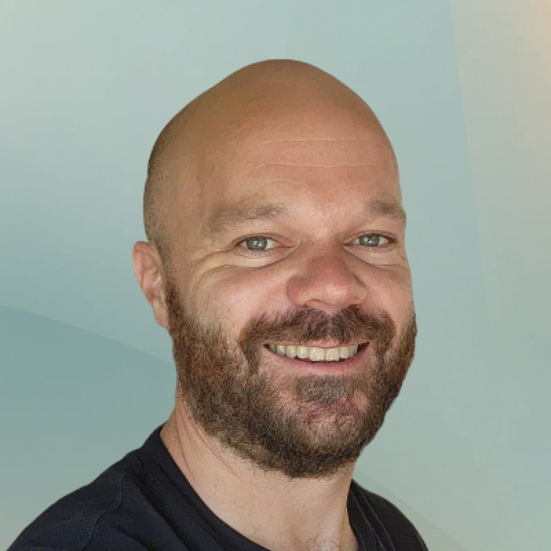
We've handed the reigns over to Sam, our freelance designer, to create our new brand identity. we're relying on him to come up with a concept for our new brand that ticks all the boxes we identified as we were laying out our new branding strategy.
Suppose you haven't been following the story. In that case, we've been documenting all the challenges and lessons we've learned from the point of realising we didn't have a niche to deciding that it was time to spend money on a branding specialist and thinking through what we wanted to get out of the whole experience.
We've been recording as much as possible because we couldn't find decent articles online explaining the process from the client's perspective.
We're finally at the point where we're ready to become a great digital brand with a new logo, color pallet, typography and style guide.
Here’s a summary of the topics we cover in this rebranding series:
- Step 1: 🏀 Defining Rebranding Goals & Brand Strategy - A Complete Guide
- Step 2: 🚚 How To Pick Your Niche - How My Software Agency Solved This Problem
- Step 3: 💳 Building Our New Branding - The Process To Follow
- Step 4: 🗺️ Website Roadmapping - Planning To Maximize Conversions
- Step 5: 🖊️ How To Write Great Website Copy - Sharing Our Process
- Step 6: 🎨 High Fidelity Design - Prepare And Execute Like An Agency
- Step 7: 😶 Choosing The Best Website Framework & Headless CMS
This is what the rebranding process looked like
In scouting out a brand designer, we were hopeful we can find someone that would have a solid process to appease our need to do things in a structured manner. Luckily for us, Sam did have a process. This is what it looked like:
Survey to understand company identity

To kick things off, Sam asked us to complete a form to understand our business model, target audience, brand values, company vision and brand strategy.
He posed questions like:
- "In one concise sentence, what problem does your business solve?"
- "Describe the key services & benefits of your products. "
- "How does your business make money?"
- "In three words, your brand is summed up as:"
This resonated strongly with us because these are the kinds of questions we ask clients when we're taking them through the Product Roadmapping process to start to understand who they are and what their goals are.
Figuring out a logo concept
With a name like "Clean Commit" and services as conceptual as helping businesses that have outgrown their technology, we needed a strong concept behind our logo. We wanted the concept to move away from anything that hinted at code or programming. After all, we're consultants who solve business problems. We can also code, but that doesn't define our digital brand.
Sam came up with half a dozen concepts and narrowed the selection to a couple he thought were the best.
The one that stood out to us was the idea of a logo that draws its shapes from a blueprint with angular lines and vectors, kind of like what would be used for a new building. This concept summarises what we do; getting to the bottom of a problem and carefully designing a solution that will stand the test of time.


Picking a logo design
The most challenging part was picking a logo design that we liked. This process made us double-guess whether we had settled on the right concept.
The problem with picking a logo design is kind of like going to a Chinese restaurant and having 700 dishes to choose from. After a while, everything looks the same, and it's hard to tell what looks good. At some point, you have to trust your gut.
Luckily for us, as we were deliberating and not really getting anywhere, Sam gave us a push towards one particular concept. His arguments were:
- It looks good as a small icon
- It holds up as a stand-alone image but also has a nice shape when combined with the text part of our logo
- This version is the most unique and memorable

Here are the runner-up logos:


Pick our new brand colour pallet
We were looking for a colour pallet that was somewhere between "fun startup vibes" and "minimalistic corporate". Luckily, this means more to a branding specialist than it does to me.

Sam picked out a ton of different colours for us, as you can see above. It's almost impossible to say which of these colours is the winner without seeing it in context, so we asked for a couple of mock-posters to be made up. This was a great strategy. It's a million times easier to look at colours in context:

Once we had the chance to review the colours in their final form, the decision became clear. We were going with a strong blue, white and yellow combination.

It's hard to be unique with colours. There are only so many, and big recognisable brands have already laid their claim. Unfortunately for us, it seems like a lot of companies have had the same thought. Most notably Atlassian and DigitalOcean.

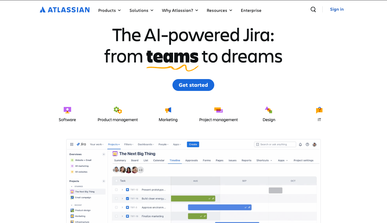
It's a small thing, but using yellow as our secondary colour at least buys us a little sense of individuality. Enough for us to be happy with our choice of colours and move on to the next step.
Choosing the fonts
There are no rules when it comes to using fonts, but best practice is to have one font for headlines and another for the body. Using more than two fonts can become busy, and only using one font can feel a little lack lustre.
Sam laid out a handful of fonts to choose from, along with the reason for his pairings. But picking fonts is something we’ve done a lot of, so we ended up doing our own research and committing to different options.
In the end, we chose Gilroy Semi Bold as our headline font and Public Sans as our body font.

We had hoped to find two Google fonts that worked nicely together so we didn’t have to write documents in MS Word, but sometimes these things just don’t work out! Gilroy was too nice to pass up.
Delivering the final assets
With all the individual components and stylings designed, all that was left was for Sam to package everything together in a Figma project and build the various implementations;
- Social media covers
- Logo marks, covers, full logos and colour variations
- Stationary design
- Brand guidelines

Having the assets prepared in the forms we intended to use them was super handy. We probably could have figured out how to modify a banner to make it the right dimensions for different social media platforms or separate the logo mark from the cover, but having this done for us was great.
Wrapping up
We’re super happy with the results and the experience of working with our branding freelancer. The concept has grown on us over time and looks really tight in our website implementation.
What’s next?
The next part of the branding rework is arguably the most important part; planning our new website. We follow a specific process that has yielded great results for our clients, but we’ve never tried the process on our own website. Stay tuned because the next article holds a bunch of value for any business that wants to improve its website conversion rate.
