Case Study: Bitmax
The Bitmax team reached out to us for help redesigning and developing their website. After bouncing a few emails back and forth, we jumped on a call to review where their current site was at:
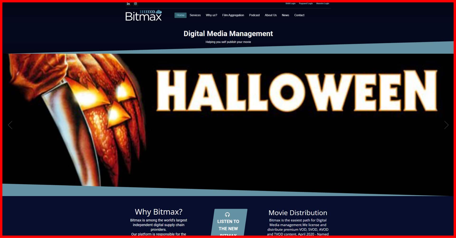
Home page
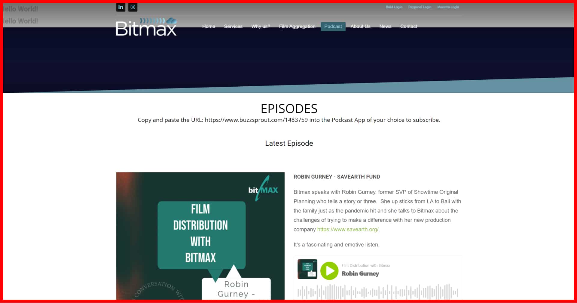
Podcast page
Services page

After a quick review, we became extremely excited about the project. The site already boasted a good amount of content and showcased some interesting images that we could leverage. This site had great bones but needed a bit of polish.
Picking a style
The primary goal of rebuilding the Bitmax website was to create a new fresh look. The first step in nailing this goal was to draw inspiration from some other really well-designed websites.
Speaking with the Bitmax team, they pointed to frame.io as a site that had a lot of what they were looking for. Unlike frame.io, the Bitmax team didn’t have high-quality images or footage of their SaaS platform.
The lack of these assets meant we needed to bridge the gap and design custom illustrations that looked like their screenshots but stayed in line with the website’s general theme. We dug around a ton of sites looking for inspiration and landed on palantir.io. They incorporate tidy, lightly animated illustrations that complement the clean theme.
There were a number of other sites we looked at. These are the ones that made the shortlist:
- https://www.evernote.design/categories/icons/
- https://www.uistore.design/categories/illustrations/
- https://icons8.com/illustrations/
- https://undesign.learn.uno/illustrations/
We ended up going in a fairly unique direction. The style is inspired by going to the cinema. As the user scrolls down the page they’ve shown a parallax style multi-layer image that aims to look like the grainy lights in the movie theatre.
We’ve also incorporated a scrolling image carousel that gives the impression of walking along the hallway decorated with posters on the way to the theatre room.
Picking the technology
For the last few years, we’ve leaned more towards Jamstack (Javascript, APIs and Markup) websites for brochure sites like this. We would typically integrate them with Netlify CMS or Prismic.
However, while we love the performance of Gatsby and the developer experience of working with a React-based framework, we’ve found that there are some shortcomings. Setting up staging environments and making use of popular, affordable split testing platforms are the two most notable.
Early in the project, we had floated the idea of using Gatsby with the Bitmax team. After giving it a bit more thought we decided that WordPress was going to be a better fit. The Bitmax team were already used to WordPress so they wouldn’t have to learn a new CMS. Plus, we’ve got our WordPress development process nicely dialled.
Since we’ve developed dozens of websites with both website frameworks, we’ve got some strong opinions on when they’re the right fit. We’ve written an article comparing WordPress with Gatsby if you’re trying to figure this comparison out for your own project.
Content authoring
One of the biggest questions we deal with when creating new sites is how much involvement we’ll need to continue having once the site is deployed. Our goal is to avoid our clients needing to call us for help when they want to make any kind of content changes or create new pages. We achieve this by building sites using modular sortable blocks that contain dynamic fields so content and images can be updated.
The challenge in creating these reusable blocks is to avoid adding so many that it’s difficult to manage while also providing enough flexibility to create new landing pages. This balance is only achievable if the design follows a consistent pattern.
We usually aim to create as few blocks as possible. It’s easy to get creative and unstructured with the design which ends up in dozens of content blocks being developed. The only way to do this efficiently is to review the design frequently as a team and identify sections that could be streamlined.
Ultimately for the Bitmax website, we ended up with just over 20 blocks.

Challenges
Besides coming up with a super unique and creative design concept, we wanted to add some animation. Identifying where to add animation is kind of tricky. Adding too many moving elements can end up distracting the user.
We ended up building in three primary animated components. The first is a staggered, slow scrolling carousel that showcases Bitmax’s portfolio. The second is a slightly more complex globe animation with curved lines that jump from country to country. And finally is a variation on the first scrolling slider.
Check it out
At the time of writing, the Bitmax project is receiving a few content tweaks before being published. You can check it out here!


