Case Study: Clean Commit
Every so often there comes a time when the team here at Clean Commit rethink our approach towards our services. Over many projects, we slowly test what's most efficient to do and adopt new standards. Usually, it's a technical change or a new framework introduction that improves our development experience. But there are rare moments when it’s a significant change that allows us to deliver much better results than we have in the past.
Our first significant shift was the way we build, deploy, and maintain WordPress projects. We moved from a wide variety of starter templates to Roots stack.
This time the paradigm shift was the addition of a static website to our stack. In 2020 alone we completed 8 projects using Gatsby and learned a lot during that time. We strongly believe JAMStack coupled with a headless CMS is the best solution to most businesses' problems while providing unprecedented speed of development and blazing performance for clients.
We wanted to use the experiences we'd gained to finally redesign our own website with speed and SEO in mind.
We wanted to start 2021 strong.
And we wanted to do it with our website.
First website for Clean Commit and it's problems
The first site we made for Clean Commit was done quite hastily. We just wanted something to show to our potential clients, but this time around we had more time to perfect it.
Our original website had some obvious flaws.
The biggest one? Presentation of our past projects.
The most annoying one? Outdated stack.
Last time we decided to use React Static which we never ended up using again on any client work. While the page load speed was fast, it was a hard platform to update and add new content.
Our goals for redesigning
In terms of the design we had a couple goals:
- Improve the portfolio presentation
- Improve our services pages
- Grow our careers pages
Above that, we felt like we needed changes implemented on our home page. It said very little about what we do and how we do it. With these goals in mind, we set out on a designing adventure our vision - bigger, bolder, and devilishly fast.
REALLY showcasing our portfolio
Portfolio pages were the biggest issue for me personally. Take a look at this screenshot taken from our old website presenting the Dionysus project.

Not too good, right? There's very little content hierarchy. At first glance it's hard to say what Clean Commit did as an agency in this project. The small image suggests we're not too proud of the project, and there's nothing that grabs your attention.
The solution? We decided to blow up the image making it a central part of the page. Additionally, we've added large headers to focus the reader's attention and inform about the most important points of the project.
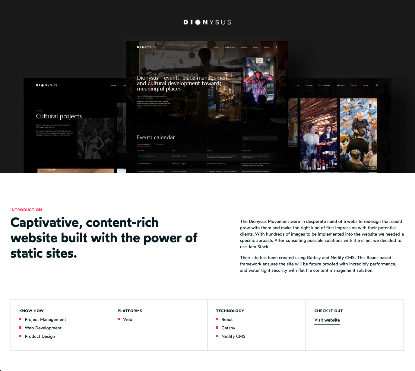
The next problem was the lack of flexibility for our projects. Sometimes we want to add more content or show different images on the website. We decided to build portfolio pages in a modular way, where each section is a separate component. Now the editors can compose pages to their liking adding more content or images with ease.
Redesigning the services page
Service pages are a hard subject in every company. The offering tends to change a bit. Sometimes you want to add more information or reorganize it to give clients a better idea of what they can get.
We knew these problems too well. What did we do? A modular approach of course! Instead of a long block of text, now we can extend content by adding new modules or updating existing ones. Editors can use the sections to order content however they see fit.
Redesigning the careers page
Previously careers page was only a list of currently open positions. The single listing page was quite simple with a singular block of content. Instead of a form, we asked all candidates to send us an email, which was inefficient and hard to manage.

The new design separates listings content into the position's description and it's requirements. We've also added a form that helps us manage applications based on the position there were send for.
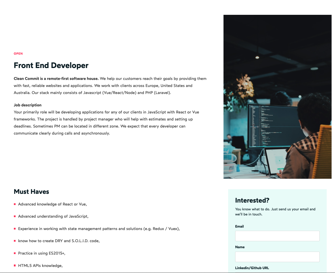
The new careers page features a better distinction on currently open positions. We also highlighted the benefits we offer to our applicants and tell a bit more about our company.
How did we choose our stack?
Selecting our stack was easy. Our main site generation framework is Gatsby. This decision was a no-brainer. It's the most battle-tested static framework at Clean Commit, with which we have a lot of experience. We used our open-sourced Gatsby starter called Henlo to speed up development and configuration.
Which CMS did we use?
Our previous CMS was a Git-based Netlify CMS, it worked great so we decided to keep it with a couple of improvements. Instead of using single-file configuration, we switched to Manual Initialization. It makes configuration of collections and pages a breeze using JavaScript objects instead of hard to debug Yaml files. The only downside of git-based CMS is longer build times (we average ~2.5 minutes). But, since we don't have a lot of pages on our website and we won't update it a lot it's not much of a problem.
Additionally, quick changes can be made within our code editors or my favorite Markdown editor - iA Writer - and pushed directly to production. Flat file solution will also keep our data in-sync across all developers without worrying about database migration.
How did we ensure the best performance?
We wanted our website to be fast. And when I say fast I mean absurdly fast. No matter where you are accessing the website from and what network you're using.
To achieve such speeds we had to optimize the code base and deploy our website on a great performing CDN network.
When it comes to codebase optimization we used our usual solutions.
With the gatsby-image package we made sure our images will be optimized and load correctly depending on the device you're using. To save time we opt-in for different loading strategies depending on where the image is used.
We optimized GraphQL queries to make sure we're not loading redundant content for any page. This would result in bloated JSON files that are loaded on each page. Additionally, we optimized the strategy for loading CSS files and fonts efficiently by enabling prefetching for the most important assets. On top of that, we've enabled brotli compression to save bandwidth however we can.
These small improvements made a huge difference on top of a great code.
When it comes to hosting and deployment we went with Netlify, our go-to service for our static projects. To take full advantage of Netlify's CDN we needed to opt-in for their DNS service or find an alternative solution that supports ALIAS or ANAME records.
Since we use the cleancommit.io domain for a couple of other projects we wanted to use a more flexible DNS service. After some digging and testing, we bundled Netlify with Cloudflare DNS. Thanks to Cloudflare's CNAME flattening we took full advantage of Netlify's CDN while having a centralized solution for all of our domains.
After all these changes and tweaks we were able to significantly improve our website performance, achieving an almost perfect score in Lighthouse :)

Would you like to have a faster website? Reach out to us, we can schedule a call and talk through your project!

