Case Study: Humanforce
Humanforce is a leading Australian roster and shift management SaaS provider.

They approached us after a frustrating experience working with a different development agency. Things that seemed like they should be simple were taking a mountain of effort and time to complete, there was no flexibility in changing content, and serious interface issues had been pushed to production.
The Humanforce team reached out asking if we could pick up the pieces and get the project back on track. We’re not a team that shies away from a challenge, so we accepted!
There were some notable issues to overcome from the start of the project. Picking up a half-designed and developed website is the most difficult way to build a site. Inheriting another developer's code and retroactively fixing poor code while building within someone else’s standards is tricky!
Before we dived in, we needed to figure out what we were dealing with.
Reviewing the project’s health
The way the previous developers had constructed the website was a fairly standard approach using Advanced Custom Fields to allow Humanforce to change some of the content.
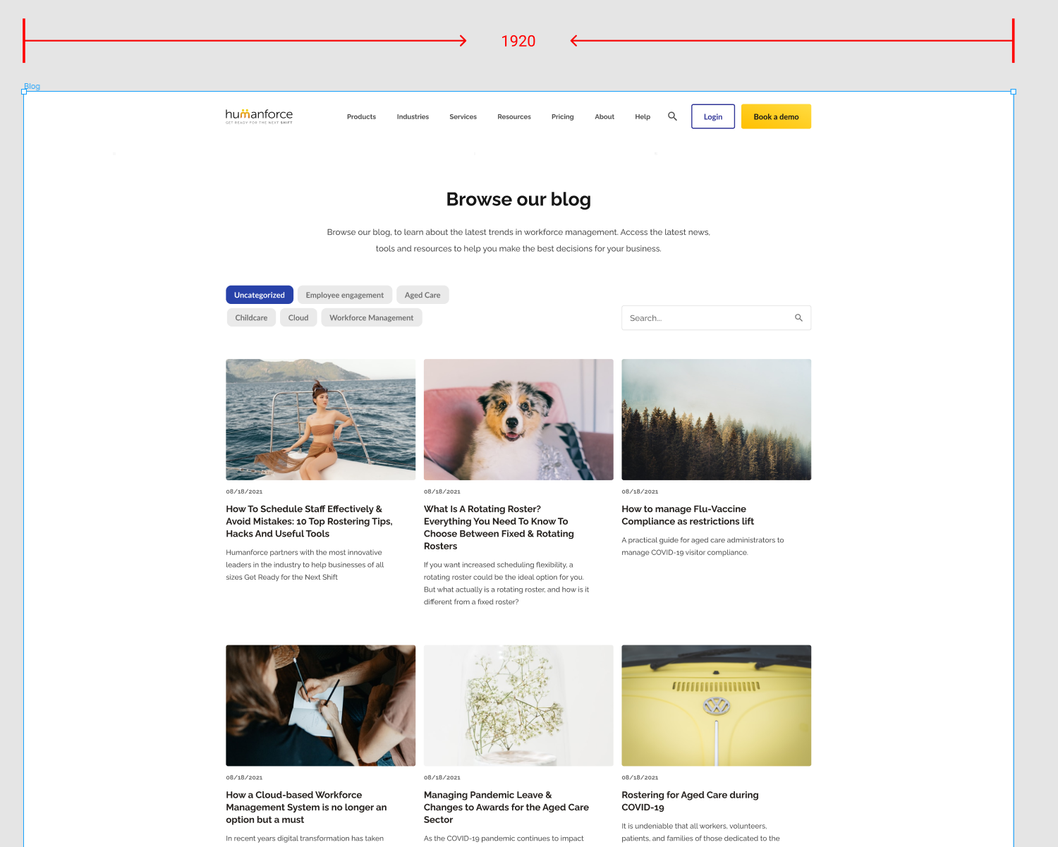
The problem was that the fields were fixed in the interface. There was no way to move “blocks” of content around on the page. Even though the images and content could be changed, no page could be lengthened or shortened, and there was no easy way to create new landing pages. Half of Humanforce’s site is essentially landing pages, so this just wasn’t a good solution.

The interface had been created using a strange variation of Bootstrap and there was a ton of unused code cluttering up the site’s performance.
After finishing the code review, we requested access to the Figma file that was acting as the blueprint for the site’s redevelopment. This part was being handled by a different agency again.
The trail of homepage variations in Figma indicated there had been a lot of communication with the client (a good thing!) but the target width of the homepage was 1280px (a bad thing ). This width is too slim and would mean a ton of unused space would exist on larger devices.

The last thing to check was the site’s current SEO scores. We ran a quick SEO audit in Ahrefs to see if there were any critical issues. The site scored 80/100, which isn’t too bad. There were some things to reconfigure but it wasn’t the most pressing problem.
With the review wrapped up, we had a list of the most critical issues:
- Poor WordPress construction
- Target design dimensions too thin
- Redundant code causing performance issues
With the Humanforce team anxious to see some quick progress, we got to work.
Fixing WordPress
The most challenging part of the project was building on top of the existing site rather than starting from scratch. Since we build so many WordPress projects and use a very opinionated set of technologies, we couldn’t just pick up the project as it was. We needed to implement our own file structure, plugins, templates and frameworks.
We rely on Tailwind CSS to style the websites and applications we work on. Sticking to a consistent framework means no matter what underlying technology we’re using we have a familiar way of styling the interface. The problem with implementing this approach on an existing website is that we either needed to convert the existing stylesheet to Tailwind or run two stylesheets.
Rewriting the styles of pages that were about to be redesigned would have been a waste of time, so we went about implementing a system for running two stylesheets. Using a clever bit of logic, we created a method of implementing the appropriate stylesheet based on the template the page was constructed with; the old system, or our new dynamic page builder.
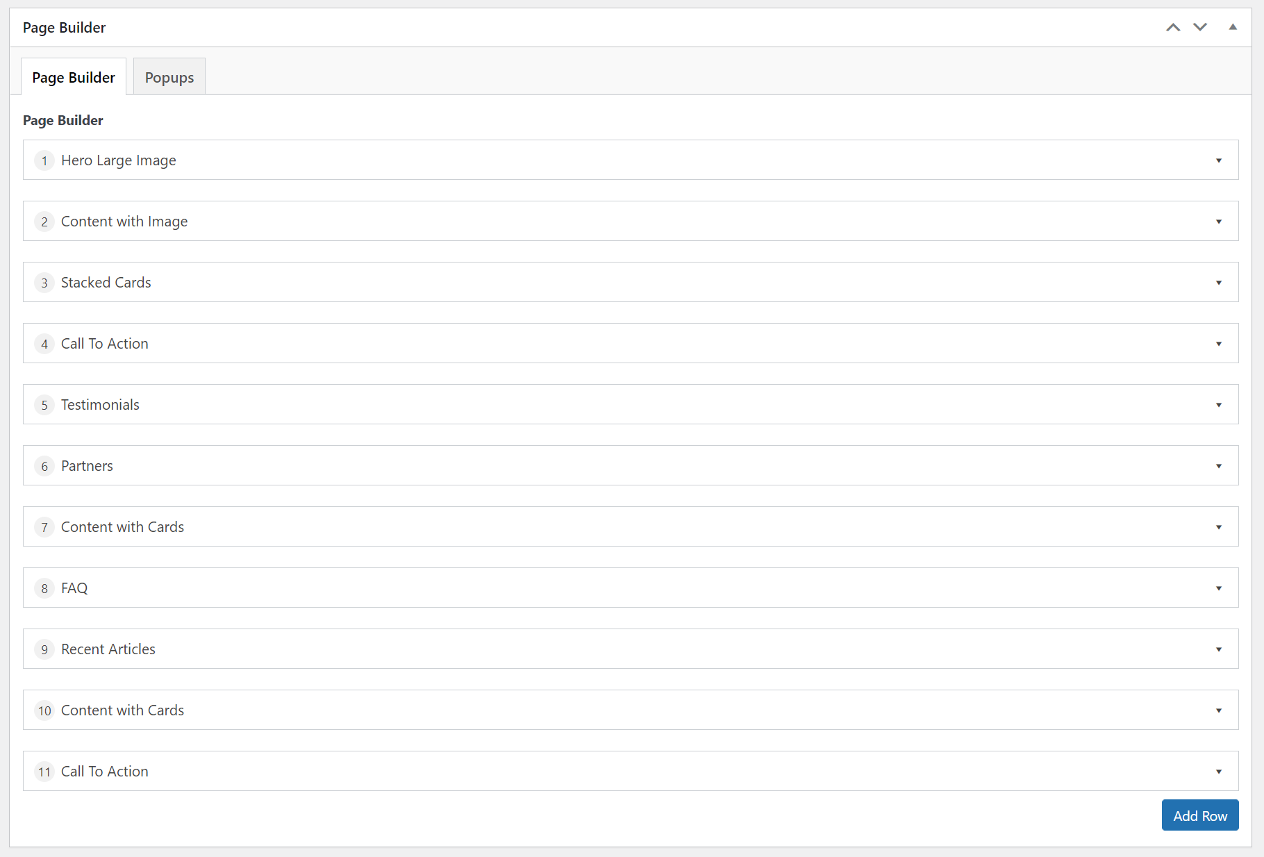
Implementing a more dynamic page-builder (pictured above) approach was another large improvement. Under this approach, the user can drag pre-styled sections up and down the page. Each section allows new images and content, and some design variations like swapping images from left to right or vice versa.
Increasing target design dimensions
The original Figma design had been set up with a width of 1280px. A typical laptop screen is 1444px wide, most desktop screens are at least 1920px wide, and larger monitors are up to 2560px wide.

By the time we had a chance to review the design, the homepage had already been implemented. Rather than try to go back to the start we made the decision to increase the design resolution to 1920px wide and work on the outstanding pages.
Removing redundant code
The previous developers had left their mark on the project. In addition to an unused jQuery library, there were a number of redundant packages and dependencies cluttering up the website.
We removed the most obvious redundancies and saw a fairly immediate boost in performance.
Humanforce weren’t ready for all of their existing pages to be rebuilt, leaving some of the old inefficient code living on the site.
The Results
Work hasn’t completely wrapped up on the Humanforce site, however it’s getting close! You can check the site out here.
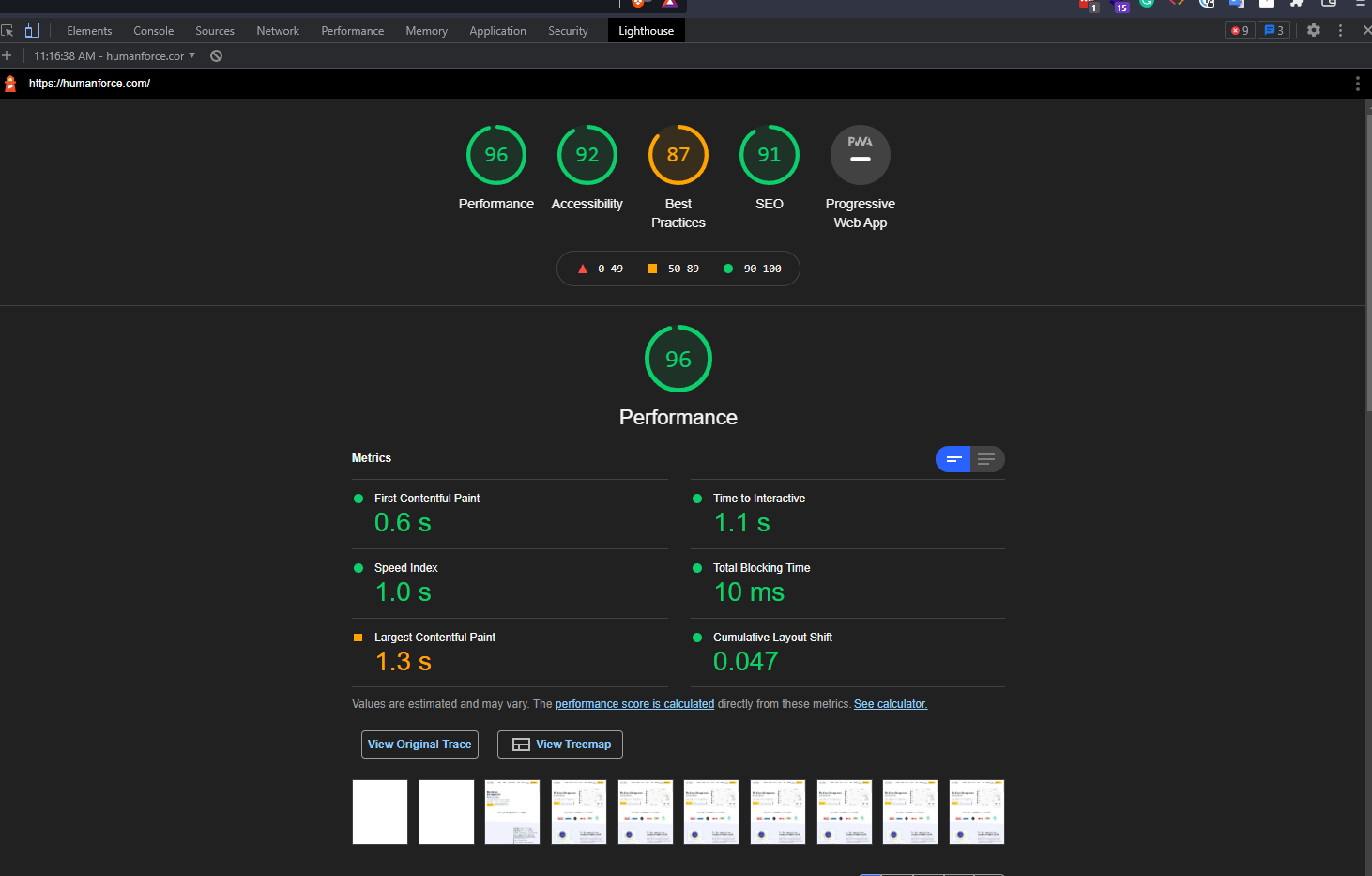
In addition to rebuilding the Humanforce site, we moved their hosting to Linode. Since they created a data centre in Sydney, Linode has been our virtual private server provider of choice. The performance for domestic visitors is unrivaled as you can see below:
Overall, the project has been a huge success. We managed to get the project back on track and the website is infinitely easier for the Humanforce team to manage.


