Case Study: Salt Of The Coast

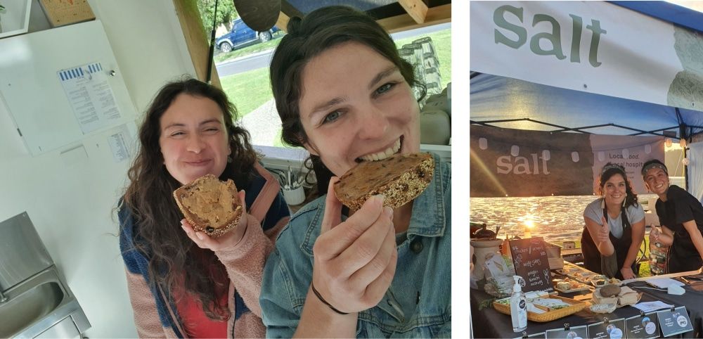
Immy Love and Caroline McGrath had just purchased a cafe together in Narooma, NSW. Their first mission was to distance themselves from the brand that the previous owner had created.

As one of the only locally-owned cafes in Narooma, they wanted everyone to know that their vision was to source their products from the surrounding area. Not just because small local businesses need to support each other, but also because the Eurobodalla produces tons of great products, but there’s no central retailer.
Ultimately, they planned to expand their operations to source and sell local products online.
The girls approached the Clean Commit team for help to get their website up and running quickly to support their new business launch. They wanted the site to be stylish but also very easy for their older customers to navigate.
The Salt website also needed to have the capability to extend into eCommerce to support the girl’s plan of selling products online.

We met with Caroline and Immy to discuss the “style” they wanted to achieve and find some examples to inspire the design process.
The design was then created over a few weeks with frequent reviews to adjust it to fit their vision.
When everyone agreed that the design was ready, our development team snapped into action. The site was built out using GatsbyJS and integrated with Prismic as the content management system.
The combination of Gatsby and Prismic was the perfect choice for this kind of small brochure website. Breakneck load speeds and improved SEO means the site will be guaranteed to do its job well into the future. And when the time comes to add eCommerce facilities, the Salt website can achieve this with a headless Shopify integration.
Pretty neat stuff!
Challenges
Every project has its ups and downs. These were the biggest hurdles we had to get over in delivering the Salt website.
Timelines
Things need to happen quickly for new businesses and startups because there’s a limited runway to keep the ship float.
The Salt girls had a hard deadline for getting the website deployed. This deadline only became important halfway through the project when their acquisition date jumped forward.
This change to the project was a challenge for us. Our schedule had suddenly become a few weeks shorter, and we had to compress a lot of development and testing into a much shorter timeframe.
It’s not a new challenge. We’re masters at the last minute cram and threw a few extra hands onto the job to get it done.
Creating a vision
When Caroline and Immy first approached us to build a website, they hadn’t thought about what it would look like, what functionality it should include, or how their users would interact with it. They weren’t sure if a shop should be available straight away. They didn’t have any content prepared.
To summarise, they didn’t have a clear vision of how the website would come together.
Shaping a well-defined vision is always a challenge and one that we deal with daily. It’s rare to work with a business with a crystal clear and well thought out plan for how their website will come together.
We worked with the Salt girls to find examples of sites they liked the look of and then talked through the journey their users would follow when visiting the website. We documented these learnings and used them to create a beautiful design.
Adopting graphic designer assets
For folk that don’t work with web technology, the difference between graphic designers and web designs seems trivial. But for our team, it’s usually a headache working with logos and branding guides that graphic designers have created.

The fonts aren’t always freely available on the internet, images tend to be too heavy or aren’t accessible, and the colour pallets suit physical products rather than the web.
But where there’s a will, there’s a way. This “way” often includes finding different web fonts that look very similar to the brand font, changing colours very slightly, and reformatting images.
Features
The Salt website is simple to use and easy on the eyes, but it's also boasting a handful of cool features.
Instagram integration
Instagram is incredibly popular and valuable in the hospitality industry. Business owners put countless hours into crafting images and posts to share with their audience. It makes sense that this content should be available on the website too so visitors can see the latest news, and feel a continuous brand experience.

The website features an integration with the Salt Instagram account. As new images are added to the account, they automatically appear on the website.
Styled map
One of the most important "use cases" of the website was customers finding the location of the cafe. Rather than just writing out the cafe address, we wanted users to be able to use a Google maps widget to be able to zoom in or out and figure out exactly where they need to go.

And for a little flare, we added some fun styling to the map!
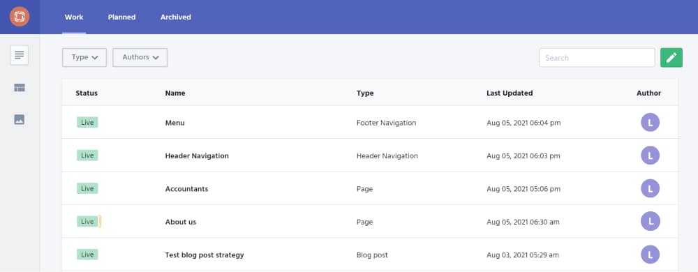
Prismic content management
Every headline, image or block of text on the website is easily editable from Prismic, which is our preferred content management system. Prismic makes changing content on the website incredibly easy. The simple interface and clean controls take virtually no time to learn, which is exactly what business owners want in a CMS.

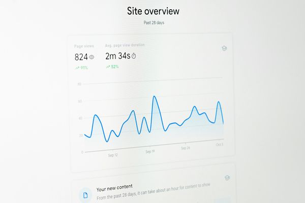
Core Web Vitals passing grade
Google started rolling out their "User Experience" algorithm update in June of 2021. This update assesses websites on their ability to pass the Core Web Vitals. If a passing grade is met, the website gets a small boost in traffic. If not, they're penalised.
Our last goal before releasing any website to production is to make sure it's nicely optimised and ready for Google to send traffic!


