How to measure your website's core web vitals

There’s a lot of buzz around the Google search engine ranking update coming May that promises to focus on “core web vitals” and the overall page experience a website creates.
Anytime Google implements a major algorithm change, it creates opportunities and risks for businesses that run significant operations on the web. This update is particularly important for any website competing for highly competitive search terms.
This summary from Google’s press release summarises the reason:
While page experience is important, Google still seeks to rank pages with the best information overall, even if the page experience is subpar. Great page experience doesn't override having great page content. However, in cases where there are many pages that may be similar in relevance, page experience can be much more important for visibility in Search.
What this says to blog owners is - if you’re one of a hundred articles with similar content, but your website presents an excellent experience for your users, we’ll push your content further up the rankings.
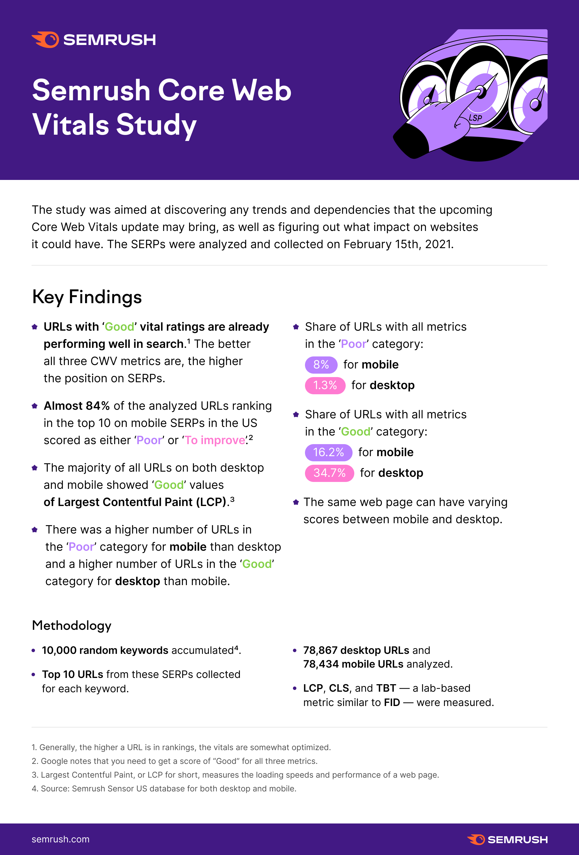
SEMrush ran a study in April that found almost 84% of websites in the U.S. scored either “Poor” or To Improve” on their core web vitals assessment. There’s no doubt that a decent number of these websites owns the top spot on a number of keywords. This means there’s a huge opportunity for businesses that are prepared to fix their core web vitals.
Web Experience Overview
There’s a lot to unpack with this update. These are the factors Google considers most important for a good website experience:
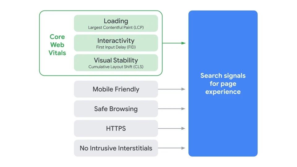
This article is going to focus solely on understanding and measuring your Core Web Vitals. We’ll break down what each metric is and the best tools for investigating your site’s current performance.
Largest Contentful Paint (LCP)
A website’s LCP is measured by how many milliseconds it takes to load the biggest thing on the page, relative to when the page first starts loading. This is often a video, hero section or even a cookie notice.

The illustration above shows that the target to pass the largest contentful paint assessment is 2.5 seconds or less.
Largest Contentful Paint may not seem like the most obvious metric to gauge website performance. It could be argued that First Meaningful Paint and Speed Index would make more sense. And they probably do, but Google has argued for “keeping it simple” with LCP.
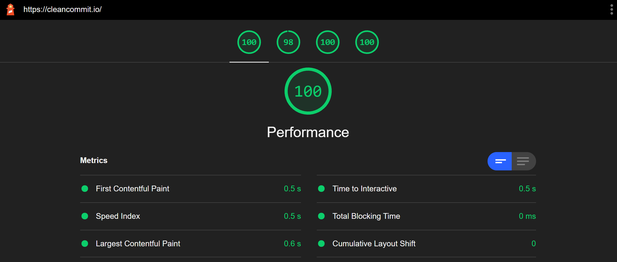
Largest Contentful Paint is something we have worked hard on with our own website, as you can see from the image below.
First Input Delay (FID)
First Input Delay describes how long it takes for a website to respond to the user taking an action like clicking a button or link. Most of the time this happens pretty fast, but there are a lot of factors that can contribute to this speed.
There are enough poorly developed websites out there that we’ve all been in the situation of opening a web page, clicking on a link or a button and waiting for what felt like… too long before something happened.
This is usually caused by the browser being tied up parsing an unnecessarily large JavaScript file before it could complete the action we requested. This situation is referred to as “blocking time”, or the time when the browser is working on code further up the line before it gets to your request.

For your website to pass the First Input Delay assessment, it needs to respond in 100ms or less.
Cumulative Layout Shift (CLS)
Have you ever found yourself on a less reputable site that is covered in advertisements? You get attacked by popups as the site loads. As you try to close them they jump around the screen and you accidentally end up clicking on one. Now you’re stuck in a loop of trying to close questionable websites that keep opening out of nowhere!
The unexpected movement of an element on the page can be super annoying, and that’s exactly what Cumulative Layout Shift is measuring.
Unfortunately for developers and website maintainers, it’s often the hardest thing to solve, especially if you’re using plugins that insert their own styles onto your site.
Funnily enough, one of the biggest culprits of CLS is advertising… and Google is probably the leading cause since it owns most of the advertising.
Regardless, there are steps your website needs to take if it wants to eliminate CLS. One suggestion from the Gatsby team is to preload SVGs onto your site in the areas where your ads will display once they load and render.

To understand the CLS target score, we need to understand the measurement definition.
Layout shift score is measured by calculating viewport size, how far the element moves on the screen and how much of the screen is impacted by the moving element.
The official Google definition is a little more complex, but this is the general gist.
Your website should be shooting for a CLS of 0.1 or less.
Measurement Tools
The days of measuring website performance with GTMetrix or Webpage Test are over. Google has a new breed of sanctioned tools for measuring core web vitals.
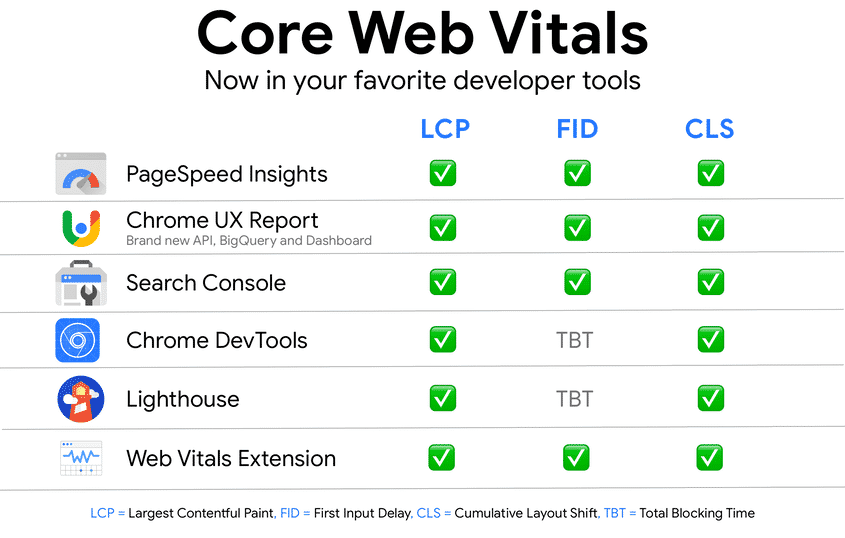
These tools measure two kinds of data; lab data and field data.
Lab data is captured in a lab setting. This is sometimes described as synthetic data because it’s run through a performance tool specifically to test performance as a snapshot.
Lab data doesn’t take into account a lot of the real-world factors like network connection speed or the users’ location around the globe.
Field Data is real aggregated user data is combined from Android devices and Chrome browsers. To make use of this data your website needs to have enough active visitors for Google to make observations.
Some of Google’s performance measuring tools only capture lab data, some only report on field data, and others do both.
When your site’s performance is being assessed and Google is ranking your content in the search results, they will only consider field data. This is important to keep in mind when you’re investigating your website’s performance. If your computer and network connection are super fast, then your lab data results may be hiding real problems.
It’s important to optimize your site for everyone because your visitors will probably be using old phones, intermittent network connections, and even underdeveloped infrastructure.
When you’re auditing your site, it’s a good idea to use a handful of Google’s assessment tools. Each has a different strength.
PageSpeed Insights
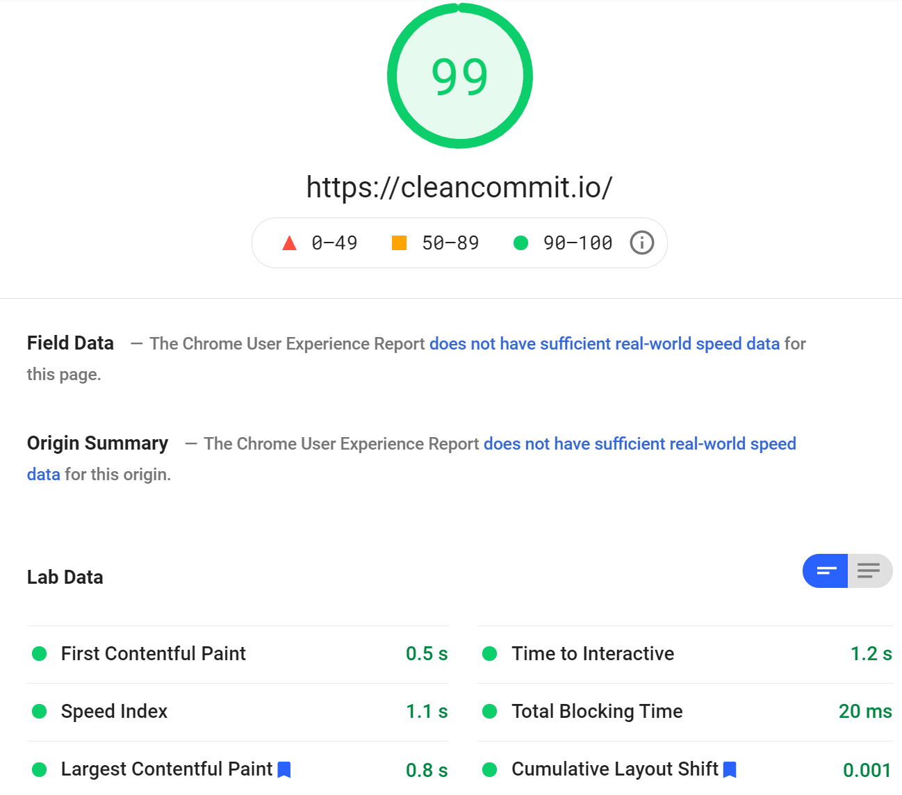
PageSpeed Insights is probably the most well known of Google’s performance assessment suite. It provides a lovely interface and returns performance results in a way that’s quick and easy to understand.
It’s not the most in-depth or detailed of all the tools available, but it works really well as a quick snapshot.
Lighthouse
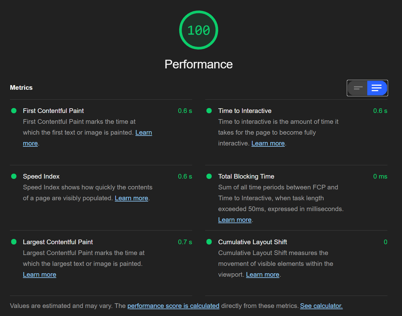
Lighthouse is a step up in detail and sophistication from PageSpeed Insights. It is part of the Developer tools available in the Chrome Browser.
Since Lighthouse captures lab data there are things you can configure on your computer to artificially improve your websites’ score, such as turning off all browser extensions or using an incognito tab.
Lighthouse is a super useful tool for developers because it’s open-source and can be accessed via API. This opens up a lot of cool opportunities like including Lighthouse audits during your website’s build process to keep on top of how your site is performing.
Chrome UX Report
Chome UX Report is a set of field data that assess aggregated user experience with a website. Google measures the real data from users that have opted in on Android devices or Google Chrome, analyses it and presents it as the Chrome UX Report.
Unlike Lighthouse and PageSpeed Insights, Chrome UX Report doesn’t have a graphical user interface to interact with. It can be accessed via BigQuery, Google Data Studio or via API.
Some of the Chrome UX Report data is also exposed on the PageSpeed Insights report.

The benefit of using Chrome UX Report is that it paints a more accurate picture of your overall user experience because it’s taking data from a large number of different sources, and over a longer period of time.
Google Search Console
Most website owners that take their traffic and website performance seriously would have used Google Search Console. It offers a broader set of reporting data to show how users are finding and interacting with a website.
Google Search Console also has a dedicated Core Web Vitals assessment tab.
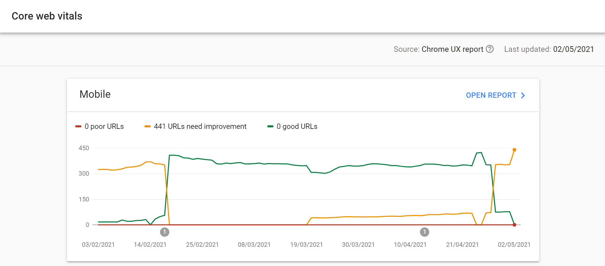
Search Console is the best 10,000-foot assessment of your website’s performance because it identifies large groups of pages that need attention. Performance is grouped by status, metric type and URL group which makes it useful for figuring out performance issue patterns.
Chrome Dev Tools
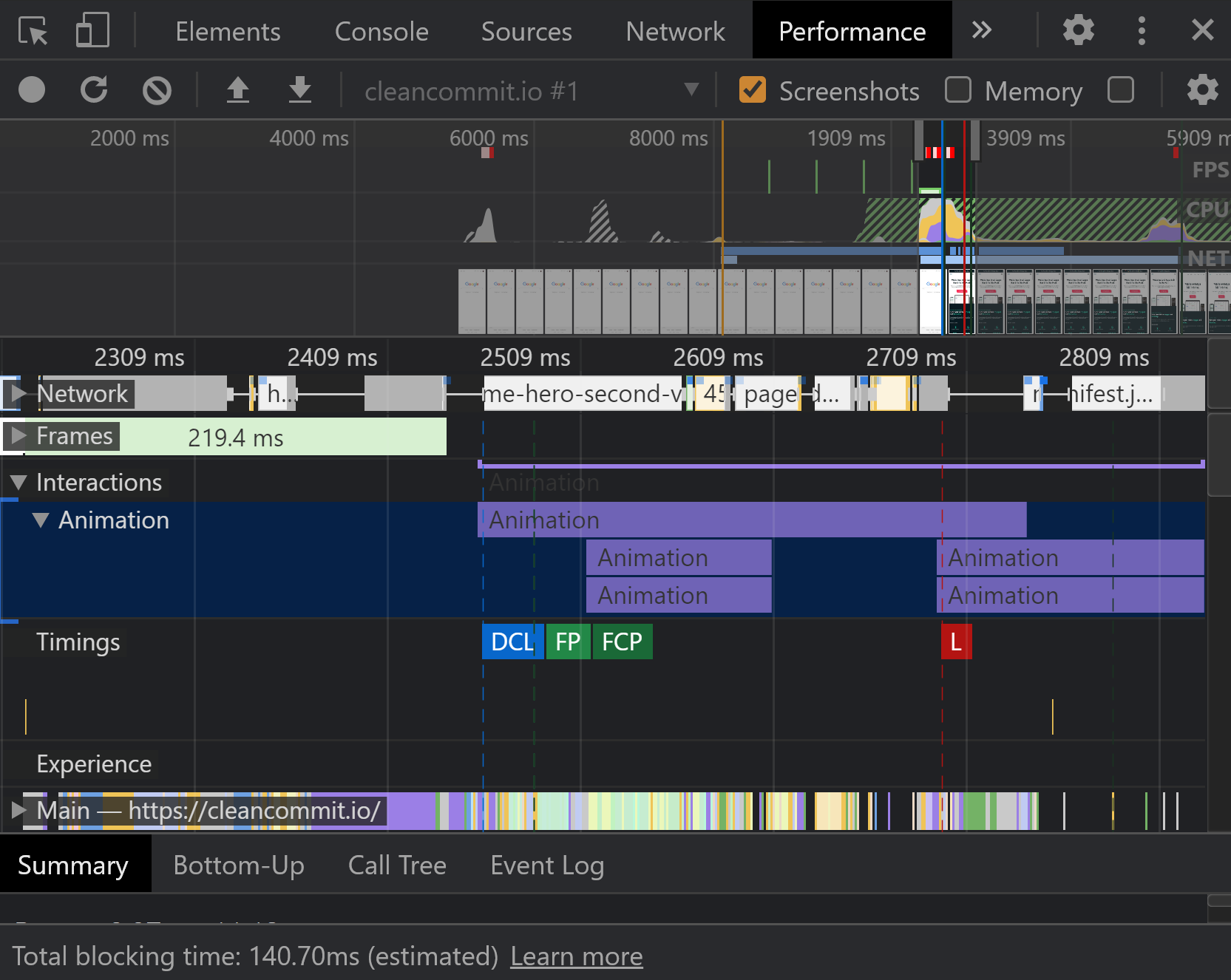
In addition to Lighthouse, Chrome offers a much more robust set of developers tools that can dig deep into performance issues. You can access these tools by opening up Chrome, selecting the settings menu, more tools, then developer tools.
Once you’re in the dev tools menu, choose the Network tab and refresh your website.
The network tab records all the requests the browser makes to load assets onto the page. This detailed waterfall breakdown provides a lot of information into which elements are taking time to load onto the page.
The performance panel offers a similar set of tools where you can measure a broader set of events across your site to identify problem areas. There’s also a new experience that can help you assess unexpected cumulative layout shift issues!
What’s next for Google?
Google announced that the core web vitals updates would be rolling out slowly starting from the end of May.
With the publication of these assessments and the suite of performance measuring tools Google has developed, it seems likely that creating a user experience that passes the test will become harder over time.
We’re expecting that Google will release more metrics and tweak the way they measure the current metrics.
One prediction Jono Alderson from Yoast has made is around a “smoothness” metric that seems to be referenced by Google every so often. This would probably focus on high animation framerates.
As the web evolves to be a more inclusive and accessible experience, it’s likely that a website’s accessibility will play a bigger part in its ranking performance.
How to fix my core web vitals?
There’s an unlimited number of factors that can have adverse effects on your website’s core web vitals. However, there are a handful of techniques you can apply to to get your website 90% of the web to passing your assessment.
In our next article, we’ll cover the 7 optimisation steps you should take to get your website ready for the core web vitals update.
Check back frequently for tips and tricks on how to keep your website running fast and passing Google’s assessments.

