SaaS Website Best Practices: 5 Critical Boxes To Tick

Creating a website for a new SaaS product is a big task. There are thousands of examples of successful SaaS products with unique designs and styles. It’s hard to know where to start with a design that will appeal to your customers.
Luckily, there are a few design patterns that have emerged over the last few years that are good to follow (and reinforced by looooots of data-driven improvements). In this article, we’re going to break down the best SaaS website designs and give you the most effective blueprints to follow.
Your website is the most important part of your business for a few reasons. First, it’s a blueprint for your app. In the early stages, your app might not be finished, or you might be selling features and functionality that won’t be available for a while.
Your site is the best vehicle for helping potential customers see the value in what you’re building. It allows you to make contact with them and start building relationships.
Second, your site is your sales team. It’s the first step for most people joining your company. Your site can’t explain everything about how your SaaS product works, but it needs to at least guide users in the right direction so they can see the functionality for themselves.
Third, your site doesn't just need to tell your company’s story but your user’s story as well. It needs to show how your product can help them overcome their pain points, perform their job better and make their lives easier.
Key SaaS website features
Before we dive into the best SaaS website designs, let’s touch on some of the key features that you'll find on most of the big SaaS sites.
Feature 1: Headlines
Your website has about 6 seconds to explain what it is that you do. Using a handful of clear, concise headlines is the most effective way to pull this off. Dropbox does this really well. Their headline explains exactly what they do and how they do it. Even if a customer has never used cloud storage, their headline “Get to all your files from anywhere, on any device, and share them with anyone.” makes it easy to figure out what they’re talking about.
Feature 2: Explainer videos
SaaS products can be hard to understand, especially if they’re providing a solution that users are familiar with. This is where explainer videos come in. The video will take the user through the process of using the application and show how it can improve their lives. Utilizing the best AI video generator for creating these explainer videos can simplify the production process, making it easier to convey complex SaaS functionalities in an engaging and easily digestible manner.

Feature 3: Benefit section
This is the user’s moment to see the value in the product. Your site needs to clearly articulate the problem they’re having and show how your product can solve it.

Feature 4: Screenshots
Screenshots should also be used to highlight the main features and functionality of your application. If you think of your SaaS product as a super efficient job worker, your website is the person who is taking your product for a test drive. They can’t do that without a quick look under the hood.
Feature 5: Calls to action
At the end of your main sales pages, you’ll want to include a call to action that directs users to sign up to a trial or purchase your product directly. These should be the most visually prominent features of your site so that users struggling to see the value in your product can quickly figure out how to give it a go.
Here's a great example.
Projects that don't have a clear map tend to steer off course. With a proper plan, your project will cost less, finish quicker and produce results that get you closer to your goals. Preparing these kinds of maps is one of the things our team do exceptionally well. Download an example of this kind of map (we call it a Product Roadmap) below.
Granted, most SaaS websites will use a CTA that pushes visitors to sign up for their service. If visitors aren't ready to take that step, then offering them something like we've done above is a great way to give some value and build a relationship.
There’s a lot more we could cover, but we might as well dive into some of the best designs and deconstruct them as we go.
SaaS Website Design Examples
Note: If you want to see thousands of SaaS website designs, just head over to Dribbble for unlimited inspiration.

1. Dropbox

Dropbox is the godfather of SaaS products. While it wasn’t the first company to offer cloud storage, it was the first to do it really well. In the early days, it was the perfect solution for people who needed to share large files. In a world where emailing 500MB .zip files was the only way to share large files, Dropbox was a revelation.
The company did a great job of getting its product in front of as many people as possible. It was one of the first SaaS products to offer a simple reward for referring friends. 1GB of free storage for every friend that signed up. It was a simple system and it worked perfectly.
It’s no surprise that a “get more storage for free by referring friends” headline is one of the first things that you’ll see when you come to the Dropbox website.
2. Slack

Slack has set the benchmark for how a SaaS product should be designed. The product is beautiful and incredibly easy to use.
Slack has taken a different approach to expanding its business than most SaaS companies. They’ve given the product away for free and then gradually added premium features that users can unlock for a monthly fee.
This business model has worked extremely well, but it means they’ve needed to focus on building a massive volume of users. The first thing you’ll notice about the Slack website is that there are ads for the platform all over the site. Every time you refresh a new page, you’ll be greeted by a new ad for Slack. It’s obnoxious but it works.
3. Duck Duck Go

Duck Duck Go is a privacy-focused search engine that claims to respect its user’s data. While they’re never going to be able to compete with Google for market share, they’ve done a good job of carving out a small niche of users who don’t want a big corporation collecting their data.
Duck Duck Go’s website is the first point of call for most users. They do a great job of explaining their solution with a series of headlines and showing how the product should be used with a clean, functional design.
4. Help Scout

Help Scout is a customer support platform that combines email, messaging and knowledge management into one easy to use interface.
The Help Scout website does a great job of keeping the design clean and focused on selling the product. They’ve added a little bit of extra colour and character with the illustrations which is a nice touch.
5. HubSpot

Hubspot is a comprehensive inbound marketing platform that provides everything you need to manage your customer’s experience.
The company has made a bit of a name for itself over the last couple of years by creating a ton of really valuable content and offering it 100% for free. Their website has a particular focus on drawing users into downloading their free courses and books. This is kind of a weird strategy but it seems to work for them.
6. Zapier

Zapier is a cool tool that lets you automate tasks between different web applications. If you’ve ever had to create a new task in Trello every time you received a new email, you can understand the value in Zapier.
The Zapier website is a blueprint for any SaaS provider who wants to sell its product to developers. The design is clean, the headlines are concise and the site does a great job of explaining how the product works.
7. Trello

Trello is a project management tool that uses a simple but powerful “Kanban” board system to break down the development process.
Trello does a great job of using customer quotes as the main selling point of its product. The simple illustrations do a great job of explaining what the product is and how it should be used.
8. Stripe

Stripe is a developer’s favourite payment gateway. The platform is incredibly powerful and easy to use.
Their site is clean, simple to use and very clear about the product’s value. They do a great job of summarising their solution with a handful of concise headlines.
9. Hotjar

Hotjar is a feedback and analytics tool that lets you understand what your users are doing on your website. They’ve got a good reputation and a solid user base. Their website is clean and simple which is to be expected from an analytics provider. There isn’t a lot of innovation on the site, but it does a great job of telling the story of the website.
10. Calendly

Calendly is one of my favourite SaaS products. It’s a booking tool that lets you create your own booking page and share it with your clients. They can jump online and book appointments directly into your calendar with a few clicks.
Calendly’s website is a little bit heavier in terms of design. They use a lot of gradients and dark colours. They do a great job of telling the story of their product and showing users how it can be integrated into their workflows.
These are just a handful of the best SaaS websites. There are literally 1000s of other examples, but we could go on forever. Now that we’ve covered some of the best designs, let’s break down the most effective blueprints and give you a handful of examples to check out.
SaaS website blueprints
Based on the websites we’ve broken down, we’ve put together a few blueprints that will help you pick up the design and content structure that works best for your product.
I’m not going to go into excruciating detail about every element of every design because each of them is unique. Instead, I’m going to highlight the main features of each one and explain how you can use the design for your site.
Before you read through our blueprints, you might want to jump onto Dribbble and find a few designs that you like. It’ll help you make more sense of what we’re talking about.
Blueprint 1: Slack

Slack has set the benchmark for SaaS website design. This is one of the designs we took inspiration from for a product we're developing internally right now (called CourseLayer).
They've made great use of the top fold without having it look too busy. These are the key ingredients:
- Headline and call to action that explains the value of Slack in six words. Visitors who are unfamiliar with Slack (...do these people still exist?) can figure out if they're in the right place quickly.
- Sticky CTA that follows visitors as they scroll down the page, always providing them an option to take the next step.
- A product showcase to help visitors understand visually what the platform does. This is kind of like window shopping.
- Localised social proof to prove that Slack is the real deal by using logos of big, reputable companies in the same country (I'm in Australia and all these companies are Australian).
Blueprint 2: Trello

The Trello site has a very similar structure to the Slack site. It uses a tagline and a hero section to explain the product. It uses a diagram to show the product's work and then showcases the main features.
The only difference is that rather than reiterating the product's value with customer quotes and screenshot explanations of features, they’ve used a handful of customer quotes to show the product's value.
Here's the full breakdown:
- Headline and overview that pitches Trello's value. Note that it doesn't explain what Trello is, but cuts straight to the value of using Trello.
- Sticky CTA in almost the identical position of Slack (this means these guys have tested it, and it's the best place to put it).
- Product showcase using some vector-based images to show what Trello looks like. I actually think they've done a better job here than Slack. Even though it's an artistic representation, I instantly recognise this as Trello's user interface.
- CTA block with two options; a single-field sign up or the option to watch a video and see Trello in action.
Blueprint 3: Calendly
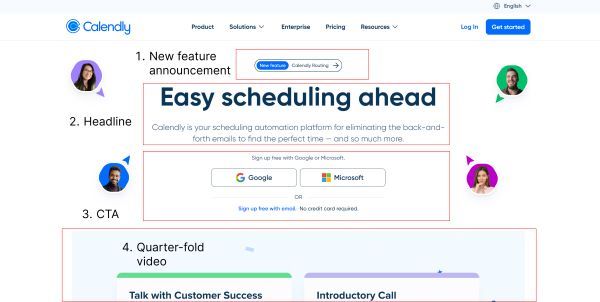
The final blueprint we’re going to cover is the Calendly site. This is a nice middle ground for products that are easy to understand but would benefit from showing users how the product works.
Here's the teardown:
- New feature announcement. Calendly obviously see this feature as a big deal and it routes users to another landing page.
- Headline that focuses on the benefit of using Calendly. Unlike Slack and Trello, Calendly is easier to explain in fewer words because people understand how calendars and schedules work.
- The CTA section focuses on using Single Sign On (SSO), effectively making the process one-click.
- Finally, Calendly have used what I've called a quarter-fold video. This is a neat way to get visitors scrolling down to the next part of the page. The video plays when you land on the page, using movement to catch the reader's attention.
What’s next?
Now that we’ve given you the blueprints, it’s time to start designing. Even though your brand has to be special and distinct, there really is no reason to reinvent the wheel.
Just check out the underlying structure that the world's biggest SaaS brands are using and put your own flair on top.


