Website Roadmapping - Planning To Maximize Conversions

Website Roadmapping is one of the planning activities that separates our team from average web developers. It's a collaborative process we facilitate with our clients to figure out what content, features and design each web page should contain.
It sounds simple, but figuring out a new website's composition is usually lumped on the client. They rarely have experience with a task, and as a result, the site's content ends up being sub-par.
Our team were very keen to avoid ending up in this situation during our rebranding exercise. We had already poured a lot of time and money into the project and needed to get it right on the first try.
Ultimately, we needed our new website to convert visitors into customers. Convincing a visitor to take a particular action is influenced a bit by having a nicely polished design, but it's mostly driven by the messaging, copy and content of the site.
In this brief article, we're going to explain how we went about our Website Roadmapping process. Following these steps for your own business website is incredibly valuable, even if you're not planning on building a new site.
Here’s a summary of the topics we cover in this rebranding series:
- Step 1: 🏀 Defining Rebranding Goals & Brand Strategy - A Complete Guide
- Step 2: 🚚 How To Pick Your Niche - How My Software Agency Solved This Problem
- Step 3: 💳 Building Our New Branding - The Process To Follow
- Step 4: 🗺️ Website Roadmapping - Planning To Maximize Conversions
- Step 5: 🖊️ How To Write Great Website Copy - Sharing Our Process
- Step 6: 🎨 High Fidelity Design - Prepare And Execute Like An Agency
- Step 7: 😶 Choosing The Best Website Framework & Headless CMS
Why do you need a Roadmap for your website?
I'm going to answer this question with another question. Have you ever browsed a website where everything feels intentionally synchronised? The logo and page design seem to be related, the content ties into the design, and everything feels like it belongs.
Websites like this feel safe. They're usually nice to navigate and interact with. They're memorable.
Building a website that ticks these boxes doesn't just happen. The experience and composition need to be carefully planned from the outset.
There are a few other tangible reasons to spend time going through the website roadmapping process:
Define information architecture
Information architecture is the formal term given to the arrangement of information and content across a website. It answers the question "what journey do we take the visitor on?" by deciding the layout of your website's messaging.
If this isn't clear, think about information architecture like sorting a bunch of related arguments into a logical sequence, like in a newspaper article. The most important and critical information is always at the start of the story to get readers hooked. The deeper details are saved for later in the article when readers are committed to learning about the story.
During the "cart sorting" stage of website roadmapping, we work with our clients to talk through the priority of presenting information to visitors. It usually looks like this:
- Let the users know who we (the business) are and what we do
- Benefits of working with us
- Our services or product
- Call to action
- Finer details about what we do and how we work
The journey is slightly different depending on what the business goals are. eCommerce sites typically cut to the chase and present a product offering whereas brochure websites need to let visitors know that they're in the right place before making any kind of pitch.
Connect design and digital marketing strategy
Savvy businesses with a well planned digital marketing strategy often need some help from the website design for their strategy implemetation.
A good example is adhereing to Google's SEO guidelines and writing content to an E-E-A-T (experience, expertise, authority, trustworthiness) model. This can be achieved by writing a series of articles that deeply explain a topic. To make life easier for visitors, these pages can be collected and summarised on a single landing page, but this requires a dedicated design.
A similar example is including lead magnets and newsletter opt-ins in the middle of blog content. A clean transition between written content and a newsletter opt-in improves the chances visitors will take the offer.
Being intentional about designing mechanisms to support a digital marketing strategy can help its implemetation. This is only possible if there's an open discussion about what kind of digital marketing the business plans to undertake during the website roadmapping process.
Align business and tech teams
A mistake a lot of businesses make when hiring an agency to handle their website development is assuming that the agency knows exactly what they want. Similarly, agencies that make assumptions about what the business wants always get it wrong.
Website roadmapping circumvents these issues by getting both parties together so the right questions can be answered.
When we're in charge of facilitating a website roadmapping session with client stakeholders, we ask questions that will help us understand what a wildly successful website will look like for the client.
What is their primary goal? How will the website support its broader strategy? What functionality is necessary? What do their customers like about their current website? What will the website need to do in 5 years?
Website roadmapping provides an opportunity to ask the questions that ensure the right thing gets built.
Prioritize conversions
Almost every website project we've worked on has had the ultimate goal of converting visitors into customers. Trying to figure out this piece of the puzzle after your new website has been designed is ten times more difficult than getting it right from the start.
In order to convince a visitor (who doesn't know your brand) to take action, they need to be taken through a seamless purchasing journey, given the right information, and explicitly asked to take the next step. During the website roadmapping process, we put this journey under the microscope to consider the specific objections a visitor might have before moving forward.
These are the kinds of questions we ask:
- What call to action (CTA) will have the highest success rate? (e.g., Newsletter opt-in, lead magnet, or contact form?)
- Does a new visitor have all the information they need to understand the value of the service?
- How can we visually guide them through the journey?
- Where are users likely to drop off?
- How far up the page should the CTA be? And should we have multiple CTAs?
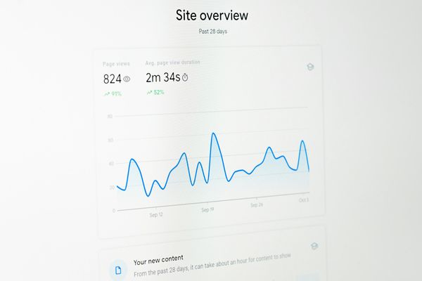
This was a huge consideration for our own website, where we saw only 1% of visitors converting by submitting our contact form. Since most of our new work comes through this channel, it was an obvious problem to work on.
This is where the concept of micro-conversions became essential to our strategy. Rather than expecting a visitor to immediately convert to a final purchase or contact request, you must track and optimize the smaller, incremental steps they take along the way.
Focusing on these smaller signals of intent allows you to identify exactly where your funnel is leaking and nudge users gently toward the finish line.
How We Prepared Our Website Roadmap Template
Our website roadmapping process took longer than we would normally commit to the process if we were working with a client because we second-guessed every decision. When we work with other businesses, the direction is so clear, but for some reason, it's all different working on our brand.
Anyhow, the website roadmapping process is separated into three parts:
- Defining goals
- Card sorting
- Wireframing
Defining goals
We've written an extensive guide on Product Roadmapping goals and how they lay the foundation for a successful project. Even though our team were all pretty clear on our goals, we decided to go through the exercise.
We jumped into a Zoom room for a 2-hour session of questioning each other about the reasons we decided to rebuild our website. The kind of questions we asked were:
- What is our current conversion rate?
- What is our goal conversion rate?
- What is our website missing at the moment that would be of value?
- What are the pain points of using the current CMS?
- What do visitors like about our site, and what can be improved?
- Where do we want our site to be in 5 years?
We ended up going through about 50 questions until we had a baseline of where we are and where we want to be after the website rebuild.
Card sorting
The next step is the magic behind website roadmapping. Card sorting is an exercise where everyone on the team jumps on a Zoom session with a shared Figjam board. The aim is to write down all the "things" we believe to be important to include on the new website. The result will be a rough sitemap where each page is made up of the required information and functionality.
The things to include during the cart sorting exercise can be:
- Content
- Functionality
- Design styles or elements
- Calls to action
- Lead magnets
- Images
- Particular media types
It can be hard to get started with this process, but once the juices are flowing, it tends to go quickly.
All ideas are recorded on Figjam sticky notes in a big pile. Once all the ideas have been captured, they need to be organised into logical pages.
This part of the process simply boils down to questioning how valuable each piece of information, functionality or design element is and where it should fit. You should be asking questions like:
- Should it be on the homepage, or does it make more sense to be on the contact page?
- Are we adding duplicate arguments or functionality?
- How high up the page should this piece of information be?
Below is the finished result of our card-sorting exercise. It's a hard concept to articular clearly, so this example should help.

Wireframing
The final step in our website roadmap template was to prepare wireframes based on the card sorting exercise.
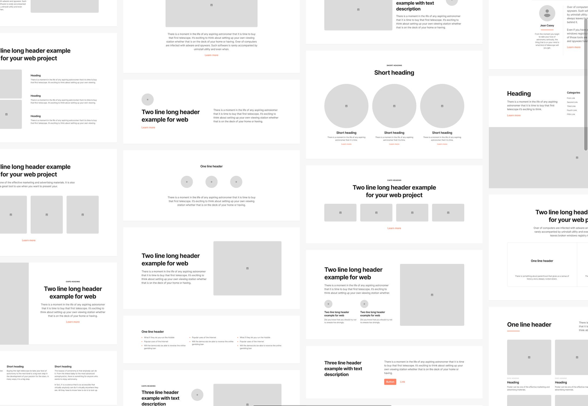
We use a free Figma library called Sections 2.2 for this step. It contains a set of heroes, CTAs, navigation, footers, sliders, content areas, and all the other "blocks" we need to arrange to create a wireframe.

The process here is pretty straightforward. For each sticky note in the card sorting sitemap, we look through the Sections 2.2 wireframe library and pick a block that matches our intention. The blocks aren't meant to describe how the final design will look. They're just rough placeholders.
The benefit of laying out a complete wireframe in this fashion is:
- It's quick because we already know the information architecture of the entire sitemap
- It provides guidelines for the length and amount of copy we'll need to write
- It's way easier to discuss the website's construction with something that's closely representative of the final design
Below is a screenshot of a couple of pages of our finished wireframe.

Wrapping up
That's it for website roadmapping. If you followed along at home, your wireframes are ready to be filled in with actual content.
What's next?
The next part of our rebranding write-up will focus on how we went about the copywriting process. Like everything else, it's a task that can yield excellent results if the right process is followed!
Feel free to drop us a comment below and we'll get back to you in a few days.


