Alevo’s performance score jumped from 38% to 95%
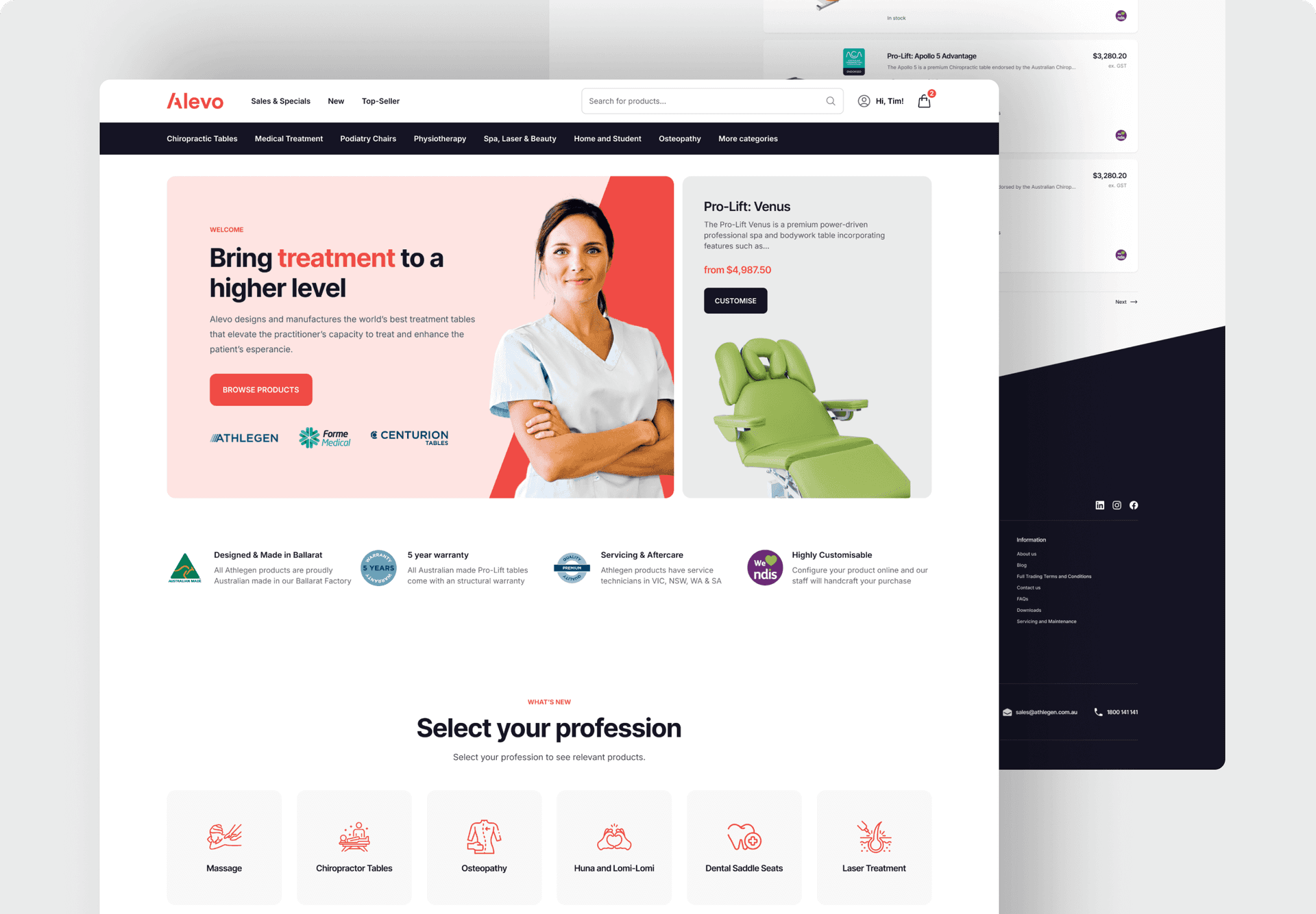
We helped Alevo consolidate two websites into a single platform that loads faster than ever before.

Challenges
Alevo stand alone as Australia’s premier medical table manufacturer. Their website simply wasn’t doing their products justice. Between a poor user experience, slow site speed and some parts of the system that simply didn’t work, their old website was in desperate need of support. When they approached us for help, they expressed these challenges:
- Clunky navigation and site UX that frustrated users
- Slow website performance that was being noticed by customers
- Their brand was spread across two websites
- Unable to make content changes without manually updating the database

Technology
- WordPress
- WooCommerce
- TailwindCSS
- Klaviyo
Goals
Alevo had been flirting with the idea of a full redesign for a while, but understood the costs involved and weren’t confident on seeing a positive return. Coming into the project, their most important goal was to see a positive return on investment and improve the number of sales made by their website but there were a number of other important boxes to tick:
- Unify the two product ranges into a single website
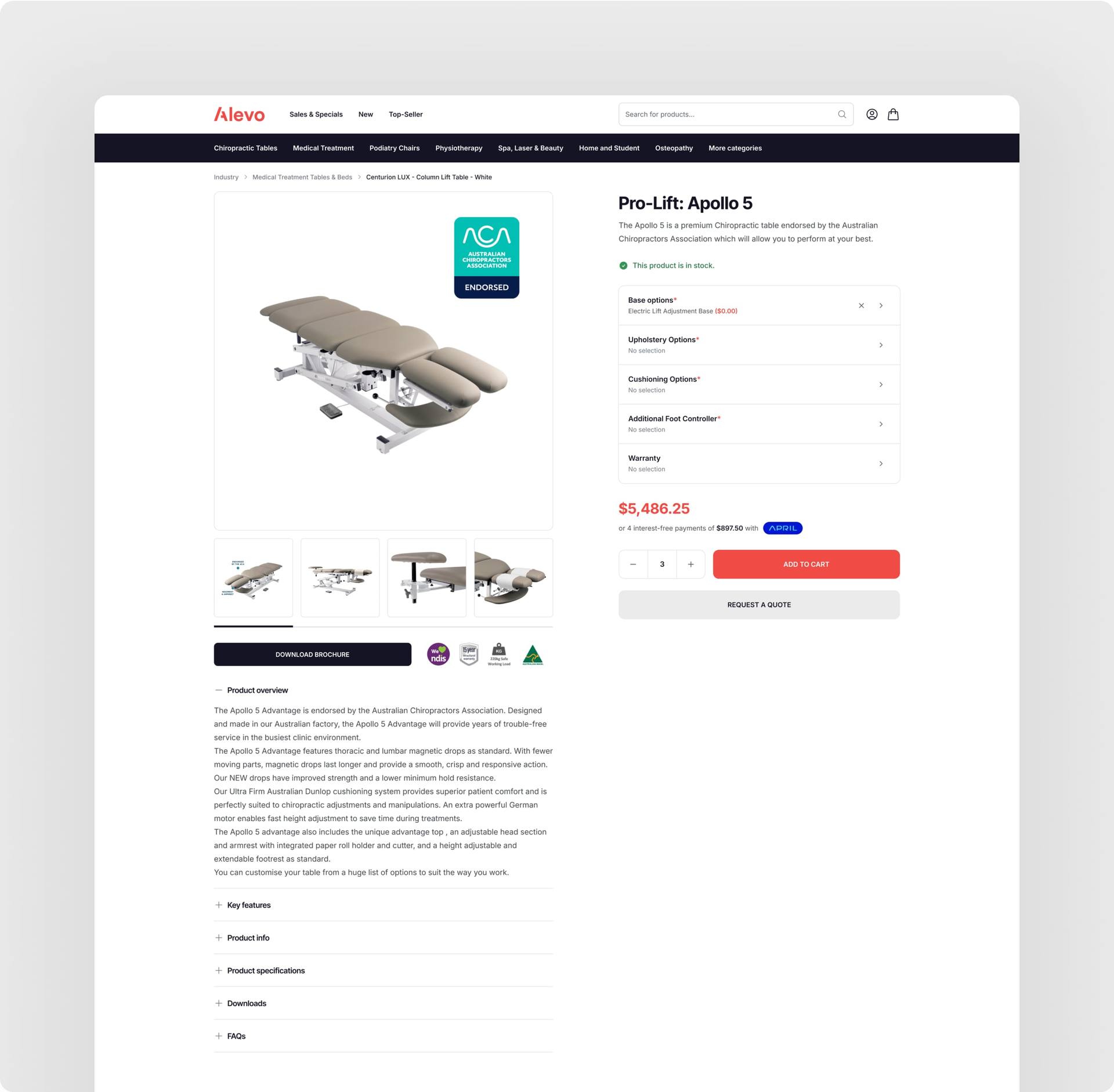
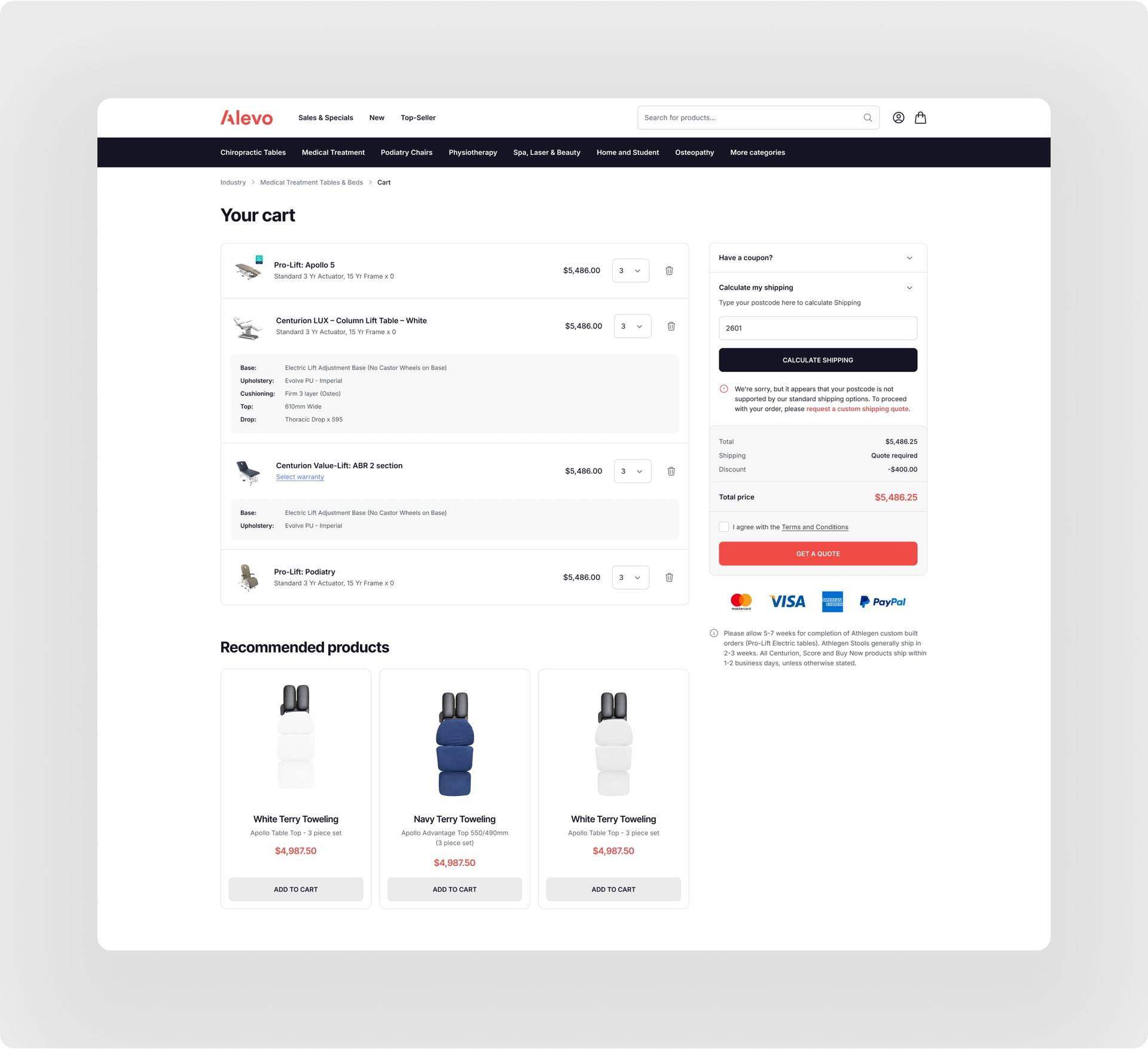
- Make the website highly useable and friendly for customers
- Reach an all-time-high conversion rate
- Integrate a new payment gateway that handles financing
How did it play out?
Alevo had two separate WordPress sites to merge into one. Both were operating as eCommerce sites, but only one was running WooCommerce.
In order to figure out the cleanest path forward, we visited the Alevo office and spent a full day to plan out the roadmap for their new site, gathering technical details, financial goals, and all the information required to make the project a success.
After this meeting, the design came together over a period of around three weeks, followed by two months of development.
The site was launched at the beginning of June 2024. Traffic was expected to bottom out for a while, but the drop ended up turning into a small upturn with a nice boost to the conversion rate from <2% to 2.48%.

What's next for Alevo?
The new website is just the start for Alevo. They needed to kick their next chapter off with a solid foundation, but the bigger aspiration was always to see their conversion rate improve and traffic grow over a longer period of time.
Over the next 12 months, the Clean Commit conversion rate team will help run over 30 experiments, with the aim to increase Alevo’s conversion rate by a further 50%.
This is a completely realistic target, and will help Alevo unlock their most profitable year of operation.
Let’s work together
Book a 15 minute call and find out what improvement we can provide to your site.
The Clean Commit team was able to find us a better financial solution to make the project a lot more cost-effective.
They've been great with communication and have done a tremendous job in getting our site to gain speed and increase conversions.
