Ecommerce Landing Page Optimization The Complete Masterclass

This is not another "10 quick tips" article.
This is a complete, A-to-Z masterclass on ecommerce landing page optimization. We are tearing down the entire process, from the high-level strategy that 7-figure brands use before they ever build a page, to the tactical, no-bullshit A/B testing methods that actually get results.
In this guide, you will learn:
- The 6-Step Strategy: The critical planning work to do before you open your page builder.
- Actionable Best Practices: The design and copy rules that actually drive ecommerce conversion optimization.
- How to Test (Without the Bullshit): The right way to run A/B tests to get statistically significant, actionable data.
- The Retrospective: The post-launch process to turn every campaign - win or lose - into a learning.
What is an ecommerce landing page?
An ecommerce landing page is a standalone page designed with one singular goal: converting visitors into customers or leads.
Unlike your homepage or product category pages that offer multiple paths and distractions, removes competing offers, and focuses everything - your copy, design, images, and call-to-action - on a single conversion objective.
For ecommerce stores, landing pages typically drive visitors to:
- Purchase a specific product (often with a special discount or offer)
- Sign up for early access to new product launches
- Join an email list in exchange for a lead magnet (discount code, free shipping, exclusive content)
- Register for a webinar or event related to your products
- Download a buying guide or other high-value content
The key difference between a landing page and your regular site pages? Intentional constraints. Every element is deliberately chosen to guide visitors toward your conversion goal - nothing more, nothing less.
What is landing page optimization?
Landing Page Optimization (LPO) is the systematic and structured process of improving elements and sections to improve conversions for the main goal of the page.
Here's what that actually looks like: You're spending $5,000/month on Facebook ads. Your landing page converts at 1.9%. You change your headline, reposition your CTA, and add one customer testimonial. Now it converts at 2.7%. Same ads. Same traffic. Same product.
But now you're getting 42% more sales from the exact same ad spend. That's conversion rate optimization.
Landing page optimization isn't about making changes based on what worked for another company or what you read in a blog post last week. It's about understanding your customers on your landing page with your specific offer.
That means:
- Testing systematically - Changing one variable at a time (headline, CTA button, hero image) so you know exactly what moves the needle.
- Analyzing data ruthlessly - Using heatmaps, scroll depth, analytics, and conversion tracking to understand where visitors drop off and why.
- Iterating continuously - The best landing pages are never "done." They're constantly being refined based on user behavior, seasonal trends, and new traffic sources.
For ecommerce specifically, landing page conversion optimization focuses on removing friction from the buying journey. Every extra click, confusing headline, or unclear value proposition costs you sales. Optimization means identifying these conversion killers and eliminating them one by one.
What works for landing pages?
The goal isn't perfection on day one. It's building a process where your landing pages get 2-5% better every month through deliberate, data-driven improvements.
When you should use an ecommerce landing page?
Not every campaign needs a dedicated landing page. If you're running ads to your best-selling products, sending traffic directly to optimized product pages often works perfectly fine. But there are specific scenarios where a standalone landing page will dramatically outperform your standard site pages - especially when you need to control the narrative, emphasize a specific offer, or target a particular audience.
Here are the six scenarios where landing pages deliver the highest ROI
Ecommerce landing page for specific product launches
When introducing a new product, a landing page lets you build hype, collect email signups, and drive pre-orders without the distraction of your full catalog. Your homepage has to serve everyone - browsers, returning customers, people looking for customer service. A product launch landing page has one job: get people excited about this product.
The tactical advantage: You control the narrative. No competing products. No navigation to other categories. Just your new product, its benefits, and a pre-order button. Brands like Apple and Supreme have mastered this - when they launch something new, you're seeing exactly what they want you to see, nothing else.
Landing Pages for promotions and sales
Black Friday deals, flash sales, or seasonal promotions work better on focused landing pages that emphasize urgency and the specific offer. When someone clicks an ad that says "50% Off All Winter Jackets - Today Only," they expect to land on a page that delivers exactly that - not your homepage where they have to hunt for the sale.
Why this matters for conversions: Promotion landing pages let you crank up the urgency tactics without cluttering your main site. Countdown timers, limited stock indicators, and bold sale messaging that would feel too aggressive on your homepage work perfectly here. Plus, you can track the exact ROI of your promotion without your analytics getting muddied by regular traffic.
Smart workflow tip: Create templates for your recurring seasonal promotions. After each Black Friday or Cyber Monday, run a retrospective to identify what worked (which headlines, which CTAs, which urgency tactics drove the most sales). Update your template with those improvements. Next year, you're starting with a proven winner that you can launch in 30 minutes instead of building from scratch.
Ecommerce landing pages for different customer personas
Your product might be the same, but the reasons people buy it are wildly different. A landing page lets you speak directly to specific buyer motivations in a way your product page can't. Parents buying toys for their kids care about safety certifications and educational value. Adults buying the same toys for themselves (collectibles, nostalgia) care about authenticity and rarity.
What this looks like in practice: You sell premium blenders. Your Facebook ad targets fitness enthusiasts with "Make Perfect Protein Smoothies in 30 Seconds." The landing page shows buff people making post-workout shakes, testimonials about easy cleanup, and emphasizes the high-powered motor. Your Pinterest ad targets home bakers with "Silky Cake Batters, Zero Lumps." That landing page shows beautiful cakes, professional chef testimonials, and emphasizes the precision speed settings. Same blender. Completely different emotional drivers.
Other persona splits that work: Women's vs. men's grooming products (even if the product is identical), gift-givers vs. self-purchasers, budget-conscious vs. premium buyers. The more you can match your messaging to the specific "job" the customer is hiring your product to do, the higher your conversion rate.
Landing page for affiliate or influencer partnerships
Give partners unique landing pages with tracking codes and messaging that resonates with their specific audience. When an influencer promotes your product, their audience trusts them, not necessarily your brand yet. A custom landing page lets you bridge that gap.
The smart way to do this: Include the influencer's name or photo on the landing page ("As seen on @InfluencerName's Instagram"), use their discount code prominently, and echo the language they used in their promotion. If they talked about how your skincare product "finally cleared up their hormonal acne," your landing page headline should reference that exact problem.
Bonus benefit: Unique landing pages make attribution crystal clear. You'll know exactly which influencer drove how many sales, what their conversion rate was, and whether the partnership was worth the investment. No more guessing whether that $5,000 influencer deal actually made you money.
Using landing pages when testing new markets or products
Before fully integrating a product into your site, test demand with a simple landing page to gauge interest and collect data. This is especially valuable if you're considering a new product category, expanding to a new country, or validating a product idea before manufacturing.
How brands use this: You're a coffee brand considering launching tea products. Instead of investing in inventory, photoshoots, and full site integration, you create a landing page with mockups and a "Notify Me When Available" email signup. If you get 5,000 signups in two weeks, you know there's demand. If you get 47 signups, you just saved yourself from a costly mistake.
Companies like Spotify, Buffer, and countless DTC brands have used this "landing page validation" approach to test ideas before building them. It's the lean startup methodology applied to ecommerce conversion rate optimization.
When your paid ads don't match your product pages
Here's when you need a landing page for paid advertising: when there's a gap between what your ad promises and what your product page delivers. If your Facebook ad promotes "Buy 2 Pairs, Get 1 Free" but your product page has no mention of that offer, you've created friction.
Visitors have to hunt for the discount code, figure out how the promotion works, or worse - assume the ad was misleading.
The decision framework:
- Running ads to existing products with no special offer? → Send to product page
- Running a limited-time promotion or bundle deal? → Need a landing page
- Testing a new market or audience segment? → Need a landing page
- Running evergreen ads to your best-sellers? → Product page is fine
Why this matters for ad costs: When your ad and landing page are perfectly aligned (same messaging, same offer, same visual style), platforms like Google and Meta reward you with better ad performance and lower costs. Google's Quality Score directly impacts your cost-per-click. Better message match = higher Quality Score = lower CPCs = better ROI.
What to do before building an ecommerce landing page?
Most landing page failures happen before a single pixel is designed. You jump into Shopify's page builder, start dragging elements around, and three hours later you have a page that looks decent but converts terribly.
Why? Because you skipped the strategy work.
The brands with landing pages that consistently convert at 5%+ all do the same thing: they spend more time planning than building.
1. Identify Your Customer and Their Problem
Start with the most important question: Who exactly are you talking to, and what problem are they trying to solve?
Tim's approach to breaking down conversion rates
Don't say "people who need winter jackets." Get specific:
- Working moms buying durable winter jackets for kids who destroy everything
- Fashion-conscious professionals who need a winter coat that works for both commuting and client meetings
- Gift buyers who are anxious about choosing the right size and style for someone else
Same product. Completely different problems:
- Mom needs: "Will this last through the winter? Is it machine washable? Will my kid actually wear it?"
- Professional needs: "Does this look good? Is it warm enough for a 15-minute walk? Does it wrinkle?"
- Gift buyer needs: "What if they don't like it? Is returning this easy? Does it come in gift packaging?"
Your job: Get inside one customer's head at a time.
Answer these questions:
- Who specifically is this landing page for? (demographics, role, life stage)
- What problem keeps them up at night related to your product category?
- Where are they in their buying journey? (just realized they have a problem, actively comparing solutions, ready to buy but need a push)
- Where are they coming from? (Facebook ad, email blast, Google search, influencer link)
- What do they already know? (Never heard of you? Familiar with your brand? Already browsed your site?)
The mistake most people make: Trying to speak to everyone at once. Your landing page can't be everything to everyone. Pick your primary customer segment, and build for them first.
Advanced move: Create 2-3 landing page variants for different segments and test which angle resonates best. One variant for moms (emphasis on durability), one for professionals (emphasis on style), one for gift buyers (emphasis on easy returns). Let your customers tell you which message converts highest.
PRO TIP: Not sure where to start? Use our 5-Minute AI Shopify Audit (uses a custom GPT). It can instantly analyze your store to spot conversion blockers and identify who your page is actually speaking to right now.
2. Define Your Offer and Value Proposition
Now that you know who you're talking to and what problem they have, what are you offering them?
This isn't just "a winter jacket." It's the specific solution to their specific problem:
- For moms: "The Indestructible Winter Coat - Machine Washable, Reinforced Seams, Actually Stays Zipped"
- For professionals: "Looks Like $400, Costs $150 - The Commuter Coat That Works in the Boardroom"
- For gift buyers: "Free Gift Wrapping + 90-Day Returns - Zero-Stress Gift Guaranteed"
Build your value proposition with this formula:
"This landing page will convince [specific customer] to [take action] by demonstrating [specific benefit]."
Examples:
- "This landing page will convince working moms with kids 5-12 to buy our winter jacket by demonstrating it's the only coat that survives a full winter without falling apart."
- "This landing page will convince professionals who hate bulky coats to pre-order our packable winter jacket by demonstrating it fits in a bag but keeps them warm in sub-zero temps."
If you can't complete that sentence clearly, you're not ready to build yet.
Your offer checklist:
- What exactly are they getting? (Product name, what's included, what makes it special)
- What's the deal? (Price, discount, bundle, free shipping threshold)
- Why buy now? (Limited time? Limited stock? Exclusive early access?)
- What's the risk? (Return policy, guarantee, what if they don't like it?)
Pro tip: Your value proposition should answer the customer's internal question: "Why should I choose this over everything else competing for my attention right now?" That "everything else" includes your competitors, yes, but also doing nothing, or buying from Amazon because it's easier.
3. Set Your Single Conversion Goal
Based on who your customer is and what you're offering them, what's the ONE action you want them to take?
Not two actions. Not three. ONE.
A landing page that tries to capture emails and drive immediate purchases and promote multiple products will fail at all three. Focus creates conversions.
Common ecommerce landing page goals:
- Direct purchase: "Buy Now" or "Add to Cart" (works best for impulse buys, promotional offers, or products under $100)
- Email capture: "Get 10% Off Your First Order" or "Join the Waitlist" (works for list building, product launches, or expensive products that need nurturing)
- Pre-order: "Reserve Yours Now" (for upcoming product launches or testing desirability of new product line)
- Lead qualification: "Book a Free Consultation" (for custom/B2B products)
How to choose ecommerce landing page goal?
Ask yourself: What would move the needle most for your business right now?
Sometimes the answer isn't "more sales." Other business goals include:
- building your email list so you can remarket later,
- validating demand before you manufacture,
- getting people into your funnel even if they're not ready to buy today,
The single-goal test: If someone lands on your page, can they accomplish your goal in 30 seconds or less? If not, your goal isn't focused enough.
The golden rule of CTAs: Only 1 CTA repeated multiple times.
Your CTA should say the same thing whether it's in the hero section, after the benefits, or at the bottom of the page. "Buy Now" at the top, "Add to Cart" in the middle, and "Learn More" at the bottom?
That's three different goals. Pick one.
(We'll dig deeper into CTA optimization in the best practices section, but this decision starts here in the planning phase.)
Testing multiple angles: Once you have your primary goal nailed down, create 2-3 variants testing different approaches to the same goal:
- Variant A: Feature-focused headline ("3-Layer Waterproof Technology")
- Variant B: Benefit-focused headline ("Stay Dry in Any Weather")
- Variant C: Problem-focused headline ("Tired of Soaking Through Your 'Waterproof' Jacket?")
All three variants have the same goal (buy the jacket), but different psychological angles. Test them, let data tell you which resonates with your actual customers.
4. Gather Your Assets
Don't start building until you have everything you need. Nothing kills momentum like getting halfway through design and realizing you need to wait three days for product photos.
Perfect Landing Page Design - and what you need
Visual assets:
- Product images: High-quality photos showing the product in use, not just floating on white backgrounds (lifestyle shots convert better)
- Hero image or video: If your product requires demonstration, video can increase conversions by 80%+
- Graphics and icons: Any supporting visuals for benefits, features, or trust indicators
Copy elements:
- Headlines: Write 5-10 options for your main headline, test them with colleagues or customers before committing
- Benefits/features: 3-5 maximum, ordered by what matters most to your customer (not what you think is coolest)
- Body copy: Benefits over features, "you" over "we," specific over generic
Social proof:
- Customer testimonials: Specific results beat generic praise ("This jacket survived my 6-year-old's entire winter" beats "Great product!")
- Reviews: Star ratings, number of reviews, pull quotes from best reviews
- Trust badges: Secure checkout icons, money-back guarantee, free returns policy
- Media mentions: "As Seen In" logos (if you have them)
- Social proof numbers: "Join 50,000+ customers" (only if impressive)
Offer details:
- Pricing: Regular price, sale price, savings amount
- Discount codes: How they work, any restrictions
- Shipping terms: Free shipping threshold, estimated delivery time, international shipping
- Guarantee/return policy: Money-back guarantee, how returns work, any time limits
Brand elements:
- Logo and brand colors
- Fonts: Stick to 2 maximum (one for headlines, one for body text)
- Voice and tone: Are you playful? Professional? Irreverent? Your landing page copy should sound like your brand
The asset checklist rule: If you're waiting on anything, you're not ready to build. Get it all first.
5. Set Up Tracking Before Launch
If you can't measure it, you can't improve it. Set up tracking before you launch, not three weeks later when you realize you have no idea what's working.
Macro vs. Micro Conversions: The difference that matters
Your landing page has one primary goal - that's your macro conversion. It's the action that matters to your business: a purchase, an email signup, a waitlist registration.
But only tracking macro conversions tells you if your landing page is working, not why or where it's failing.
That's where micro conversions come in. These are the smaller actions visitors take on their way to your primary goal. Each micro conversion is a signal: it tells you whether people are engaging with your page, understanding your offer, and moving toward a purchase decision.
Why micro conversions matter for landing page optimization?
Let's say 1,000 people visit your landing page. 20 buy. 2% conversion rate.
Without micro conversion tracking: "My conversion rate is 2%. That's not great, but I don't know what's broken."
With process milestone micro conversion tracking, you see:
- 850 people scrolled past the hero section (85%)
- 600 people clicked your CTA button (60%)
- 200 people added to cart (20%)
- 20 people completed purchase (2%)
Now you know the problem isn't your landing page - it's your checkout. You're getting 60% of visitors to click "Buy Now," and 20% to add items to their cart. But only 10% of those cart additions result in completed purchases. Your optimization focus should be on reducing checkout friction, not redesigning your landing page.
With the power of micro conversion tracking its easier to optimize your store: It shows you exactly where people drop off, so you know where to focus your optimization efforts.
What to track on an ecommerce landing page?
Example Macro conversion (your primary goal):
- Completed purchase
- Email signup
- Waitlist registration
- Pre-order placement
Micro conversions (steps toward the goal):
- Engagement signals:
- Scrolled 25%, 50%, 75% of the page (tells you if people are reading or bouncing)
- Time on page over 30 seconds (indicates genuine interest vs. accidental clicks)
- Returned to page (came back after leaving - strong buying intent)
- Content interaction:
- Watched product video (and for how long - 50%, 75%, 100% completion)
- Clicked through product image gallery
- Opened product zoom or 360° view
- Clicked into product description tabs (specifications, sizing, materials)
- Buying intent signals:
- Clicked main CTA button
- Clicked "Add to Cart"
- Opened size/color/variant selector
- Clicked to view shipping information
- Clicked to view return policy
- Opened FAQ items (especially pricing, shipping, or return questions)
The micro conversion mindset
Don't track everything. Focus on the actions that indicate progress toward your macro conversion.
Ask yourself: "If someone does this action, are they more likely to convert?" If yes, track it. If it's just noise, skip it.
For example:
- Worth tracking: "Clicked Add to Cart" → Strong buying intent
- Not worth tracking: "Hovered over testimonial section" → Doesn't predict conversion
Check out the mindset behind choosing which micro conversions to track in our article on micro conversions
The goal is to understand the obstacles between landing on your page and completing the purchase. Each micro conversion you track should answer a question:
- Low scroll depth? Your headline or hero image isn't engaging enough
- High scroll depth but low CTA clicks? Your value proposition isn't convincing
- High CTA clicks but low cart adds? There's friction in your product selector or pricing
- High cart adds but low purchases? Your checkout process is broken
Setting up tracking: The platforms you need
Analytics Tool: Set up custom events for your micro conversions (scroll depth, video plays, CTA clicks) and configure your macro conversion as a goal. GA4 will show you which user behaviors correlate with conversions. Use Google Analytics or other analytics tool
Heatmap tools (Hotjar, Microsoft Clarity): Show you where people actually click, how far they scroll, and which elements get ignored. Essential for understanding why micro conversions aren't happening
Traffic source tracking with UTM parameters
You also need to know which traffic sources drive the best conversions. A Facebook ad might drive 5x more traffic than email, but if email converts at 4x the rate, you should be investing more in email.
Tag every link with UTM parameters:
?utm_source=facebook&utm_medium=paid&utm_campaign=winter-saleUTM tags example
This tells your analytics exactly where each visitor came from, so you can see which channels and creatives drive not just traffic, but actual conversions. Use this UTM Campaign Builder to quickly create URLs
The pre-launch question
Before you launch, ask yourself: "If my landing page fails, will I know why it failed?"
If you're only tracking purchases, the answer is no. You'll know it failed, but not where or why.
But if you're tracking micro conversions - scroll depth, CTA clicks, video engagement, cart adds - you'll know exactly which part of the user journey needs fixing.
Set up tracking first, or you're just guessing.
6. Plan Your Traffic Source and Message Match
Your landing page design and copywriting should match where traffic is coming from. Someone clicking a Facebook ad has different expectations than someone clicking an email link or finding you organically.
Know where visitors will come from:
For running paid ads (Google, Facebook, Instagram, TikTok):
- Have your ad creative and copy ready first, before you build the landing page
- Your landing page headline should echo your ad headline (message match = higher conversions)
- Example: Ad says "50% Off Winter Coats Today Only" → Landing page hero says "50% Off Winter Coats - Sale Ends Tonight"
- Budget allocated and campaigns ready to launch simultaneously
- A/B testing plan for different ad variations
For email marketing:
- Segment your email list (don't send the same message to everyone)
- Email subject line should match landing page headline
- Consider traffic temperature: Cold subscribers (new to list) need more education than warm subscribers (engaged, repeat openers)
For influencer or affiliate traffic:
- Give each partner a unique landing page URL with tracking
- Echo the influencer's language ("As mentioned by @InfluencerName")
- Consider featuring the influencer on the landing page itself
For organic search:
- Match your landing page to search intent (informational vs. transactional)
- Include the keywords people searched for in your headline
- Provide the depth of information searchers expect
For cold traffic (new audiences who've never heard of you):
- More trust-building required (social proof, guarantees, educational content)
- Simpler offers work better ("Get 10% Off" vs. complex bundle deals)
- Clearer value proposition needed (they don't know who you are yet)
For warm traffic (retargeting, past visitors, email subscribers):
- Less education needed, more urgency works ("Final Hours" or "Almost Gone")
- Can use more aggressive offers or upsells
- Assume familiarity with your brand
The message match principle: The tighter the alignment between your ad/email/link and your landing page, the higher your conversion rate. Every mismatch creates friction and doubt.
Pro move: Create a simple one-page brief before you build anything:
- Customer segment: [Who]
- Their problem: [What]
- Our offer: [Value prop]
- Conversion goal: [One CTA]
- Traffic source: [Where they're coming from]
- Key message: [Main headline]
Share this brief with everyone involved (designer, copywriter, developer). When everyone's aligned before building, you'll launch faster and convert better.
Mistakes to avoid when building your landing page
You can do everything right - great headline, strong CTA, compelling images - and still kill your conversion rate optimization efforts with avoidable mistakes.
Here are the most common landing page errors that destroy trust and drive visitors away.
Don't use fake urgency or scarcity
Countdown timers that reset when you refresh the page. "Only 2 left in stock!" on unlimited inventory. "Sale ends tonight" every single night.
Visitors see through this immediately, and it destroys trust in your brand.
The problem: Fake scarcity might create a short-term conversion boost, but it trains customers to ignore your urgency tactics. Worse, it makes them question everything else you say. If your countdown timer is fake, why should they believe your product claims?
The fix: Use real scarcity when you have it. Actual low inventory ("Only 8 left in size M"). Genuine time-limited sales ("Black Friday sale ends 11/29 at midnight"). Pre-order windows with real deadlines. If you don't have authentic urgency, don't manufacture it.
Don't make exaggerated or unverifiable claims
"The world's best skincare product!" "Lose 30 lbs in 7 days!" "Everyone who uses this sees results!"
Hyperbolic claims without evidence don't build trust - they trigger skepticism.
The problem: Visitors are conditioned to ignore marketing superlatives. When you say "best" or "revolutionary" without backing it up, you sound like every other overpromising brand. Credibility drops to zero.
The fix: Make specific, verifiable claims backed by evidence:
- ❌ "Our jacket is the warmest you'll ever wear"
- ✅ "Rated for temperatures down to -20°F with 800-fill down insulation"
- ❌ "Thousands of happy customers love this product!"
- ✅ "4.8 stars from 2,347 verified reviews"
Use data, test results, customer testimonials with specific outcomes, and third-party certifications. Let evidence do the convincing, not adjectives.
Don't bombard visitors with popups
Exit-intent popups. Email capture popups. Chat widgets. "Special offer" overlays. Cookie consent banners. Notification permission requests.
Death by a thousand popups.
The problem: Every popup interrupts the visitor's journey and creates friction. Stack three popups on top of each other, and you've made your landing page unusable. Visitors close the tab rather than fight through your popup gauntlet.
The fix: Pick ONE popup maximum, and only if absolutely necessary. If you must use a popup:
- Delay it: Don't show it immediately. Wait until they've scrolled 50% or spent 30+ seconds on the page.
- Make it easy to close: Large, obvious X button. No fake X buttons that open new windows.
- Don't repeat it: If someone closes your popup, don't show it again on the same visit.
Better yet: skip the popup entirely. Put your email capture offer inline on the page instead.
Don't autoplay video or audio
Nothing kills trust faster than unexpected sound blasting from someone's laptop at work or on public transit.
The problem: Autoplay audio is jarring and embarrassing for visitors. Even if your product video is amazing, forcing someone to scramble for the mute button creates a negative first impression.
The fix: Always default to muted. Add prominent play/pause controls. Include captions or subtitles so the video works without sound. Let visitors choose when to engage with audio content.
Don't hide your shipping costs until checkout
"Only $29.99!" → Adds to cart → Checkout → "$29.99 + $15 shipping + $8 handling fee" → Abandoned cart.
The problem: Hidden costs at checkout are the #1 cause of cart abandonment. Visitors feel tricked. Even if your total price is competitive, the surprise fee creates resentment.
The fix: Be transparent about costs upfront:
- Show total price including shipping on the landing page (or "Free shipping on orders over $50")
- Use a shipping calculator so visitors can estimate costs before adding to cart
- If shipping varies, say "Shipping calculated at checkout" near the price
Transparency builds trust. Surprises build abandonment.
Don't use generic stock photos
The same smiling corporate woman in a headset that appears on 10,000 other websites. Impossibly diverse office meetings where everyone is laughing at a laptop. Generic handshake photos.
The problem: Stock photos scream "we didn't care enough to create real content." They make your brand feel generic and untrustworthy. Visitors unconsciously associate stock photos with low-quality or scam sites.
The fix:
- Use real product photos (your actual product, not a stock image of a similar item)
- Show real customers using your product (user-generated content)
- Invest in custom photography - even iPhone photos of your actual product beat generic stock images
- If you must use stock photos, use high-quality ones from Unsplash or similar, and avoid overused corporate clichés
Don't assume visitors know your jargon
You've been living with your product for months or years. Your visitors discovered it 5 seconds ago. What's obvious to you is incomprehensible to them.
The problem: Industry jargon, technical specifications without context, and assumed knowledge create confusion. Confused visitors don't buy.
The fix: Explain like you're talking to a smart friend who's never heard of your product:
- ❌ "Featuring proprietary ActiveCell™ technology with thermodynamic optimization"
- ✅ "Keeps you warm without overheating, even during high-intensity activities"
Use simple language. Define technical terms. Anticipate questions a newcomer would have and answer them proactively.
Don't make it hard to contact you
No phone number. No email address. Just a "Contact Us" form that goes into a black hole.
The problem: Hidden contact information signals you don't want to talk to customers. It raises red flags about legitimacy and makes visitors nervous about buying.
The fix: Include clear contact information:
- Email address (not just a form)
- Phone number if you offer phone support
- Live chat if available (but don't make it the only option)
- Business address (adds legitimacy, especially for new brands)
You don't need all of these, but at minimum, provide an email address. Make it easy for people to reach you if they have questions.
The best practices of ecommerce landing page optimization
These aren't theoretical best practices - they're the fundamentals that separate landing pages converting at 1% from those converting at 5%+. Apply these rigorously, then use testing to refine what works for your specific audience.
Only 1 CTA (One Goal, One Action)
Best practice is to have one clear conversion goal with the same CTA repeated multiple times down the page. This keeps visitors focused and reduces decision fatigue.
Example:
- Goal: Get people to buy your new product
- CTA: "Add to Cart" or "Buy Now"
- Placement: Hero section, after benefits, after social proof, bottom of page
- Same action, same destination - just repeated strategically
Why a single CTA works?
- Reduces cognitive load - Visitors don't have to choose between competing actions. You're removing the "what should I do here?" question entirely.
- Improves conversion rates - Every element on the page drives toward one goal. No dilution, no confusion.
- Easier to measure - You know exactly what worked or didn't. If conversions are low, you don't have to guess which of your three CTAs was the problem.
- Creates urgency - Focus amplifies importance. When the only action available is "Buy Now," it feels more urgent than when "Buy Now" competes with "Learn More," "Browse Store," and "Follow Us."
When multiple CTAs make sense?
There are exceptions where you might include a secondary, softer CTA: Primary: "Buy Now"
Secondary: "Learn More" (scrolls down page) or "Watch Demo Video"
This works when:
- Your product is complex or expensive and needs education first (B2B software, high-ticket items)
- You're offering a free trial + paid option (let people choose their commitment level)
- You want to capture emails from people not ready to buy ("Get 10% Off" email capture as fallback)
The key: Make it visually obvious which is primary (bigger button, bolder color, better placement) and ensure the secondary still supports your main goal. "Watch Demo" is fine - it educates them toward purchase. "Browse Our Blog" is not - it's a distraction.
Best practice
Start with a single CTA repeated 3-5 times down the page. Test it. Only add a secondary CTA if data shows you're losing people who need a softer first step - and make sure that secondary path ultimately leads back to your primary goal.
What's the primary action you want visitors to take on your landing page?
Message Match: Your Ad Promise = Your Landing Page Delivery
If your Facebook ad says "50% Off Winter Coats - Today Only," your landing page better say "50% Off Winter Coats - Today Only" the second someone lands on it.
This is message match: the alignment between what your ad/email promises and what your landing page delivers.
When someone clicks your ad, they've formed an expectation. Your landing page either confirms that expectation (and they stay) or violates it (and they bounce in 3 seconds).
What message match looks like: Your ad: "Buy One Pair of Shoes, Get One Free"
Your landing page hero: "BOGO Sale: Buy One Pair, Get One Free"
Result: Visitor thinks, "Yes, this is exactly what I clicked for."
Message match applies to more than just the offer. It includes:
- Visual consistency: If your ad shows red sneakers, your landing page hero should show red sneakers
- Tone consistency: If your ad is playful and fun, your landing page shouldn't suddenly be corporate and serious
- Offer consistency: If your ad mentions free shipping, your landing page better mention free shipping prominently
The tighter your message match, the higher your conversion rate. Every mismatch creates doubt and friction.
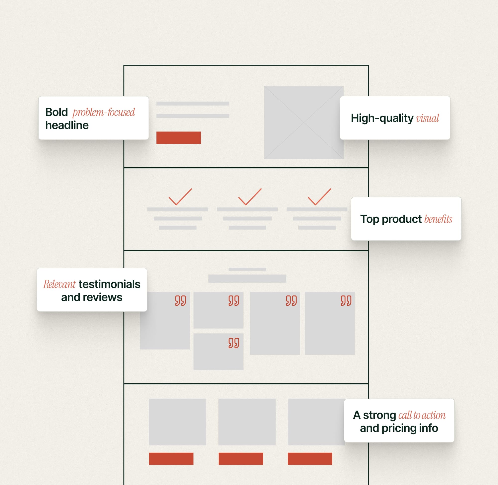
Clear Value Proposition Above the Fold
When dealing with online prospects, don't assume you have their attention. You have 3-5 seconds before they decide whether to stay or bounce. You need to get to the point - fast.
"Above the fold" means the part of your landing page visible without scrolling. This is prime real estate. Use it to answer the visitor's immediate question: "What is this, and why should I care?"
What belongs above the fold:
- Benefit-driven headline: Not "Introducing the X200 Jacket" but "Stay Warm Without the Bulk"
- Supporting subheadline: Adds context or urgency ("Packable Winter Coat That Fits in Your Bag")
- Hero image or video: Shows the product in use, not floating on a white background
- Primary CTA button: Visible, contrasting color, clear action ("Shop Now" or "Get 10% Off")
- Social proof (optional but powerful): "4.8 stars from 2,000+ reviews" or "As seen in GQ"
What doesn't belong above the fold:
- Long paragraphs of text
- Your company history
- Navigation menus (kill these on landing pages)
- Multiple competing offers
If a visitor lands on your page and has to scroll to understand what you're selling, you've already lost half your traffic.
The 5-second test: Show your landing page to someone for 5 seconds. Then hide it. Can they tell you:
- What you're selling,
- Who it's for, and
- What action to take?
If not, your above-the-fold messaging isn't clear enough.
Segment Your Traffic and Customize Your Pages
Not all visitors are the same. A first-time visitor from a Facebook ad has different needs than a returning customer who's already browsed your site. A B2B buyer has different concerns than a consumer.
The best landing pages acknowledge this and adapt accordingly.
How to segment and customize:
By traffic source:
- Facebook ad traffic: Match the ad creative and copy exactly
- Email subscribers: Warmer tone, less explanation needed (they already know you)
- Google search traffic: Match search intent (informational vs. transactional)
- Retargeting traffic: Add urgency ("You were looking at this - it's 20% off today")
By customer type:
- New customers: More trust-building, clearer value prop, risk reversal (money-back guarantee)
- Returning customers: Skip the intro, go straight to the offer
- High-intent segments: Less education, more urgency ("Almost sold out")
By geography (if relevant):
- Different currencies, shipping times, or regulations
- Localized social proof (reviews from their country)
You don't need to build 50 different landing pages. Start with 2-3 key segments and test which approach converts best. Often, a new customer landing page and a returning customer landing page are enough to see significant lift.
Keep Copy Concise and Scannable
Online readers don't read - they scan. They're looking for the information they need to make a decision, and they'll bounce if they have to work too hard to find it. Drafting great copywriting is hard, but can be learned.
Your landing page copy should be:
Benefit-focused, not feature-focused:
❌ "Made with triple-layer Gore-Tex technology"
✅ "Stays waterproof even in heavy rain"
Short paragraphs (2-3 lines max):
Big blocks of text are intimidating. Break them up. Use white space liberally.
Bullet points over paragraphs:
When listing benefits or features, bullets are easier to scan than prose.
Bold key phrases:
Help scanners find the important bits without reading every word.
The exception to "keep it short":
If your product is expensive, complex, or requires significant trust-building, longer copy can actually convert better - but it still needs to be scannable. Use subheadings, bullets, and visual breaks to guide readers through longer content.
The rule of thumb: Every sentence should move the visitor closer to converting. If it doesn't, cut it.
Repeat Your CTA on Long Pages
If your landing page requires scrolling (and most do), your CTA should appear multiple times:
- Above the fold (in the hero section)
- After the benefits section (once they understand the value)
- After social proof (once trust is established)
- After objection handling (once concerns are addressed)
- At the bottom of the page (for people who read everything)
Different visitors convert at different points. Some people are ready to buy after seeing your headline. Others need to read testimonials, check the FAQ, and understand your return policy before they're convinced.
By repeating your CTA strategically throughout the page, you're meeting visitors wherever they are in their decision-making process.
The key: The CTA should say the same thing each time. Don't switch from "Buy Now" to "Add to Cart" to "Shop Now." Consistency reduces confusion.
Use High-Quality Product Images (And Show the Product in Use)
Ecommerce is visual. People can't touch or try your product, so your images have to do the heavy lifting.
Lifestyle shots over white background:
Show your product being used by real people in real situations. A winter coat looks better on someone hiking through snow than floating on a white background.
Multiple angles and details:
Let visitors zoom in, see close-ups of materials, and view the product from different perspectives.
Show scale:
If your product's size isn't obvious, show it next to something familiar or include dimensions prominently.
Before/after for transformation products:
Skincare, cleaning products, organization tools - show the problem and the solution.
Video when appropriate:
If your product moves, folds, or requires demonstration, a short product video can increase conversions by 80%+. Keep it under 60 seconds.
Build Trust with Social Proof
People don't trust brands. They trust other people.
Social proof - evidence that other customers have bought from you and been happy - is one of the most powerful conversion drivers on any ecommerce landing page.
Types of social proof that work:
Customer reviews and ratings:
"4.8 stars from 2,500+ reviews" is powerful. Even better: pull specific review quotes that address common objections.
Testimonials with specifics:
❌ "Great product!" - Sarah
✅ "This jacket kept me warm through a Minnesota winter without feeling bulky." - Sarah M., Minneapolis
Customer photos:
User-generated content (real customers using your product) builds more trust than professional photos.
Trust badges:
Secure checkout icons, money-back guarantee badges, free returns badges. These reduce purchase anxiety.
Media mentions:
"As Seen In" logos from reputable publications (if you have them).
Social proof numbers:
"Join 50,000+ happy customers" (only use if the number is impressive).
Where to place social proof:
- Above the fold (star rating or customer count near your headline)
- After the value proposition (testimonials reinforcing your claims)
- Near the CTA (reviews or trust badges right before the "Buy Now" button)
The more expensive or unfamiliar your product, the more social proof you need. For a $20 impulse buy, a star rating might be enough. For a $500 product from a brand they've never heard of, you'll need multiple testimonials, detailed reviews, and strong guarantees.
Create Urgency (But Make It Real)
Urgency works. When people believe an offer is time-limited or inventory is scarce, they're more likely to buy now instead of "thinking about it" (which means never buying).
Effective urgency tactics:
Time-limited offers:
"Sale ends tonight at midnight" or "48-hour flash sale"
Limited inventory:
"Only 12 left in stock" or "Low inventory alert"
Seasonal relevance:
"Get it before winter" or "Order by Dec 15 for Christmas delivery"
Exclusive access:
"Early access ends in 24 hours - then it's full price"
The critical rule: Make it real.
Fake countdown timers that reset when you refresh the page? Visitors see through that, and it destroys trust. If you say "sale ends tonight," the sale better actually end tonight.
Real urgency converts. Fake urgency kills your brand.
Optimize for Mobile
Over 50% of ecommerce traffic comes from mobile devices. If your landing page doesn't work perfectly on a phone, you're losing half your potential customers.
Mobile optimization essentials:
Fast load times:
Mobile users are impatient. If your page takes more than 3 seconds to load, 50% will bounce.
Thumb-friendly CTA buttons:
Make them big enough to tap easily (minimum 44x44 pixels). Place them where thumbs naturally rest.
Minimal form fields:
Every form field you add reduces mobile conversions. If you need an email address, ask for just an email - skip the phone number and mailing address unless absolutely necessary.
Readable text without zooming:
Minimum 16px font size for body copy. Headlines should be large and scannable.
Simplified navigation:
Even less navigation than desktop (which should already be minimal).
The mobile-first mindset:
Design for mobile first, then adapt for desktop - not the other way around. Mobile constraints force you to prioritize what actually matters.
Handle Objections Proactively
Every visitor has doubts. "What if it doesn't fit?" "How long does shipping take?" "What if I don't like it?"
Using AI to write better copy
If you wait for them to ask, you've already lost the sale. Most people won't reach out - they'll just leave.
Address objections before they become deal-breakers:
Near your CTA:
- "Free returns within 90 days"
- "Ships in 2-3 business days"
- "Money-back guarantee - no questions asked"
In an FAQ section: Answer the 5-7 most common questions clearly and briefly. Place it near the bottom of your page where people look for final reassurance before buying.
Inline throughout the page: Don't wait until the FAQ. Show your sizing guide near product images. Mention your warranty near product features. Display shipping info near the price.
The aggressive guarantee that works:
Standard: "30-day money-back guarantee"
Better: "90-day money-back guarantee"
Aggressive: "If you're not satisfied, keep it and we'll still refund you"
Aggressive guarantees sound risky, but they eliminate all purchase anxiety. The conversion lift is worth it - very few people abuse these policies.
How to optimize your landing page call to action?
Your call-to-action (CTA) is the single most important element on your ecommerce landing page. It's the moment of conversion. Everything else - the headline, the copy, the social proof - exists only to get a visitor to click that button.
A weak, confusing, or poorly placed CTA neutralizes all your other work. Here's how to get it right.
Make your CTA copy clear and action-oriented
Generic CTAs are conversion poison. Vague, one-word commands like "Submit" or "Click Here" tell the visitor nothing about the value they'll receive. Your CTA copy must be the logical, value-driven conclusion to your headline.
Aim for be 2-5 words and start with a strong action verb.
Weak CTAs:
- "Submit"
- "Click Here"
- "Continue"
Strong CTAs:
- "Add to Cart"
- "Get 10% Off"
- "Join the Waitlist"
- "Start Your Free Trial"
Your CTA should tell visitors exactly what they're getting when they click. If you're selling a product, say "Buy Now" or "Add to Cart." If you're capturing an email, don't say "Sign Up." Say "Get Our Free Guide." The first is a chore; the second is a benefit.
The one exception: For high-consideration purchases (expensive items, complex products), softer CTAs like "Learn More" or "See Details" can work better as a first step. But your final CTA should still be direct: "Buy Now."
Give your CTA button visual priority
Your CTA button should be the most noticeable element on your page. Use:
High contrast colors:
If your page is mostly white and gray, make your button bright orange or green. It should pop immediately.
Generous whitespace:
Don't crowd your CTA button with other elements. Give it room to breathe so it stands out.
Size that matters:
Your CTA button should be large enough to notice immediately, especially on mobile (minimum 44x44 pixels for thumb-friendly tapping).
Strategic placement:
Above the fold in your hero section, after benefits, after social proof, and at the bottom of long pages.
Repeat your CTA and keep it consistent)
Your CTA should appear multiple times on your landing page, especially if it requires scrolling. But the copy should stay the same.
Don't do this:
- Hero section: "Buy Now"
- Mid-page: "Add to Cart"
- Bottom: "Shop Now"
Three different CTAs create confusion. Is "Buy Now" different from "Add to Cart"? Does "Shop Now" take me somewhere else?
Do this:
- Hero section: "Add to Cart"
- After benefits: "Add to Cart"
- After social proof: "Add to Cart"
- Bottom of page: "Add to Cart"
Same action, same destination, repeated strategically throughout the page.
Use Real Urgency, Not Fake Scarcity
Urgency works when it's authentic. But fake scarcity tactics are a cancer on ecommerce and destroy brand trust.
Effective urgency CTAs:
- "Buy Now - Sale Ends Tonight"
- "Add to Cart - Only 5 Left"
- "Reserve Yours - Launching in 24 Hours"
Fake urgency that backfires:
- Countdown timers that reset when you refresh
- "Only 2 left!" on unlimited inventory
- "Sale ends today" every single day
Real scarcity converts. Fake scarcity destroys trust. If you're going to use urgency, make it legitimate.
Remove friction near the CTA
Right before your CTA button, you must eliminate any final, last-second objections. This tiny, supporting text is often called "microcopy" or "reassurance copy," and its job is to reduce perceived risk.
Add trust signals:
- "Free shipping on all orders"
- "30-day money-back guarantee"
- "Secure checkout" icons
Answer the final question:
- "Ships in 2-3 business days"
- "No credit card required"
- "Cancel anytime"
The goal is to remove every reason not to click. By the time someone reaches your CTA, they should feel confident and safe proceeding.
Test your CTA ruthlessly
Small changes to your CTA can have a massive impact. But don't start by A/B testing "red vs. green" - that's a micro-optimization that requires huge traffic to get a clear signal.
Prioritize your tests by psychological impact:
- Test Your Copy: This is the highest impact. Test a value-driven CTA ("Get My 10% Off") against an action-driven one ("Shop Now").
- Test Your Offer: Test the offer itself. "Start My Free Trial" vs. "Book a Demo."
- Test Placement: Does your CTA perform better in the hero, or only after the social proof?
- Test Color & Design (Last): Once you have winning copy, then test for the highest-contrast color. Does a high-contrast green outperform a high-contrast blue?
Run A/B tests on one element at a time. Let data - not opinions - determine your final CTA.
How to test and optimize your ecommerce landing page?
The relationship between change size and statistical detectability is straightforward: bigger changes produce clearer signals.
If you modify your entire value proposition, you'll know within days whether it's working. If you adjust button padding by 5 pixels, you'll need months of traffic to detect any difference - and even then, the impact is negligible.
This isn't about a rigid hierarchy of "always test this before that." It's about probability. Changing your headline affects every single visitor's first impression. Changing your hero image shapes how people perceive your product immediately. Changing your core offer - 10% off versus free shipping - directly impacts the value equation in someone's head.
Compare that to button styling. Does it matter? Maybe - we can test it, but chances are it will be inconclusive.
Testing is about learning what works for your audience
The goal isn't to "win" every test. Some tests will be inconclusive - the variations perform identically, or external factors muddy the results, or you didn't have enough traffic to detect a difference.
That's not failure. That's information.
When you test a problem-focused headline against a benefit-focused headline and see no meaningful difference, you've learned that headline framing isn't a major friction point for your audience. Move on to testing something else.
Running valid A/B tests (without the bullshit)
Here's the hard truth: most A/B tests don't produce a statistically significant winner. Many marketers run tests, see a 5% lift after three days, and declare victory - when in reality, the "lift" might be just random noise.
The number one culprit isn't bad ideas; it's insufficient statistical power. When you test small changes with limited traffic, even a well-designed experiment can run for months without reaching a conclusion. Here's how to set up tests that actually produce actionable results.
A/B/n vs. MVT vs. Radical Redesign: Know Your Test
Before you start, you must decide what you're testing.
- A/B/n Testing (Test One Variable): This is the classic method and the best starting point for 99% of stores. You test one variable at a time (e.g., the headline). "A" is the control (original headline), "B" is variation 1, and "C" is variation 2. If "C" wins, you know conclusively that the new headline caused the change. Sequential testing (headline test wins, then you test the hero image) takes longer, but you actually learn what works.
- Multivariate Testing (MVT): This is a powerful method for high-traffic stores. MVT tests multiple elements at once (e.g., 2 headlines and 3 hero images) to find the winning combination. It tests how elements interact with each other. The downside? It requires massive traffic to test all possible combinations (2x3 = 6 variations) and get a valid result. Don't use this unless you have hundreds of thousands of visitors per month.
- Radical Redesign (Test a New Strategy): This is the exception to the "one variable" rule. Here, you test two completely different landing page approaches (e.g., your original page vs. a new, super short-form page). You're testing a holistic strategy, not isolating a single variable. You won't know why the new page won (was it the copy? the layout? the new images?), but you'll know if the new approach works.
Know when you have enough data
You need two things for a valid test: enough conversions and enough time.
- Minimum conversions: 100-150 conversions per variation. If your landing page converts at 3%, that means roughly 5,000 visitors per variation (10,000 total for a simple A/B test) before you can trust your results.
- Minimum time: 1-2 full weeks, regardless of traffic volume. Why? Because visitor behavior varies by day of week. Running a test Monday through Wednesday might show Version B winning, but if you'd run it through the weekend, Version A would have won. You need a complete weekly cycle to account for these patterns.
Low-traffic site? If you don't have enough traffic to get 100 conversions per variation in a reasonable timeframe, test higher up the funnel. Instead of "completed purchase," test for a micro-conversion like "CTA clicks" or "add-to-cart." These happen more frequently and let you iterate faster.
What to test first?
Before testing any change, ask yourself: "Will this change be big enough to produce a detectable signal with the traffic I have?"
If you get 500 visitors per week and your baseline converts at 3% (15 conversions/week), testing micro-variations will take months to reach statistical significance. You need to test bigger changes - different offers, different value propositions, fundamentally different approaches to the page. You can use existing calculator to figure out the sample size you'll need
Start with high-impact, easy-to-test changes The best first tests combine meaningful impact with practical feasibility. You want changes that (1) could materially improve conversions and (2) you can implement and (3) measure quickly.
Your headline and value proposition
High impact, easy to test. Write 3-4 headline variations with different angles (problem-focused, benefit-focused, outcome-focused) and test them against each other. This affects every visitor's first impression and requires zero design work - just copy changes.
Your core offer
High impact, moderate effort. Test "10% off" versus "free shipping" versus "buy-one-get-one-half-off." The offer directly impacts your unit economics, so understand what drives the best combination of conversion rate and profit margin.
Your hero image or video
High impact, moderate effort. Test lifestyle shots versus product-only images, or static image versus product video. Visual changes are immediately noticeable and shape product perception.
Your primary CTA copy
Medium-high impact, very easy to test. "Buy Now" versus "Add to Cart" versus "Get Yours Now." Small change to implement, meaningful signal if one significantly outperforms.
Social proof placement and type
Medium impact, easy to test. Test showing star ratings in the hero section versus testimonials after benefits. Or test detailed customer stories versus simple review counts.
Understanding statistical significance (simply)
Statistical significance tells you whether your results are real or just random noise.
- At 95% confidence (the standard threshold), there's only a 5% chance your results happened by luck.
- At 90% confidence, there's a 10% chance it's random.
Most A/B testing tools calculate this automatically. If you're running tests manually, use an A/B test calculator to check significance before declaring a winner.
Check this helpful tips to understand when to use different confidence levels.
The danger of calling winners early This is the most common testing mistake. You run a test for three days, see Version B ahead by 20% with 85% confidence, and declare victory. But if you'd waited another four days, the results would have converged - no real difference. Early results are often misleading. Random fluctuations (a viral post, a holiday, an influencer mention) can temporarily favor one variation. Wait until you hit both your sample size and your confidence threshold.
Tools that handle the mechanics
You don't need to manually split traffic or calculate statistical significance. Use tools designed for this. For more options, check out our comprehensive list of CRO tools for Shopify.
The testing discipline Set your success criteria before you start: "We'll run this test until we have 150 conversions per variation and at least 95% confidence, or until 3 weeks pass - whichever comes first."
Then stick to it. Don't peek at results daily and stop the test early because one variation is winning. Don't extend the test indefinitely because you don't like the results. Decide your criteria upfront and honor them.
What to do when your ecommerce landing page campaign ends?
Most ecommerce store owners launch a landing page campaign, watch it run, then move on to the next thing. The landing page gets archived or forgotten.
This is a massive missed opportunity.
What you do after your campaign ends is just as important as what you do during it. Post-campaign analysis tells you what worked, what didn't, and what to do better next time.
Run a retrospective (even if the campaign "succeeded")
Within 48 hours of your campaign ending, sit down and analyze what happened. Not just "did we hit our goal?" but why things worked or didn't work.
Questions to answer in your retrospective:
Traffic:
- Which traffic sources converted best? (Facebook ads vs. email vs. influencer vs. organic)
- Which specific ads or emails drove the highest conversion rates?
- Where did traffic drop off? (High bounce rate? Low scroll depth?)
Conversions:
- Did you hit your goal? If not, where was the gap?
- What was your actual conversion rate vs. your target?
- Which customer segments converted best? (New vs. returning, demographic differences, geographic differences)
Creative:
- Which headlines performed best in A/B tests?
- Which product images got the most engagement?
- What CTA copy drove the most clicks?
Offer:
- Did your discount/promotion/offer resonate?
- Were there objections you didn't anticipate? (Check FAQ clicks, support emails, abandoned carts)
- Did shipping costs or timing create friction?
Unexpected insights:
- What surprised you? (A traffic source that overperformed, a customer segment you didn't expect)
- What assumptions were wrong? (You thought mobile would convert poorly, but it outperformed desktop)
Document everything. Write it down. Save screenshots. Export your analytics data.
Why? Because in 6 months when you run a similar campaign, you won't remember these details. Your retrospective becomes your playbook.
Evergreen your successful campaigns
Most ecommerce stores treat seasonal landing pages as disposable - once Black Friday ends, they archive the page and rebuild from scratch next year, wasting hours recreating what already worked. Instead, save your high-performing pages as templates, document what converted best in your retrospective, and next season you'll launch an improved version in a fraction of the time.
How to evergreen your campaigns?
What you do with your landing page after the campaign ends depends on the type of page you built.
Seasonal promotions (Black Friday, Valentine's Day, holiday sales) should be saved as templates. When the campaign ends, document what worked in your retrospective, save the page structure in your builder, and archive it. Next year, clone the template, apply your documented improvements, update the dates and copy, and launch. You'll go from 8 hours of building to 1 hour of updating.
Time-limited product launches give you two options.
- Convert the page to an ongoing sales page by removing countdown timers and changing "Pre-Order Now" to "Buy Now" - everything else stays the same.
- Keep it live for SEO value even if you're not actively promoting it. Google's been indexing it for weeks, backlinks from press coverage still send traffic, and it costs nothing to maintain. Just update the CTA to reflect your current offer.
Evergreen pages (email capture, ongoing promotions) never end, but they need quarterly maintenance. Update social proof with new review counts and testimonials, refresh urgency elements if needed, test new variations based on performance data, and update imagery if your product or branding has changed.
Each campaign teaches you what converts for your specific audience. Over time, you'll build a library of proven templates - a product launch structure that converts at 6%, a seasonal sale format that hits 5%, an email capture page that gets 12%.
Every campaign refines these templates. Every test makes them better. You stop starting from scratch and start building on proven winners.
Archive your learnings, not just your pages
The real value of a campaign isn't the revenue it generated - it's what you learned.
Create a "Landing Page Playbook" where you document
What converts for your audience:
- Which headlines resonate (benefit-focused vs. feature-focused vs. problem-focused)
- Which types of social proof work best (star ratings vs. detailed testimonials vs. customer photos)
- Which CTAs drive the most clicks (action-oriented vs. benefit-oriented)
- Which images perform best (lifestyle shots vs. white background vs. product in use)
What doesn't convert:
- Aggressive urgency language backfired with our audience
- Long-form landing pages get skipped - our customers want quick decisions
- Discount percentages underperform BOGO offers
Traffic source insights:
- Email subscribers convert 3x better than cold Facebook traffic
- Instagram drives high engagement but low purchase intent
- Google search traffic has the highest purchase intent but needs educational content
Customer segment preferences:
- New customers need more trust-building (reviews, guarantees)
- Returning customers respond better to urgency and exclusivity
- Mobile users abandon at checkout - need simpler forms
This playbook becomes your competitive advantage. Every campaign teaches you more about your customers. Every test adds to your knowledge base.
Six months from now, when you're building a new landing page, you're not guessing - you're applying proven insights from past campaigns.
The continuous improvement loop
Landing page optimization isn't linear. It's a cycle:
- Launch a campaign with your best hypothesis
- Measure what happens (analytics, heatmaps, conversion data)
- Analyze why things worked or didn't (retrospective)
- Document your learnings (playbook)
- Apply those learnings to your next campaign
Each cycle makes you smarter. Your landing pages get better. Your conversion rates improve. Your cost per acquisition drops.
The brands dominating ecommerce aren't starting from zero every time. They're building on months or years of accumulated knowledge about what works for their specific audience.
Start building yours today.
Don’t let your traffic go to waste. Driving visitors to your site is expensive; losing them once they arrive costs you even more. Instead of pouring more budget into ads, focus on fixing the foundation.
At Clean Commit, we specialize in turning underperforming pages into revenue engines by removing friction and optimizing the user journey. Stop leaving money on the table—explore our conversion rate optimization services and start getting the ROI you deserve.


