eCommerce Sales Funnel Optimization: Seven Figure Guide

Most ecommerce brands eventually reach a point where they want to get more out of the traffic they already have. They are spending money on ads, improving their organic content, and now they want to make the store itself convert better. That is really what ecommerce sales funnel optimization is about.
You only have so much energy to invest each week and it is easy to get overwhelmed by the backlog of things you could improve. But improving your ecommerce conversion rate even slightly has a big impact.
You've probably heard how much going from a 2% to 2.1% conversion matters from LinkedIn "gurus". Everyone knows its true, but you don't realize how significant the image is until running the numbers.
Hypothetical revenue: $1,800,000 / year
Average order value: $105
Visitors: 857,143
Conversion rate: 2%
When your conversion rate increases to 2.1%, this changes the revenue to $1,890,000.
$90k in the bank. The changes could take as little as a few hours to make.
When you compare that to how much you need to spend on ads to get the same lift, it becomes obvious why this work is worth doing.
It saves you money, it makes your traffic more valuable and it compounds over time. If you ignore it, you are leaving money on the table.
There are levels to funnel optimization. Some things you can absolutely do yourself, especially the early changes around copywriting, design clarity and basic UX. Then there are more advanced improvements that take custom work.
This guide focuses on the things you can do yourself, but I will also touch on the deeper stuff so you understand where the opportunities are.
Before I get into the tactics, it is worth talking about how ecommerce funnels actually work today.
What does a eCommerce Sales Funnel look like?
I have never been a huge fan of the classic definitions. Most describe a funnel as a visual diagram that maps out the customer journey. That is not how I think about it.
An ecommerce funnel is simply the series of stages someone goes through as they become familiar with your brand and eventually decide that your product is the thing they want to buy.
There are more complicated models out there, but none of them matter nearly as much as understanding the basics. You could list the funnel stages in a Google Doc and it would work just as well.
The real point of a funnel is that it describes how someone learns about your brand, builds trust with you, understands the problem you solve and eventually gets to a point where buying feels like the obvious next step.
As a brand, you influence this through your content, your messaging, the way your product is presented, and how easy the path to purchase feels.
That is the practical definition. No diagrams required.
The Traditional Ecommerce Funnel (Fast Overview)
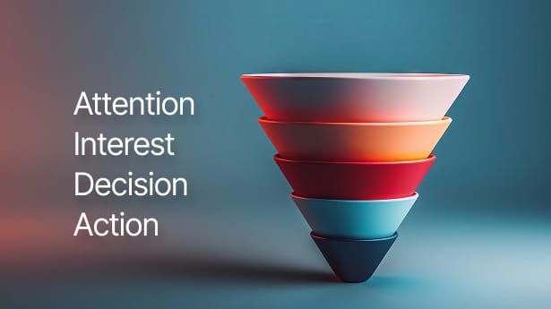
The classic model uses four stages:
- Awareness
- Interest and consideration
- Desire and decision
- Action
It is simple and it works well as a foundation, especially for understanding why certain optimizations matter. But the modern ecommerce customer journey is not linear.
People jump between platforms constantly. TikTok, Google, Instagram, your website, email… it all blends together.
A single strong UGC video can collapse the entire funnel from awareness to purchase in minutes. Or customers can live in the consideration stage for weeks.
The traditional funnel also stops at the purchase, which is a mistake. Retention and advocacy are where a huge amount of profit lives.
So I use the traditional stages as a starting point, but not the full picture.
Stage-by-Stage Ecommerce Funnel Optimization
Below is how I actually think about improving each part of the funnel in a practical, hands-on way.
Stage 1: Awareness (Top of Funnel)
This is where people first discover your brand. For long-term growth, top-of-funnel content is essential.
Strong ways to build awareness include:
- YouTube product reviews or behind-the-scenes content
- TikTok, Reels and Shorts
- LinkedIn if you sell something that appeals to professionals
- SEO content that answers questions people actually search for
- Paid social ads
- User-generated content
The biggest unspoken truth about top-of-funnel is that it is a volume game. Posting once a week will not move the needle. Posting daily gives you a real shot at reaching your audience.
And the content needs to be good. Helpful, entertaining or insightful. Something worth sharing.
Stage 2: Interest and Consideration (Middle of Funnel)
Now someone knows who you are, but they need more trust before they buy.
Here is what matters most:
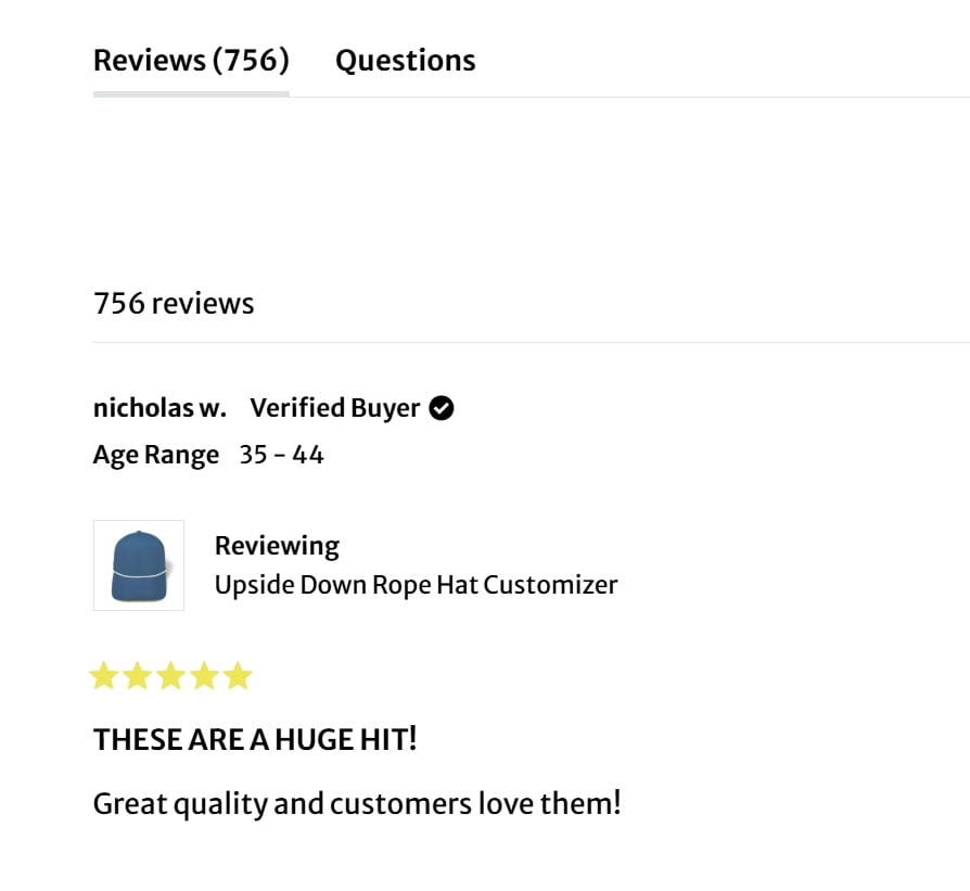
Social proof and reviews
These carry far more weight than anything you say. Customers trust other customers.
Email capture and nurturing
If you are on Shopify, Klaviyo is almost always the right choice. Your goal is not to spam sales emails. It is to start a useful conversation.
A ratio of four helpful pieces of content to one promotional email works well.
Lead magnets
Offer small, specific value in exchange for an email. This opens up a new channel to keep the relationship alive.
In-depth educational content
Guides, breakdowns, stories, or anything that helps someone understand their problem and how your product fits into it.
Quizzes (when appropriate)
They work only when you sell something that requires personalisation. For most stores, quizzes are unnecessary.
Stage 3: Desire and Decision (Bottom of Funnel)
By this point, shoppers already want what you sell. The goal now is simple; make the product feel desirable and remove any friction.
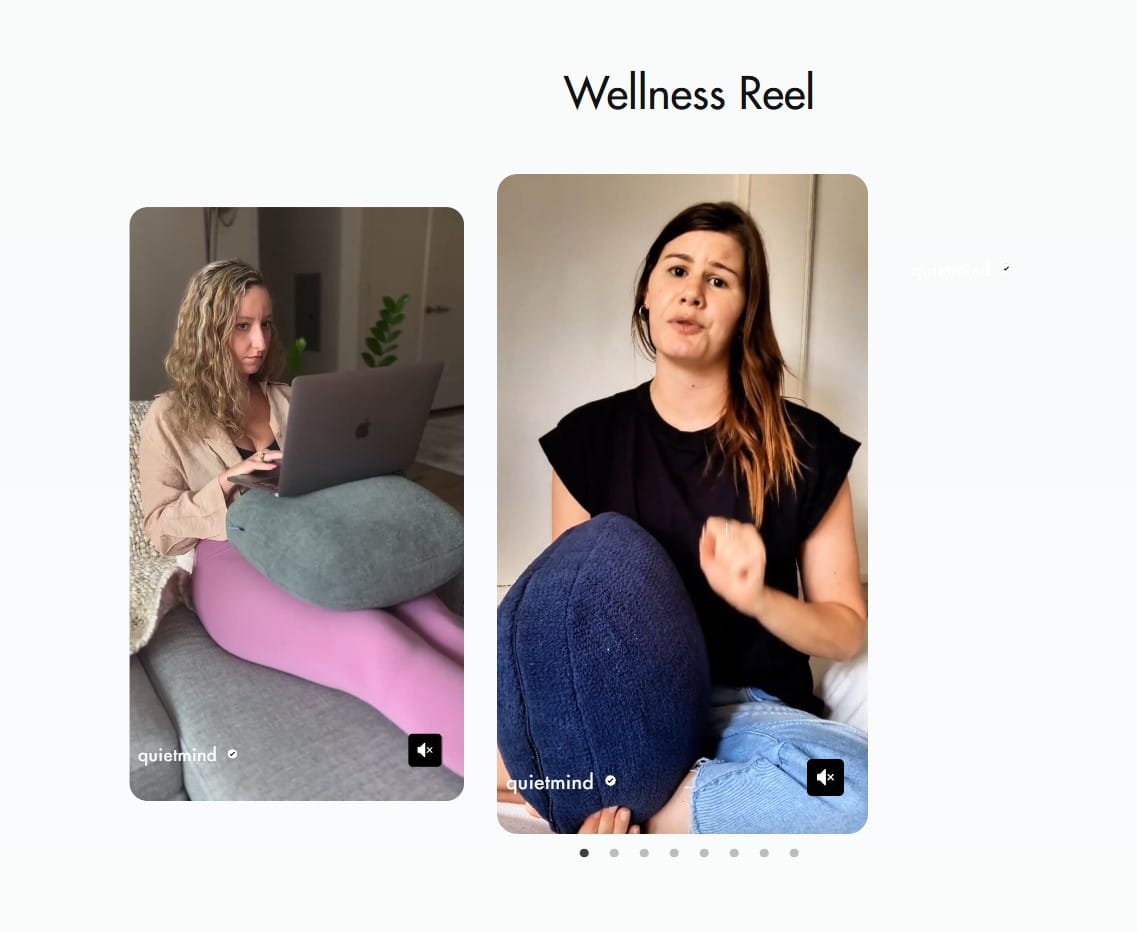
The easiest place to start is product photos. High-quality photos that actually make people want the thing matter more than almost anything else on a product page.
There’s a whole subreddit called r/reviewmyshopify, and the number one problem I see on there is crappy product photos. If your images don’t make people imagine owning the product, you’re going to lose them before they even read the rest of the page.
Once someone’s interested, reviews do the heavy lifting. Most shoppers scroll through reviews until they find one that feels like it was written by someone like them. That one review is often what tips them over the line.
You can make this process smoother by adding a sticky add-to-cart header, so the moment someone decides they’re ready, they can buy straight away without having to scroll back up.
If you sell multiple versions of a product, comparisons can help too. These are useful when someone’s choosing between variants or similar items within your range, but not as helpful for comparing your brand to others.
Keep it focused on helping the customer decide between your own products. That’s where comparisons actually add value.
Urgency is another lever, but you need to handle it carefully. Top retailers rarely use countdown timers or aggressive “buy now” language. Subtle urgency works better.
Things like showing stock levels, highlighting low quantities, or reminding people that items aren’t reserved once they leave the site. That kind of quiet nudge works because it feels real, not forced.
And finally, retargeting. Most shoppers won’t buy the first time they visit. Strategic retargeting campaigns — browse abandonment, cart abandonment, or general remarketing — can help bring them back. People often need a reminder or a little push to finish the process, and that’s where these campaigns earn their keep.
Stage 4: Action (Checkout Optimization)
Even with everything dialed in, about 70% of people who add something to their cart still won’t buy. That’s just how ecommerce works. Even my big eight-figure clients see the same trend.
If you’re using Shopify, you’ve got a head start. Shopify’s checkout has had millions poured into optimization and testing. There’s not a lot you can improve inside it, but what you can optimize is everything that happens before. i.e. The mini cart and the cart page.
Why Shoppers Abandon Carts
The Baymard Institute’s research gives a good breakdown of why people drop off here. The main reasons are:
- Extra fees like shipping or taxes
- Forced account creation
- Long or confusing checkout steps
- Not trusting the site with payment details
- Slow delivery
- Hidden costs
- Website errors
- Missing payment options
Most of these come down to friction and surprises. But there’s also a psychological side. Adding to cart often acts like a wish list. It’s how people explore what they want or test the idea of buying something.
When it comes time to pay, that’s when doubt creeps in or distractions pull them away. It’s normal. The goal isn’t to eliminate that part, it’s to make it easier for them to follow through once they’ve decided.
The Practical Checkout Checklist (Shopify-Friendly)
Here’s what actually helps reduce abandonment and make the checkout process smoother:
- Guest checkout: Shopify already covers this. Don’t force account creation.
- Transparent pricing: Be upfront about shipping and taxes. Don’t surprise people at checkout.
- Progress indicators: If you use a multi-step checkout, show people where they are in the process.
- Minimal form fields: Only ask for what’s essential. The fewer clicks and keystrokes, the better.
- Trust signals: Keep it simple — clean design and clear messaging work better than a wall of logos.
- Strong mobile experience: Most people buy on their phones. Make the mini cart and buttons easy to use.
- One-click checkout: Use Apple Pay, Google Pay, or Shop Pay wherever possible.
- No distractions: Keep checkout clean. No chat popups, no unrelated links, nothing that takes them away.
- Subtle social proof: If you want to add a bit of reassurance, small details like star ratings or recent purchase activity help.
Recovering Abandoned Carts
Even with a good checkout, people will still leave. That’s normal, but it’s worth having a process in place to bring them back.
A simple three-email sequence usually works best:
- Email 1: A gentle reminder, sent a few hours after they leave. Keep it simple and human.
- Email 2: Add social proof. i.e. reviews, photos, or quick UGC clips of the product in use.
- Email 3: A small incentive, like free shipping or a discount, for anyone still on the fence.
Adding real customer photos in these emails can make a huge difference. It reminds people that others have already bought and loved the product. And if someone still doesn’t convert, an exit-intent popup can at least grab their email before they go, so you can follow up later.
How I Actually Find Funnel Problems
Before I run A/B tests, I want to know what’s actually broken. Guessing doesn’t help — you need to see real behavior.
Here’s what I look at:
- Heatmaps: To see where people hesitate or drop off.
- Session recordings: To actually watch how people move through the site.
- On-site surveys: Short and specific — ask “What stopped you from buying today?”
- Competitor reviews: Read what people say about other brands to see what matters to your audience.
- Paid user testing: Ask real users to go through your site and explain what they’re thinking. You’ll spot patterns fast.
Once I’ve figured out where people are getting stuck, then I start testing. If you’re on Shopify, a no-code tool like Shoplift makes it easy to set up experiments without needing a developer.
But testing is only valuable if you’ve done the work to understand the problems first.
The Modern Ecommerce Funnel (Non-Linear)
The funnel isn’t really a funnel anymore. It’s more like a web.
Someone might find your brand on TikTok, then Google you, then read reviews, see a retargeting ad, open an email, and finally decide to buy a week later. The path is messy, and that’s fine — that’s just how people shop now.
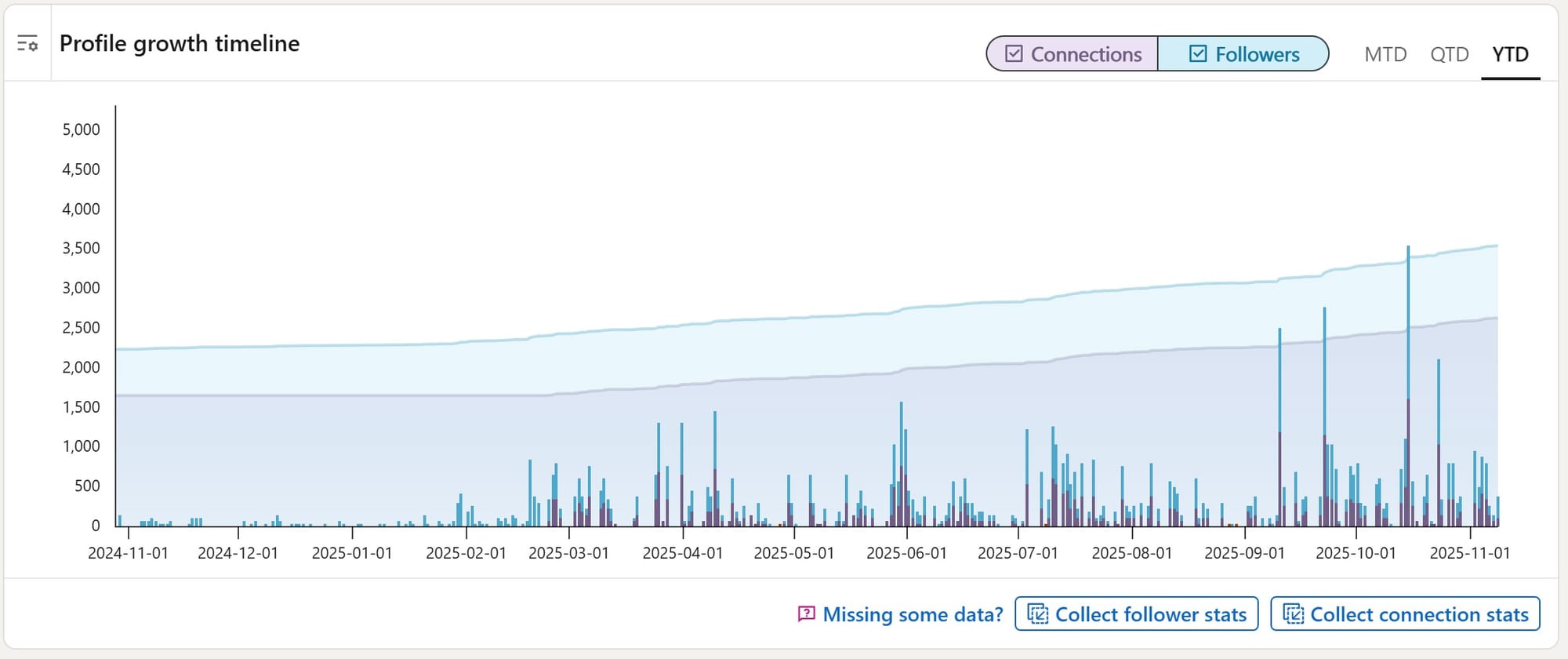
User-generated content plays a massive role here. UGC can collapse the whole funnel, awareness, consideration, and action, into one step. When someone sees a real person talking about your product and showing what it’s like, it builds instant trust. That’s why collecting and reusing UGC across your site, your ads, and your emails is one of the smartest things you can do. It’s social proof in action, and it works because it’s real.
Post-Purchase Optimization: The Most Overlooked Growth Channel
Once someone buys, that’s not the end. It’s actually where some of the biggest opportunities sit. Post-purchase is where most brands can grow the fastest because keeping a customer is always cheaper than getting a new one.
A few areas make the biggest difference:
- Order confirmation and thank-you pages: These have the highest open rates you’ll ever get. Use them to reinforce value and confidence.
- Shipping updates: Send them before customers ask. It builds trust.
- Effortless returns: A difficult return process kills loyalty. Make it simple and clear.
- Review requests: Time them properly — not before the product arrives. One brand I worked with only asked for reviews when the order arrived quickly, and it worked beautifully.
- Loyalty programs: Focus on emotional loyalty, not just discounts. Sephora does this really well — their VIP system rewards loyalty with exclusivity.
- Advocacy: Encourage referrals, UGC campaigns, or community spaces where customers talk to each other. That’s how you build a real growth loop.
This part of the funnel — the stuff that happens after the sale — is where brands win long-term. It’s where you build trust, repeat purchases, and word of mouth that doesn’t cost you anything.
Conclusion
Funnels still matter, but the real game is relationships.
The traditional funnel stops at the purchase. The modern one doesn’t. It looks more like this:
Discover → Purchase → Retain → Advocate
If you treat the purchase as the end, you’ll always be chasing traffic and paying for every click.
If you treat it as the start of a relationship, everything gets easier — more profit, more loyalty, more organic growth.
That’s what sustainable ecommerce actually looks like.
Don’t let your traffic go to waste. Driving visitors to your site is expensive; losing them once they arrive costs you even more. Instead of pouring more budget into ads, focus on fixing the foundation.
At Clean Commit, we specialize in turning underperforming pages into revenue engines by removing friction and optimizing the user journey. Stop leaving money on the table—explore our conversion rate optimization services and start getting the ROI you deserve.


