How to Increase Add to Cart Rate: 10 Data-Backed Tactics

You're watching traffic climb. Product pages are getting views. But the add to cart button sits there untouched — and your revenue stays flat.
The gap between a product page view and an add to cart click is where Shopify stores lose the most revenue.
In this guide, I'll walk you through the data-backed strategies to increase add to cart rate for your Shopify store. that matter most, organized by impact level so you know what to fix first.
What Is a Good Add to Cart Rate?
Add to cart rate is the percentage of visitors who add at least one product to their cart. It's your first real conversion step, the moment a browser becomes a potential buyer.
The benchmarks vary wildly by vertical. According to Dynamic Yield's live benchmark dashboard (aggregating data from 400+ brands and 200M+ monthly unique users), here's where industries stand:
| Industry | Add to Cart Rate |
|---|---|
| Food & Beverage | 10.45–14% |
| Beauty & Personal Care | 9.09–10.14% |
| Multi-Brand Retail | 8.37% |
| Fashion, Accessories & Apparel | 6.62–7.12% |
| Consumer Goods | 4.81–5.98% |
| Home & Furniture | 3.88–4.36% |
| Pet Care & Veterinary | 2.97–3.49% |
| Luxury & Jewelry | 2.32–3.23% |
Pro Tip: Know your vertical's benchmark before you start optimizing. A 3% add to cart rate in electronics means something entirely different from 3% in fashion.
Diagnose Why Visitors Aren't Adding to Cart
Before you start changing the flow, figure out which problem you actually have.
Too many stores jump straight to tactics without understanding why visitors aren't clicking. A low add to cart rate can have completely different root causes — and the fix for each is different.
Here's a diagnostic framework you can run through using your Shopify analytics and a heatmap tool like Hotjar or Microsoft Clarity:
- High bounce rate (above 60%) on product pages — traffic quality problem. Ads or SEO are bringing the wrong people. Fix your targeting before touching the product page.
- Low bounce rate but visitors don't scroll past the fold — above-the-fold content isn't compelling. Product images, price, or headline aren't engaging enough to keep them reading.
- Visitors scroll through the full page but don't click ATC — trust, price, or value communication problem. They're interested but unconvinced. Focus on trust signals, pricing psychology, and shipping transparency.
- Visitors click ATC but at very low rates across all products — page layout or UX has a structural issue. The button might be hard to find, the page might load too slowly, or the mobile experience might be broken.
- ATC rate varies wildly between products — Some products convert, others don't. Seems like a product-market fit or PDP quality issue. Analyze your top performers and replicate what works.
What to implement: Install a heatmap tool and inspect top product pages this week. Run it for 7-14 days. Watch 20 session recordings. The pattern will tell you which of the five problems above you're dealing with.
Need help picking the right tools? Our roundup of Shopify conversion rate optimization tools covers heatmaps, A/B testing platforms, and analytics tools.
How to Increase Your Add to Cart Rate
Your product page has one job: give visitors enough information and confidence to click add to cart. The principles behind ecommerce landing page optimization apply directly here — every element on the page should serve the conversion goal.
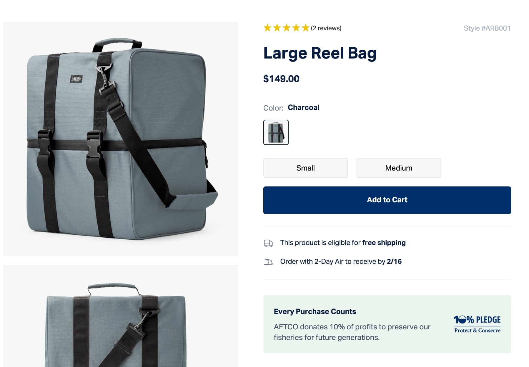
Invest in Product Photos and Video
Products with multiple professional images are 2x more likely to convert than products with a single image, and 75% of buyers say product images are the strongest influence on their purchasing decision. Aim for a minimum of five images per product: front, back, detail shot, lifestyle context, and scale reference.
Product pages with video see 37% more add-to-cart conversions than pages without.
AFTCO is using videos to better display product features
Video lets shoppers see the product in motion, understand size and texture, and build confidence in ways static images can't. You don't need a production studio — a well-lit 30-second demo on a smartphone is enough to start. Alternatively, experiment with AI tools to generate sample videos.
What to test:
- 5+ product images — including lifestyle shots that show the product in context
- Product video — even a 15-30 second demo clip
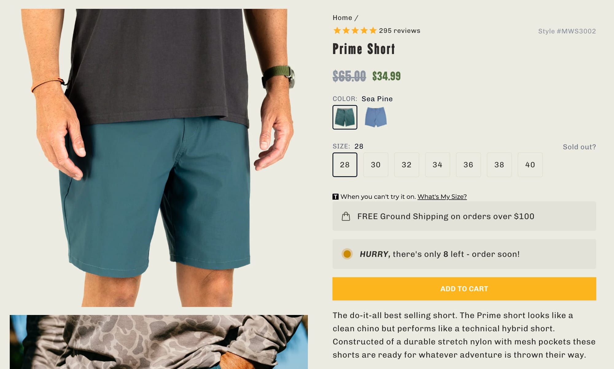
Use Strikethrough Pricing to Anchor Value
The moment a visitor looks at your price, their brain runs a calculation: is this worth it? Pricing psychology tips that calculation in your favor — not by lowering prices, but by framing them differently.
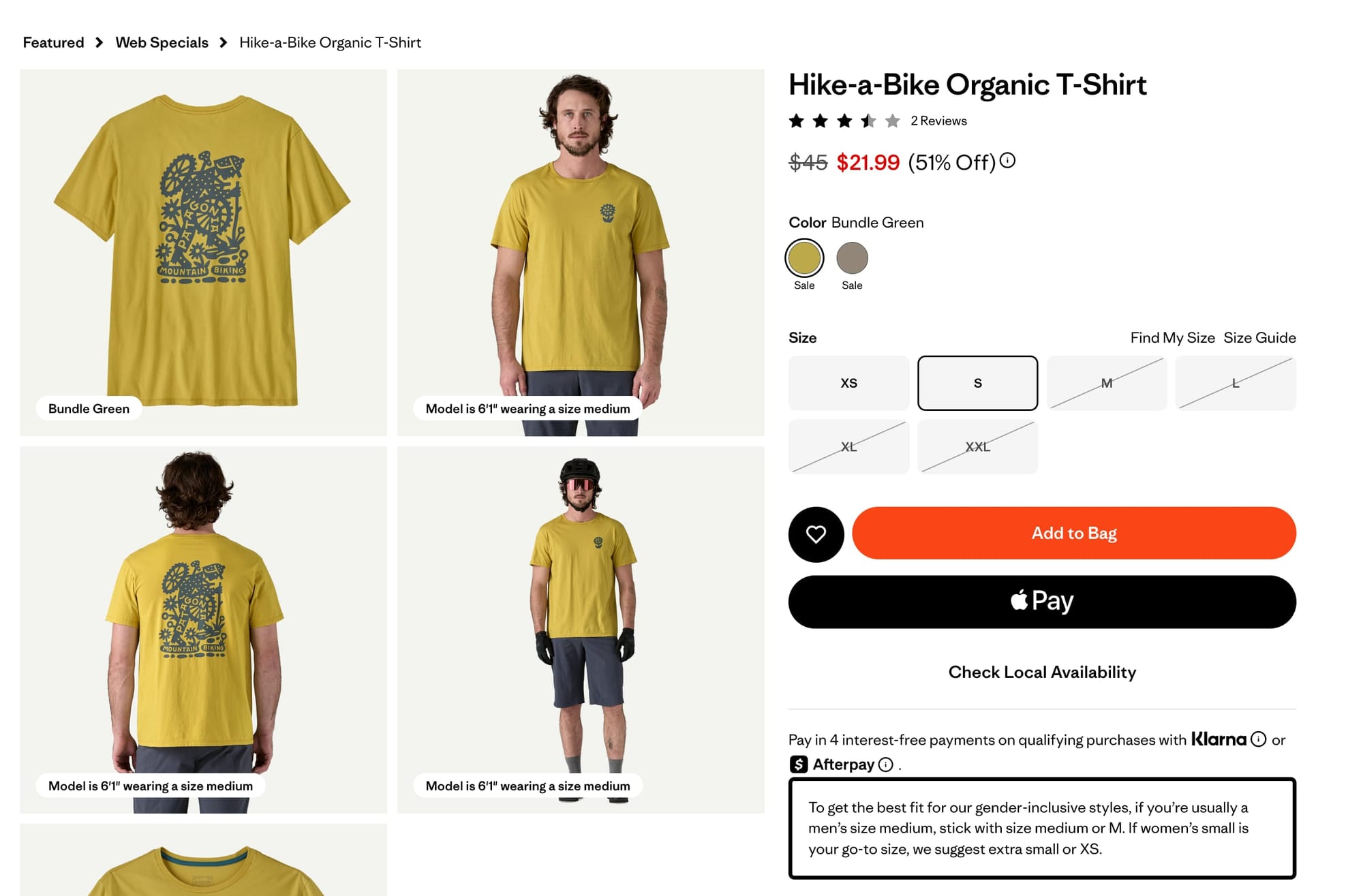
When you show a compare-at price next to your selling price, the crossed-out number becomes the mental anchor. The purchase reframes from "spending money" to "gaining value."
But authenticity matters. If your compare-at price was never your real price, you'll destroy trust and trigger higher bounce rates. Use strikethrough pricing for genuine promotions, seasonal markdowns, or introductory pricing — not as a permanent fixture.
Further reading: Our guide to running profitable pricing experiments covers the full framework — elasticity testing, anchoring strategies, and how to measure results using Gross Profit Per Visitor instead of conversion rate alone.
What to test:
- Strikethrough pricing — use Shopify's compare-at price field for genuine promotions
- Bundle pricing — create product bundles that anchor a higher "individual" price against the bundle discount
- Charm pricing — test prices ending in .99 vs. .00 (results vary by vertical, but it's a low-effort experiment worth running)
Add Buy Now, Pay Later Messaging
BNPL is the pricing lever most stores underuse. It increases average order values by 20–40% and can boost checkout conversion by up to 30%. For products over $50, showing "4 interest-free payments of $12.50" directly below the price breaks the psychological barrier of a larger purchase.
If you're running a Shopify store with products above $50 and you haven't enabled BNPL messaging on your product pages, you're leaving money on the table. It takes 15 minutes to set up with Shop Pay Installments.
What to test:
- BNPL messaging on product page — show installment amounts directly below the price
Offer Free Shipping or Set a Threshold
Shipping, returns, and delivery timelines are purchase decision factors and they belong on your product page.
If your margins support it, free shipping on every order removes the biggest objection outright. If they don't, set a free shipping threshold at 20–30% above your average order value. 58% of consumers will add items to their cart just to qualify, which lifts your AOV at the same time.
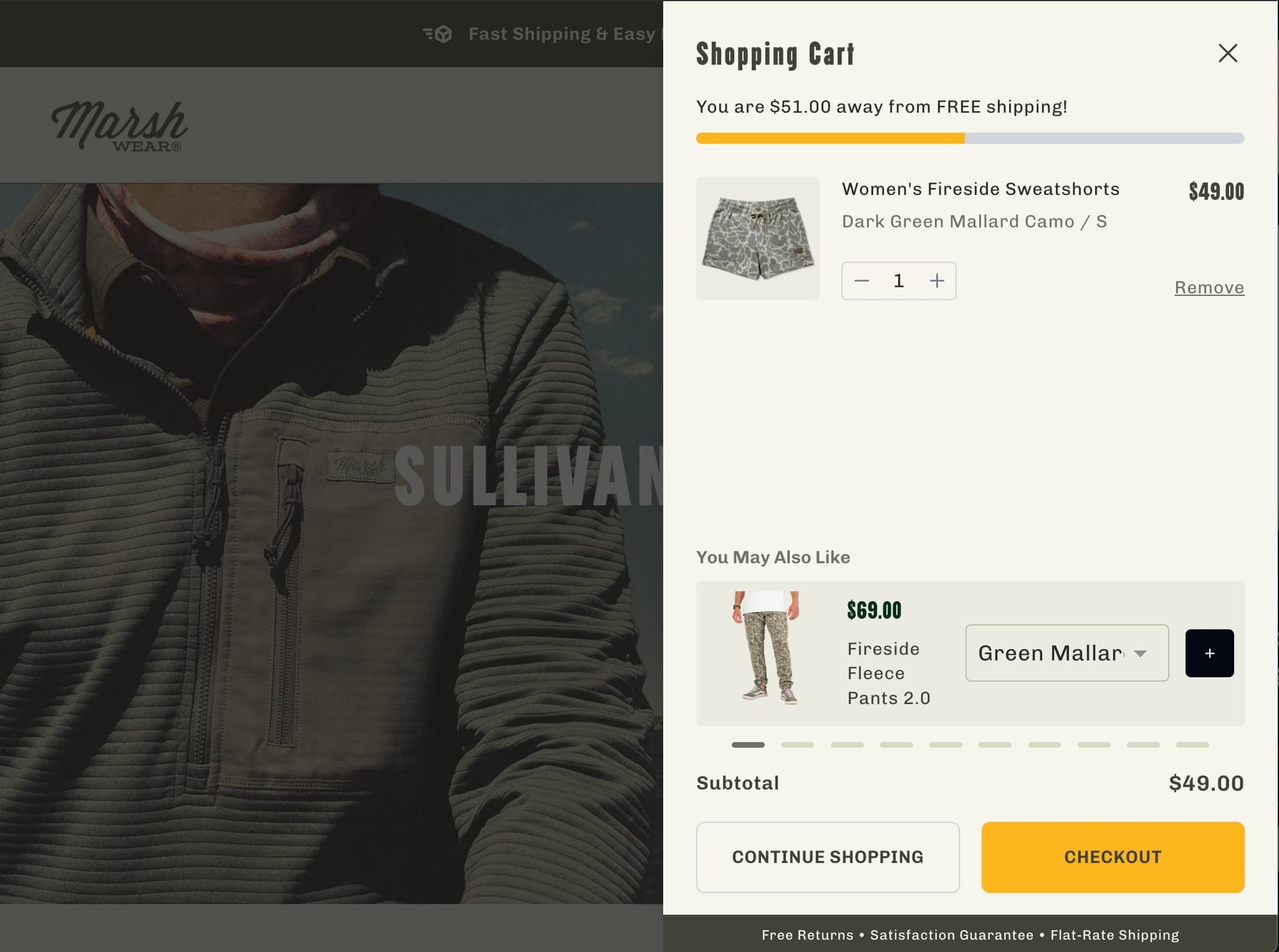
One thing stores get wrong with thresholds: if a product already qualifies for free shipping on its own, say so on the product page. A "$75 jacket" that shows "Free shipping" right below the price converts differently than one where the customer has to do math.
What to test:
- Free shipping messaging — on the product page, not just in the cart. Use a progress bar for thresholds ("You're $12 away from free shipping!")
- No surprises at checkout — show shipping cost (or "Free") on the product page itself
Show Return Policy and Delivery Dates on the Product Page
A "Free 30-day returns" line next to the ATC button is a risk reversal. Shoppers buying apparel, furniture, or anything they can't try first need to know they have an exit. The quicker that objection is tackled the better for conversion rate.
"Arrives by Friday" does more work than "Ships in 3–5 business days." Concrete dates reduce uncertainty. Vague ranges create doubt. If your fulfillment setup allows it, show estimated delivery dates calculated from the customer's location.
Don't make visitors hunt for this information — or worse, surprise them at checkout. Show shipping cost (or "Free"), return policy, and delivery estimate directly on the product page.
Want to know which specific changes will move the needle for your store? We run data-driven A/B tests on Shopify stores to validate exactly what converts your visitors, so you're not guessing.
What to test:
- Return policy snippet — one line next to the ATC button, not a link to a separate page
- Delivery date estimate — "Arrives by [date]" using Shopify's delivery profiles
Build trust with social proof
Your product page needs to earn trust fast. If anything feels off — misleading information, no social proof, an unfamiliar brand with no signals of legitimacy — visitors bounce.
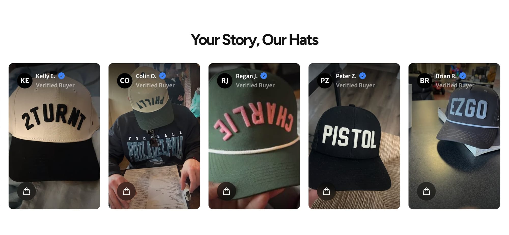
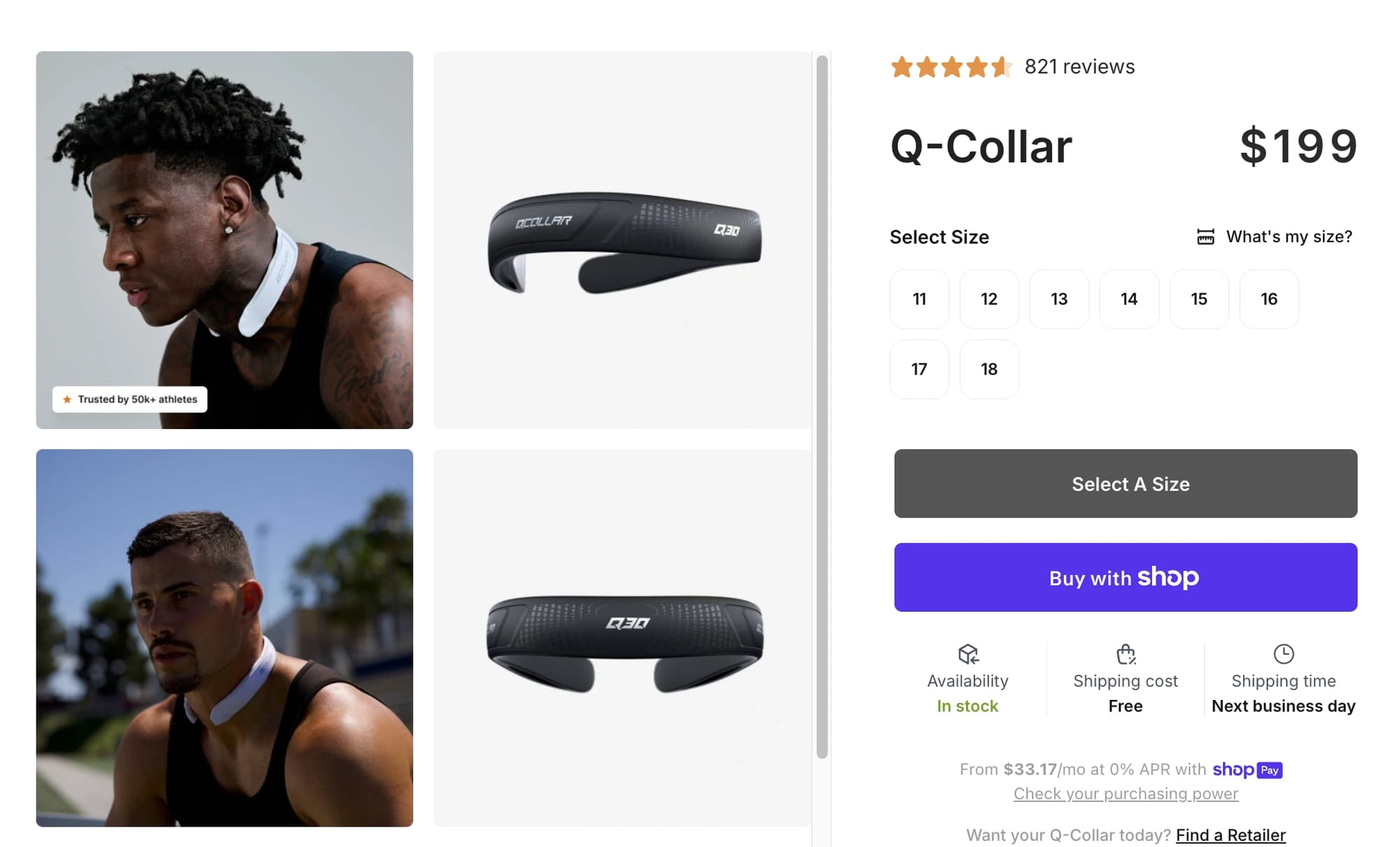
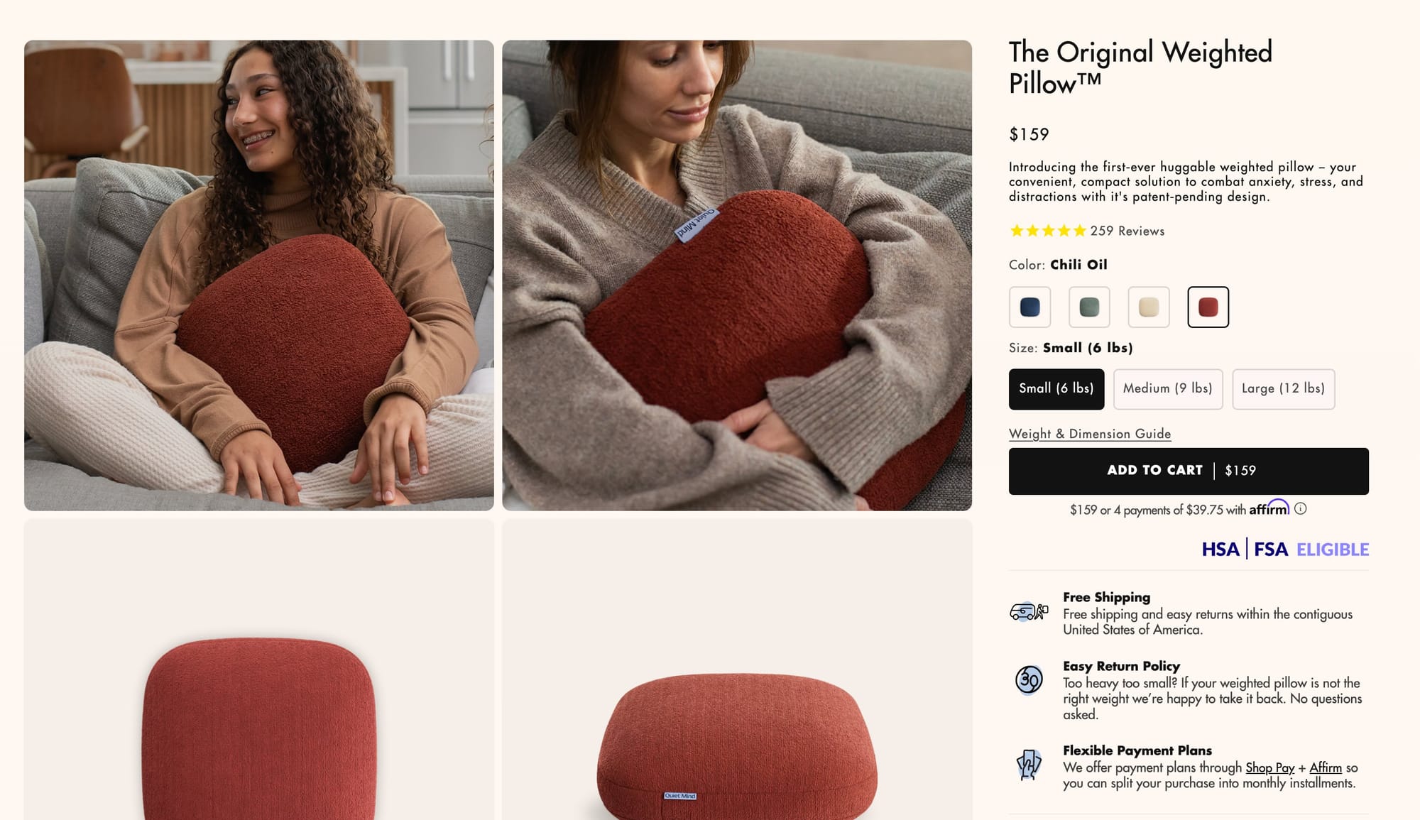
Star rating and review count should sit near the product title. A product with "4.7 stars — 312 reviews" visible immediately tells the visitor that hundreds of people bought this and were happy. That's more persuasive than any copy you'll write. If your review count is low, prioritize post-purchase review request flows before worrying about where they display.
Real customer photos carry more weight than polished brand photography — especially for apparel, accessories, and home goods where shoppers want to see how a product looks in real life. A UGC gallery on the product page gives visitors proof that real people bought and enjoyed the product.
What to test:
- Star rating + review count — visible near the product title, above the fold
- UGC gallery — real customer photos on the product page (Loox, Judge.me, or Stamped)
- Post-purchase review flow - automated emails requesting photo reviews to build your social proof library
Show Trust Badges and Payment Icons
For brands that aren't household names, this matters even more. A row of payment provider logos (Visa, Mastercard, PayPal, Shop Pay) plus a security seal near the ATC button signals that the transaction is safe. 61% of shoppers won't purchase without visible trust badges, and 19% of cart abandonments happen because shoppers don't trust the site with their credit card information.
Add a money-back guarantee badge if you offer one — it reduces perceived risk at the exact moment the visitor is deciding.
What to test:
- Trust badge row — payment icons + security seal + guarantee badge directly below the ATC button
Improve Mobile Customers Experience
Odds are the majority of your customers are shopping on mobile. The biggest mobile conversion killer are distractions.
Email capture pop-ups on product pages, announcement bars that push the product image out of view, cookie banners covering the ATC button, and chat widgets overlapping key content — they all compete with the one action you want the visitor to take. Strip them out. Every overlay or interruption on a mobile product page is friction between the visitor and the add to cart button.
Once the distractions are gone, check for Cumulative Layout Shift (CLS) — elements jumping around as the page loads. Images resizing, banners pushing content down, or the ATC button moving just as a visitor reaches for it breaks trust and interrupts purchase intent.
Run your top product pages through Google's PageSpeed Insights and fix any CLS issues by setting explicit dimensions on images and reserving space for dynamic elements like reviews or BNPL messaging.
What to test:
- Remove mobile interruptions — no pop-ups, no overlapping chat widgets, no announcement bars pushing content down
- CLS audit — run PageSpeed Insights on your top product pages and fix any layout shift issues
Make Your Add to Cart Button Impossible to Miss
On a mobile screen, the first viewport needs to do the heavy lifting: product image, title, price, star rating, and the ATC button. If a visitor has to scroll to find the price or the buy button, you've lost momentum. Push product descriptions and detailed specs below the fold — they're supporting content for visitors who need more convincing, not for the ones ready to buy.
Test the order of these elements. Most themes default to image first, but depending on your product, leading with title and price above the image may convert better. The goal is getting the most persuasive information — and the ATC button — into that first screen.
What to test:
- Above-the-fold element order — test image-first vs. title-and-price-first layouts on mobile
- Push descriptions below the fold — prioritize image, title, price, rating, and ATC button in the first viewport
Experiment with Sticky Add to Cart
Once a visitor scrolls past the fold, the ATC button disappears, and with it - momentum. A sticky add-to-cart button fixes that. We tested this on AFTCO's mobile product pages — a sticky button with the price displayed on it lifted add-to-cart rate by 3.9% and conversion rate by 6.2%.
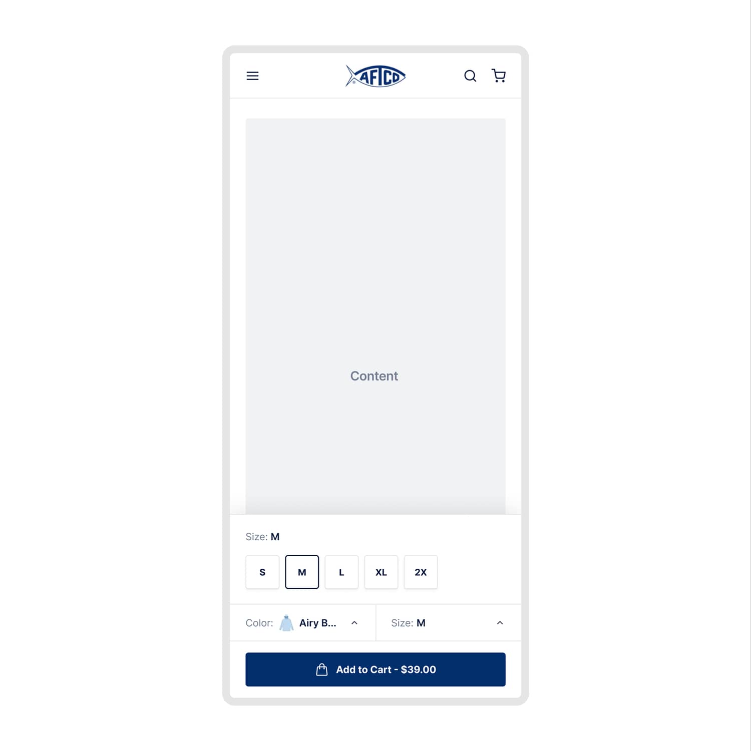
The key is including enough context in the sticky bar — product name, selected variant, and price — so the visitor can act without scrolling back up to double-check. When the buy button follows the visitor as they scroll, the friction between "I want this" and "I'll buy this" drops significantly.
What to test:
- Sticky ATC button — especially on mobile, where scrolling back up kills momentum
- Context in the sticky bar — include variant, price, and product name so visitors can buy without second-guessing
Start Testing
Every tactic in this guide is a hypothesis until you test it on your store. Tweak one thing at a time — your product images, pricing display, trust signals, mobile layout — and measure how your audience responds. Track your add to cart rate in Shopify under Analytics > Reports > Behavior, segmented by device and traffic source.
The stores that consistently grow aren't the ones with the fanciest product pages. They're the ones that treat add to cart rate as a system — diagnose the problem first, test systematically, and let data drive the decisions.
Want help finding what's blocking your add to cart rate? We run data-driven A/B tests on Shopify stores to validate exactly what converts your visitors. First month free.


