18 Tactics to Increase Conversion Rate in 2026

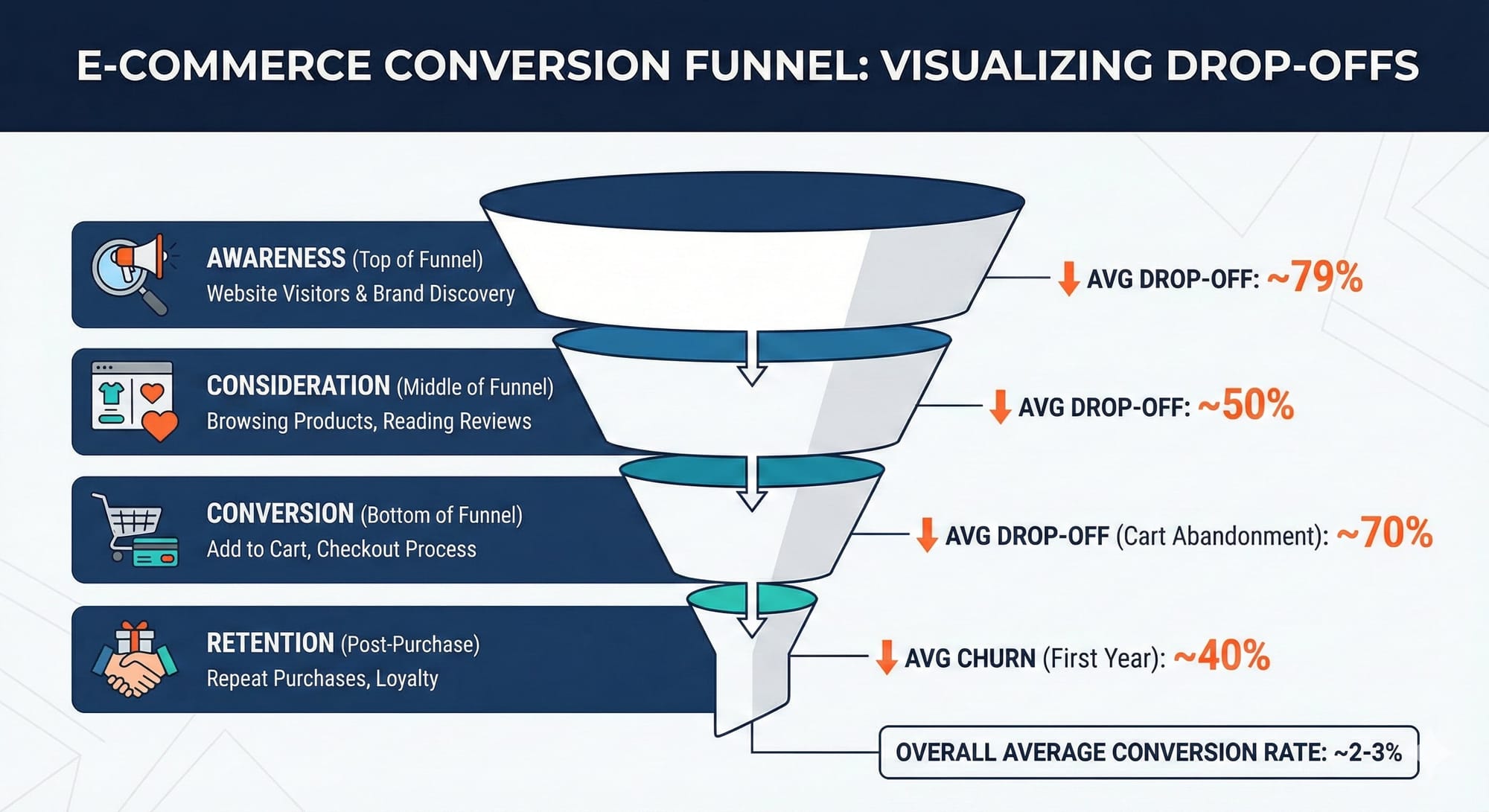
The average ecommerce store converts at 2.5-3% (see current benchmarks). That means 97 out of 100 visitors leave without buying.
Random tactics won't fix that. You can add trust badges, speed up your site, and rewrite every product description, and still see no improvement if you're solving the wrong problems.
This guide covers 18 conversion tactics organized by customer journey stage, from first impression to post-purchase retention.
First Impression - Awareness
The first 10 seconds determine whether visitors bounce or engage. 53% of mobile users abandon sites that take longer than 3 seconds to load.
1. Match Your Landing Page to Traffic Source
Message match—the alignment between what someone clicks and what they see—is one of the most overlooked conversion levers.
If your Facebook ad promises "50% off summer dresses," your landing page headline better mention 50% off summer dresses. Sending that traffic to your homepage forces visitors to work to find what they wanted.
The fix: Create dedicated landing pages for major campaigns. Even simple URL parameters that trigger dynamic content can dramatically improve conversion.
For a complete methodology on landing page optimization, including the 6-step pre-build strategy, see our Ecommerce Landing Page Optimization masterclass.
2. Put Your Value Proposition Above the Fold
Every visitor asks: "Why should I buy from you instead of Amazon?"
Your value proposition needs to answer that question in the first viewport. Not buried in the footer. Not hidden in an FAQ.
Strong value propositions are specific and differentiated:
- ❌ "Quality furniture at affordable prices"
- ✅ "Solid hardwood. Zero particle board. Delivered assembled—never flat-pack."
- ❌ "The best coffee beans online"
- ✅ "Roasted this morning. At your door in 48 hours. Never more than 7 days from roast."
- ❌ "Fast, reliable shipping"
- ✅ "Ships from 3 US warehouses. 94% of orders arrive in 2 days or less."
- ❌ "Sustainable fashion brand"
- ✅ "Each jacket removes 12 lbs of ocean plastic. Track your impact with our serial number lookup."
Stage 2: Consideration & Product Discovery
Once visitors decide to stay, they need to find products that match their needs. Poor navigation and search functionality kill conversions silently.
3. Fix Your Site Search
Visitors who use site search convert at 2-3x the rate of those who don't. But most ecommerce search experiences are terrible, returning irrelevant results or nothing at all.
What high-converting search looks like:
- Autocomplete suggestions that actually help
- Typo tolerance ("runing shoes" still finds running shoes)
- Filters that work on results pages
- No-results pages that suggest alternatives instead of dead ends
According to Algolia, stores with optimized search see up to 27% revenue increases.
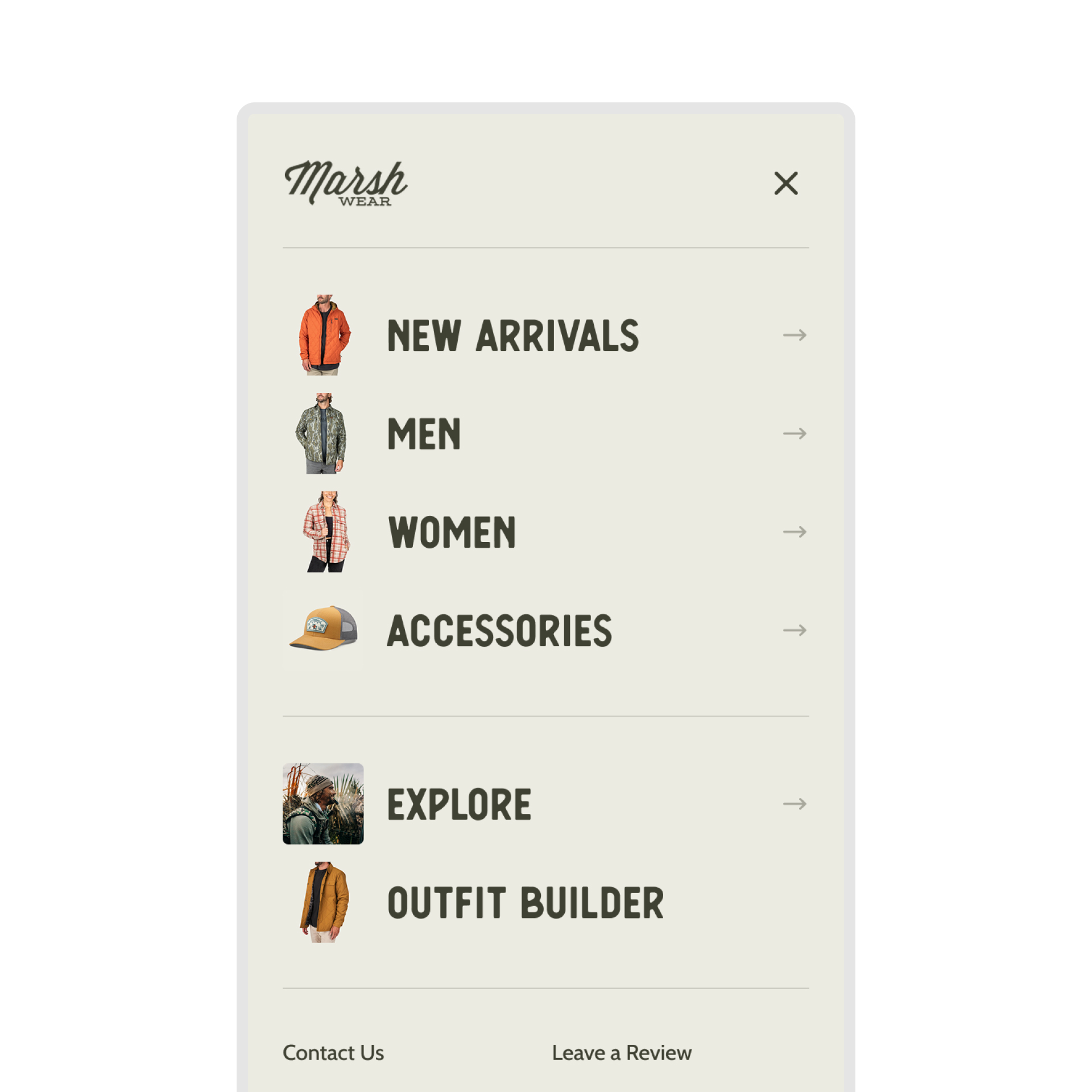
4. Design Navigation for How People Actually Shop
Most stores organize navigation by product type (shirts, pants, accessories). But customers often shop by occasion, style, or need.
Test adding:
- "New Arrivals" and "Best Sellers" categories
- Occasion-based navigation ("Work," "Weekend," "Special Events")
- Problem-based categories ("For Sensitive Skin," "Travel-Friendly")
- Provide pictures with visual cues for categories
Mobile navigation deserves special attention—it's where most of your traffic lands. We've seen significant wins from streamlined mobile navigation that reduces cognitive load, and mobile menu redesigns that prioritize the paths customers actually take.
Check how major retailers structure their navigation. Our ASOS CRO Breakdown dissects how one of the largest apparel retailers handles navigation for 80,000+ SKUs.
5. Use Recommendation Engines Strategically
Personalized product recommendations can drive 10-30% of ecommerce revenue. But placement matters more than algorithm.
High-impact placement:
- "Frequently bought together" on product pages
- "Complete the look" for fashion/apparel
- "You might also like" on cart pages
- Personalized homepage sections for returning visitors
Don't overload pages with recommendations. Two or three well-placed modules outperform ten poorly positioned ones.
We tested this with a homepage recommendations layout redesign—how you display recommendations can matter as much as what you recommend.
Stage 3: Consideration - Product Pages
Product pages are where purchase decisions happen. They need to answer every question, overcome every objection, and make buying feel safe.
6. Adjust Your Pricing Strategy
Here's a conversion lever most stores never touch: price testing.
Most brands build pricing the same way—competitive benchmarking and gut feeling. They know discounts drive conversions, but can't answer the critical question: is 25% off optimal, or just "good enough"?
Pricing experiments are different from standard A/B tests. You're not optimizing for conversion rate—you're optimizing for profit. A test where conversion drops 10% but net margin increases 25% is a massive win.
We ran a pricing experiment for Quiet Mind testing a 15% discount. Annualized impact: $151,840 in hidden revenue and $53,000 in additional profit. Money that was sitting on the table, invisible without testing.
What to test:
- Price points: Test $47 vs $49 vs $52 on the same product
- Price vs Discount: Lowering a price might work, but offering a discount can outperform direct discount.
- Anchoring: Show the original price crossed out next to the sale price
- Decoy pricing: Add a premium option that makes your target look like better value
- Charm pricing: Test $99 vs $100 vs $97 (results vary by brand positioning)
When to test up vs. down:
- Test higher prices for lifestyle, beauty, or proprietary goods—higher prices often signal quality
- Test lower prices for consumables or high-competition goods where lifetime value matters more than immediate margin
The goal isn't maximizing conversion rate. It's maximizing gross profit per visitor: (AOV - COGS) × Conversion Rate
For the complete methodology, see our guide on pricing experiments and how we discovered $151K in hidden revenue.
7. Address Objections Before They Become Bounces
Every customer has purchase objections. Price, quality, fit, shipping time, returns. Your product pages need to address these proactively.
Discover friction with customer surveys
How to find objections:
- Read your 3-star reviews (they contain the most useful feedback)
- Check customer service tickets for common questions
- Survey recent purchasers about hesitations they had
How to address them:
- Add "why it's worth it" copy near the price
- Include sizing guides with real customer measurements
- Display shipping times clearly (not buried in a modal)
- Make return policy visible and generous
Our Customer Objection Analyzer uses AI to surface your top 10 purchase objections from review data in under 5 minutes.
8. Upgrade Product Photography and Video
The #1 reason for product returns? "Item looked different than expected."
Photography standards for 2026:
- Multiple angles (minimum 4-5 images)
- Lifestyle shots showing products in use
- Scale references (especially for furniture, accessories)
- Video demonstrations for complex products
- 360° views for high-consideration purchases
Mobile zoom functionality is non-negotiable. If customers can't pinch-to-zoom on product images, expect lower conversion.
9. Leverage Social Proof Effectively
70% of online shoppers check product reviews before purchasing. But it's not just about having reviews, it's about how you display them.
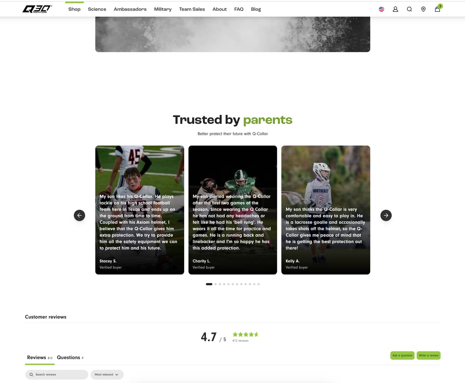
What works:
- Show review count and average rating near the product title
- Display UGC photos from actual customers
- Highlight reviews that address common objections
- Show "X people bought this in the last 24 hours" when inventory is moving
What doesn't:
- Generic 5-star reviews that feel fake
- Review widgets buried below the fold
- Reviews from 3 years ago
- Aggressive urgency tactics that feel manipulative
For a deep dive into how top brands handle social proof, see our Sephora CRO Breakdown. Sephora is a masterclass in review implementation for high-consideration products.
On product pages, it's not just what you show but how visible it is. A PDP redesign focused on trust that prioritized key information, added lifestyle video, and moved trust content higher delivered an 8.1% conversion lift. Mobile benefited most - where screen space is limited, faster access to validation matters more.
10. Write Product Descriptions That Convert
Product descriptions need to do three things:
- Help customers understand what they're getting
- Make them want it
- Reduce perceived risk
Formula:
- Lead with benefits, follow with features
- Use sensory language ("buttery-soft leather")
- Address the "who is this for" question explicitly
- Include specs for comparison shoppers
Avoid generic filler. "Premium quality craftsmanship" tells customers nothing. "Double-stitched seams rated for 50,000+ flex cycles" tells them exactly what they're paying for.
11. Optimize for Mobile (Seriously)
Mobile drives 73% of ecommerce traffic but converts at roughly half the rate of desktop (2.9% vs 4.8%). That gap represents massive revenue opportunity.
Mobile-specific optimizations:
- Larger tap targets (minimum 44x44 pixels)
- Simplified navigation
- Sticky Add to Cart buttons
- Mobile-optimized images (smaller file sizes)
- Number pad for phone/zip fields
What to test:
- Sticky CTA bar vs standard button placement
- Collapsed vs expanded product details
- Horizontal vs vertical image galleries
Stage 4: Conversion - Cart and Checkout
The average cart abandonment rate sits at approximately 70%. That's 7 out of 10 people who intended to buy but didn't complete checkout.
12. Eliminate Checkout Friction
25% of shoppers abandon because they're required to create an account. Another 18% leave because checkout is too complicated.
Non-negotiable checkout fixes:
- Guest checkout option
- 2-3 step maximum checkout
- Progress indicator
- Address autocomplete
- Mobile keyboard optimization (number pad for phone/zip)
One-click checkout options (Shop Pay, Apple Pay, PayPal Express) can increase conversion by 35% or more. If you're not offering accelerated checkout, you're losing sales.
13. Be Transparent About Total Cost
Unexpected costs at checkout are the #1 reason for cart abandonment (48% of abandoners cite this).
Solutions:
- Show shipping costs on product pages or in cart
- Offer free shipping thresholds (and display progress toward them)
- Display estimated taxes before checkout when possible
- Show "no hidden fees" messaging prominently
Consider threshold-based free shipping. "You're $12 away from free shipping" is a powerful motivator that increases AOV while reducing abandonment.
14. Recover Abandoned Carts Systematically
While 70-80% of online carts are abandoned, businesses can typically recover 10-30% of those lost sales through optimized follow-up strategies. Yet many stores either don't have abandonment flows or send generic reminders.
High-converting abandonment sequence:
- 1 hour post-abandonment: Simple reminder, no discount
- 24 hours: Add urgency (inventory levels, limited-time pricing)
- 72 hours: Introduce incentive if needed (10% off, free shipping)
Personalize these emails with the actual products left behind, customer name, and dynamic content based on their browsing history.
For the complete framework on tracking cart abandonment and other micro conversions, see our guide on funnel optimization.
Trust and Risk Reduction
Conversion optimization isn't just about making it easy to buy—it's about making it feel safe to buy.
15. Display Trust Signals Where They Matter
Trust badges work, but placement determines effectiveness.
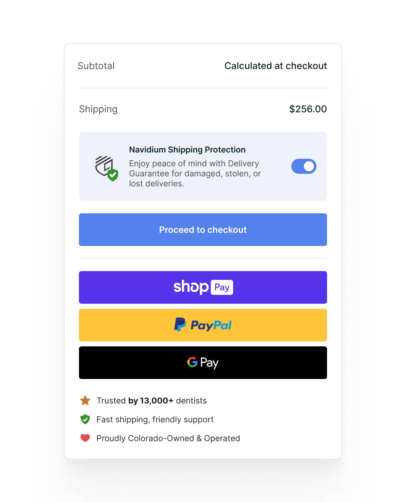
Where to put them:
- Near the "Add to Cart" button
- On the cart page
- Beside payment information in checkout
- In the footer (baseline credibility)
What to display:
- Security badges (SSL, PCI compliance)
- Payment method logos
- Money-back guarantee
- Review site ratings (Trustpilot, Google Reviews)
The cart page is an underutilized placement. We tested adding trust signals on the cart page—review snippets, warranty info, and a local ownership badge—and saw an 11% lift in conversion rate. These reassurance cues reduce hesitation right before the commitment point.
Test which elements resonate with your audience. Parent testimonials might matter more than security badges for a kids' brand. "30-day money-back guarantee" might outperform "256-bit encryption" for fashion.
16. Make Your Return Policy a Conversion Tool
Generous return policies increase conversion. Multiple studies show that free returns boost purchase confidence, even though return rates only increase marginally (2-3% on average).
Return policy best practices:
- Display return window prominently (30+ days is the new standard)
- Offer free returns when margins allow
- Provide prepaid return labels
- Process refunds quickly (within 3-5 business days)
If you can't offer free returns, at least make the process clear and easy. "Easy returns" with a clear explanation outperforms a hidden policy.
Stage 5: Post-Purchase and Retention
The customer journey doesn't end at checkout. Post-purchase experience directly impacts repeat purchase rates—and repeat customers convert at 60-70% compared to 1-3% for new visitors.
17. Nail the Post-Purchase Email Sequence
Order confirmation emails have 65%+ open rates—higher than any marketing email you'll ever send. Use them.
Post-purchase sequence:
- Order confirmation: Add product recommendations
- Shipping notification: Include care instructions or usage tips
- Delivery + 3 days: Request review, offer support
- 14-30 days: Cross-sell or replenishment reminder
Each touchpoint reinforces the purchase decision and builds toward the next conversion.
18. Build a Testing Culture (Not a Tactics List)
Here's the uncomfortable truth: Every tactic in this article might fail for your specific store.
Conversion optimization isn't about implementing a checklist. It's about building a process:
- Research: Find where customers drop off (For a complete list of what to measure, see our 12 key ecommerce metrics to track guide)
- Hypothesize: Identify why they're leaving
- Prioritize: Rank fixes by impact and effort
- Test: Validate with A/B testing before full rollout
- Learn: Document results for future optimization
The stores that consistently improve conversion rates treat CRO as an ongoing program, not a one-time project.
For a complete methodology on building a testing program, see our guide on how to A/B test your ecommerce store.
Where to Start
Don't try to implement these tactics simultaneously. Start with the highest-impact opportunities:
Use the ICE framework to prioritize:
- Impact: How much will this move the needle?
- Confidence: How sure are we this will work?
- Ease: How quickly can we implement and test this?
Score each test 1-10 on each dimension. Multiply the scores. Run highest-scoring tests first.
If you don't know where customers drop off: Use the GA4 + Claude integration guide to identify your biggest funnel leaks in minutes.
If you're losing customers on product pages: Run the 148-point CRO audit to prioritize fixes.
If checkout abandonment is your problem: Focus on tactics 11-13 first. Checkout optimization typically delivers the fastest ROI.
If you need inspiration from top performers: Review our breakdowns of Nike, ASOS, Sephora, and IKEA to see how major brands approach conversion optimization.
If you need tools to get more insights: Check out our article for best conversion rate optimization tools to leverage.
The Bottom Line
Increasing conversion rate is the most powerful lever for e-commerce profitability. A 1% conversion rate improvement on a store doing $1M annually translates to roughly $330,000 in additional revenue—with zero additional ad spend.
But sustainable improvement requires more than implementing random tactics. It requires understanding your specific customers, your specific funnel, and systematic testing to validate what actually works.
The tactics above give you a starting point. The real work is building the process to continuously find and fix conversion opportunities.
Need help implementing a systematic CRO program? Clean Commit runs data-driven A/B testing and optimization for Shopify stores—$5,950/month with the first month free. We've generated over $7.3M in additional revenue for clients with conversion improvements ranging from 57-86%.
Related Reading
- 12 Key Ecommerce Metrics to Track in 2026 — The complete guide to conversion rate, AOV, CLV, CAC, and 8 other metrics that drive revenue. Includes 2025 benchmarks by industry and how to improve each one.


