The minicart was redesigned to improve completion rates by making the checkout button harder to miss. Read the full details of this experiment.
Mini-cart redesign with highlighted checkout button boosts conversions and revenue
Goal
Revenue per visitor (RPV)
Result
+46.6% Revenue per visitor (RPV)
Category
Cart
Outcome
Winner
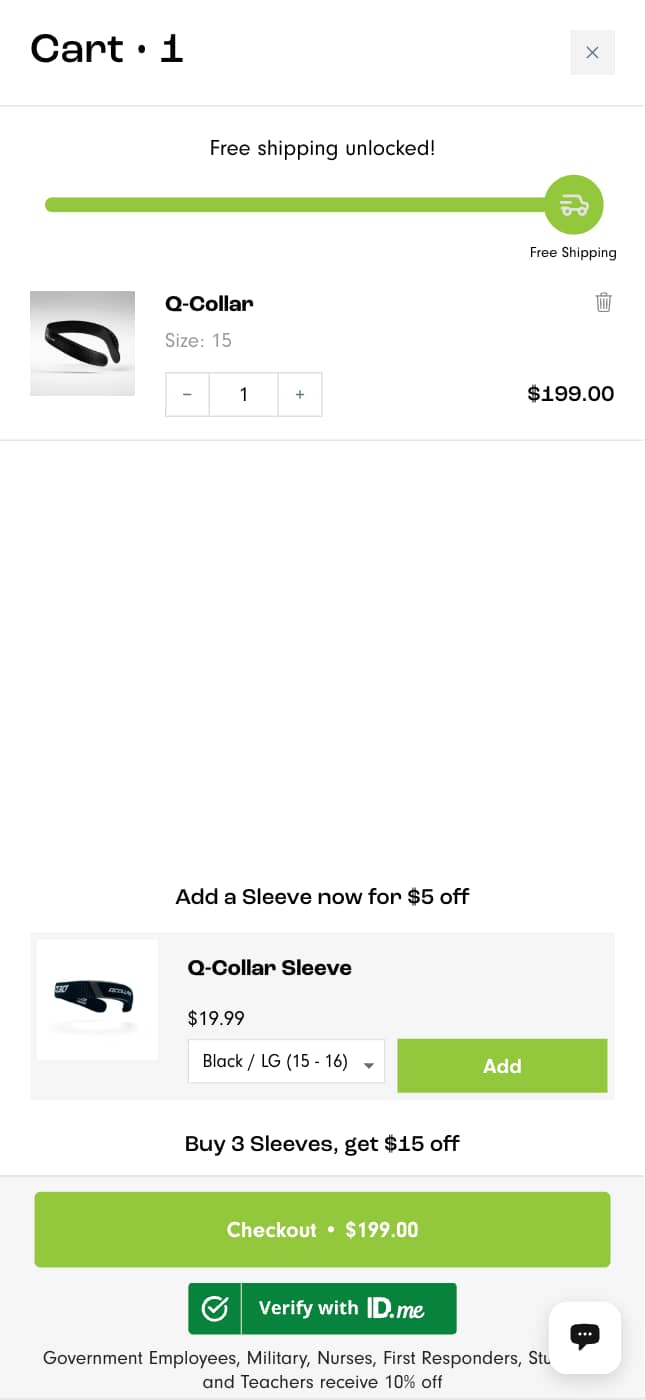
Before
After
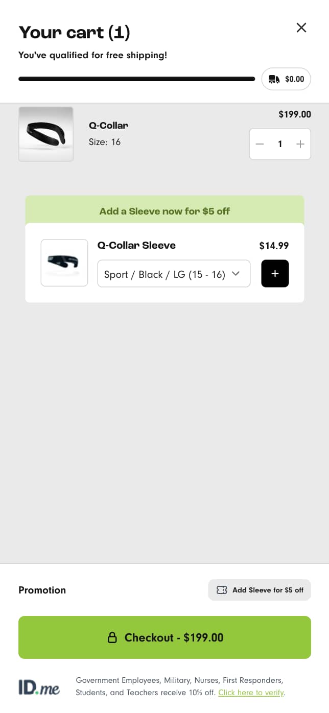
IF we move and restyle the checkout button to be more prominent AND remove the chat button from the minicart THEN more customers will proceed to the checkout BECAUSE customers will focus and click on the button instead of becoming distracted
What We Changed
- Made the checkout button more prominent.
- Removed the chat button from the minicart.
- Ensured no technical issues were present in the minicart.
- Retained the id.Me functionality.
The Results
We dig through every data source to map what's actually broken. By the end, there's no confusion.
+46.6%
Change in revenue per visitor
41.41%
Revenue change
+26.7%
Lift in conversion rate
Key Learnings
- The id.Me functionality was actually killing the checkout rate
- Making the checkout button more obvious resulted in customers finding it much easier to get to the checkout
- The drastic improvement in conversion rate clearly shows how much the poor UX was hurting the store's conversion rate.
- This change took very little time to implement but had a huge impact.
- Recommendation: Leave the mini cart for 30 days then view user sessions and heatmaps to see if any subsequent friction has emerged.
Detailed results breakdown
Add-to-cart rate change
+11.3%
Average order value
+16.9%
Click-through rate change
+4.4%
Lift in conversion rate
+26.7%
Change in revenue per visitor
+46.6%
Free Trial
Start with 3 experiments.
Zero cost.
Get a taste of our service. We'll analyze your store, pinpoint low-hanging fruit, design, implement and test solutions to lift your conversion rate in 30 days.
Who qualifies?
30,000+ Monthly sessions.
Minimum traffic needed to run statistically significant tests.
Running on Shopify or Shopify Plus.
Our specialty - we don't work with other platforms.
Investing in paid traffic.
We work with stores committed to growth, not hobbyists.
Ready to invest in systematic CRO.
You understand testing takes time - no magic bullets.
Why free?
The best proof is results. Three real experiments show you exactly how we work and whether it drives revenue for your specific store. You keep everything - no strings attached.
Our bet
We're confident enough in our process to invest our time upfront. If the tests work, you'll see the value in continuing at $5,950/month. If not, you got free optimization work.
Limited spots
We take only 4 free trials monthly to maintain quality. Each trial gets our full attention and expertise. If you qualify, secure your spot before this month fills up.
Other experiments we've run
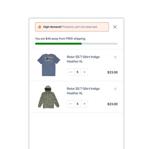
Cart
Scarcity Message Boosts Cart Conversion
Informing shoppers that items in their cart are in high demand increased conversion rates. Discover how urgency impacts purchase decisions.
+2.74% (CVR) CVR

Collection Page (PLP)
Collection pages redesign with improved visuals and navigation boosts desktop revenue and engagement
Discover how redesigning collection pages with better visuals impacted user engagement and conversions.
-2.36% (CVR) CVR
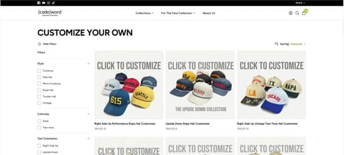
Product Page (PDP)
Enhanced Collection Filtering by Hat Attributes
Introducing a dynamic filter system on collection pages aimed to enhance user experience by enabling easier product discovery. Learn how this change impacted key performance metrics.
-6.4% Conversion rate