 Talk to a human
Sticky Add to Cart Buttons: Do They Actually Work?

In my early years doing conversion rate optimisation, sticky add to cart buttons were the first thing I'd reach for.
Wanted to lift conversion rate on a store? Slap a sticky add to cart button on the product page. Not sure what test to run to kick things off? Try a sticky add to cart button? Need something impressive to show as a case study... you get the idea.
I had a theory for why it worked, and I still think it's mostly right.
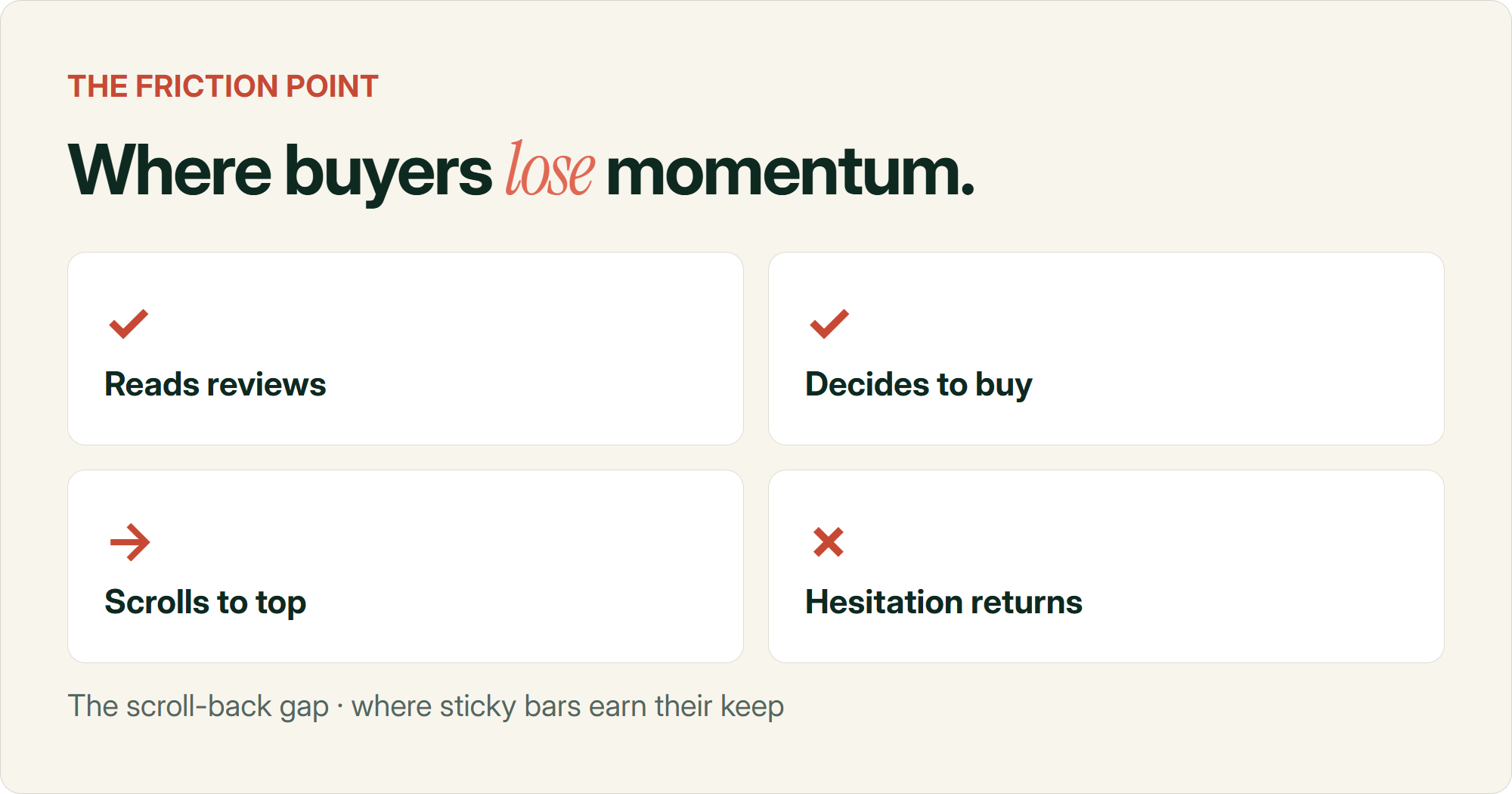
Reviews are usually the strongest thing motivating someone to actually buy. Someone lands on a product page, reads through the content, half makes up their mind, but they want to be convinced before they commit. So they scroll down to the reviews.
And somewhere in the middle of reading them, they decide to buy.
That's the moment. But then they have to scroll all the way back up to hit the regular add to cart button. And on that scroll back up, something distracts them. That little flicker of hesitation they had ten seconds earlier creeps back in. It also makes them feel like they're doing work that's already been done.
A sticky add to cart button removes that scroll. It's sitting right there next to the reviews, at the exact moment someone's decided to buy. No trip back up the page for doubt to catch up with them.
For a long time that theory held. Then it didn't, and I had to figure out why.
The test that quietly proved my theory wrong
A few years back we added a sticky add to cart button to a store expecting the usual result.
It barely moved the conversion rate at all. We genuinely couldn't quite believe it. This was meant to be the easy win, the one CRO lever that basically always worked.
So I went and dug into what was different about this store compared to the ones where sticky add to cart had worked before.
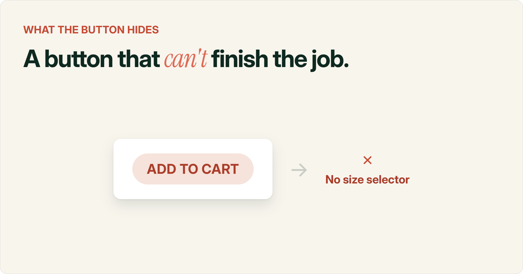
Turned out the product had variants. Size, colour, that kind of thing. And our sticky bar was just a plain "Add to Cart" button sitting on top of the page. It didn't let the customer choose anything.
The mistake we kept making
A sticky add to cart bar without a working variant selector can't complete the job it promises. The customer taps it, gets prompted to go choose a size anyway, and you've added friction instead of removing it.
So the sticky button was making a promise it couldn't keep. Tap it, and the customer still had to stop, think, and go find the size selector somewhere else on the page. Which is the exact opposite of what a sticky button is supposed to do.
That's when I started thinking about sticky add to cart less as a feature and more as a test of whether you'd genuinely reduced friction, or just added a shortcut to more friction.
Why the obvious fix still fell flat
The fix seemed obvious. Add the variant selector to the sticky bar itself.
So we did. Standard dropdowns for size and colour, right there in the sticky footer alongside the button.
That one came out flat too.
I think what happened is the dropdown itself is still a small cognitive load. The customer's mid-review, mid-decision, and now they've got to stop, open a dropdown, read through options, and pick one. It's better than scrolling all the way back up, but it's still asking them to stop and think at the exact moment you want them to just act.
What actually worked was replacing the dropdowns with visual indicators. S M L XL as tappable buttons instead of a dropdown list. Small thumbnail swatches for colour instead of a colour name in a select box.
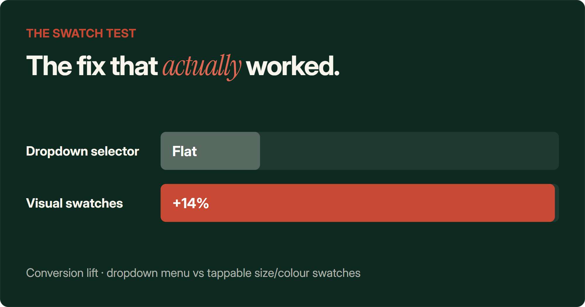
+14% conversion rate lift once we swapped dropdown selectors for visual size and colour swatches in the sticky bar, last time we ran it
The customer could glance at the options, tap the one they wanted, and keep reading reviews without really breaking their flow. No dropdown to open. No list to read through. Barely a decision at all, more of a reflex.
That's the difference between a sticky add to cart button that removes friction and one that just relocates it.
If you're working through a broader list of add to cart tactics, this is worth keeping in mind for basically all of them. The tactic on the checklist matters less than whether it makes the next step easier for the customer.
The uncomfortable truth about sticky add to cart win rates
I used to treat sticky add to cart as close to a guaranteed win. Turns out that's not really true anywhere, not just on our own tests.
Online Dialogue, a CRO agency, ran or analysed 33 A/B tests of sticky CTAs across a bunch of clients. Overall win rate was 27%, which is honestly not far off the win rate you'd expect from a completely random test idea.
Samuel Hess, another CRO practitioner, posted results from 16 sticky add to cart tests run over six months. Win rate: 12.5%. On one brand, removing the sticky bar actually produced a small positive lift.
27% win rate across 33 sticky CTA tests (Online Dialogue)12.5% win rate across 16 sticky add to cart tests (Samuel Hess)
Neither of those numbers is what the Shopify app store listings for sticky add to cart apps are telling you. Pretty much every one of them markets it as a straightforward conversion booster. From what I've seen and what these two datasets show, it's closer to a coin flip.
The most useful thing in Online Dialogue's data isn't the overall win rate though. It's the breakdown by page type. Sticky CTAs had a 0% win rate on orientation pages, meaning homepages and category or listing pages, where the shopper's still browsing and comparing. And a 100% win rate on cart and checkout pages, where the shopper has already decided to buy and just wants it to be easier.
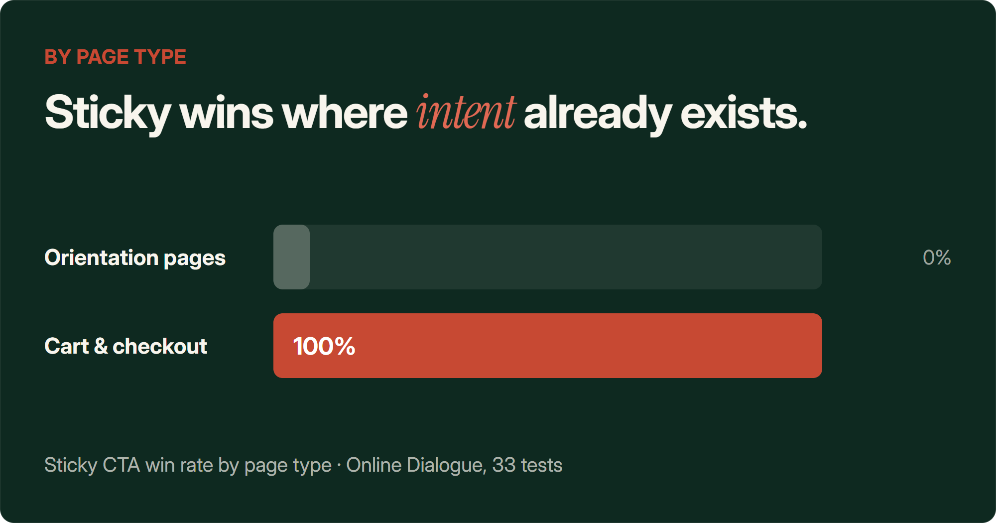
That tracks with everything I've seen. Sticky add to cart helps once someone's genuinely close to a decision. It gets in the way when they're still figuring out if they even want the thing.
If you want a general read on which changes tend to move revenue and which don't, this breakdown of which A/B tests actually move revenue is worth a look. Sticky add to cart is a decent example of a tactic that sounds like it should always work and mostly doesn't.
Where it works, and where it backfires
Once you frame it as a friction test rather than a feature, the pattern of when sticky add to cart works and when it doesn't gets a lot clearer.
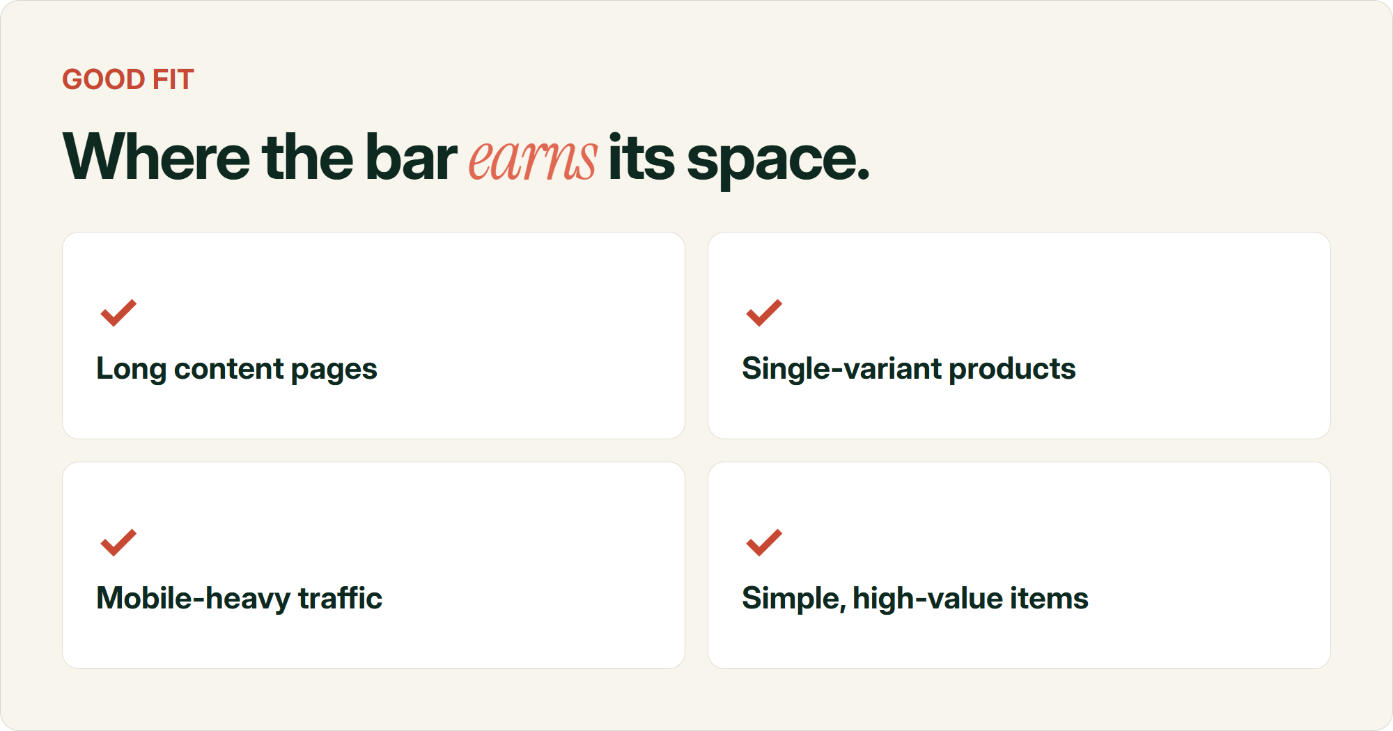
📄 Long, content-heavy product pages If the native add to cart button scrolls out of view early because the page has ingredients, benefits, specs and reviews stacked below it, the sticky bar is solving a real problem.👕 Low-variant or single-variant products The simpler the decision, the easier it is for the bar to hold the full purchase path. This is why our visual swatch fix worked. It kept the decision inside the bar instead of sending people elsewhere.💍 High-consideration but single-dimension products Jewellery is the interesting exception. High price, high consideration, but often just one variant like ring size. Show the price and the variant together, and the bar can catch someone right as they decide.📱 Mobile-heavy traffic Smaller screens mean the native button disappears from view within a few swipes. The case for replacing it is structurally stronger than on desktop.
And then there's the other side of it.
These are the conditions where I'd actively hold off on a sticky add to cart button, or at least test hard before rolling it out everywhere.
Same underlying question applies every time. Does the bar make the purchase decision easier, or does it just look like it does.
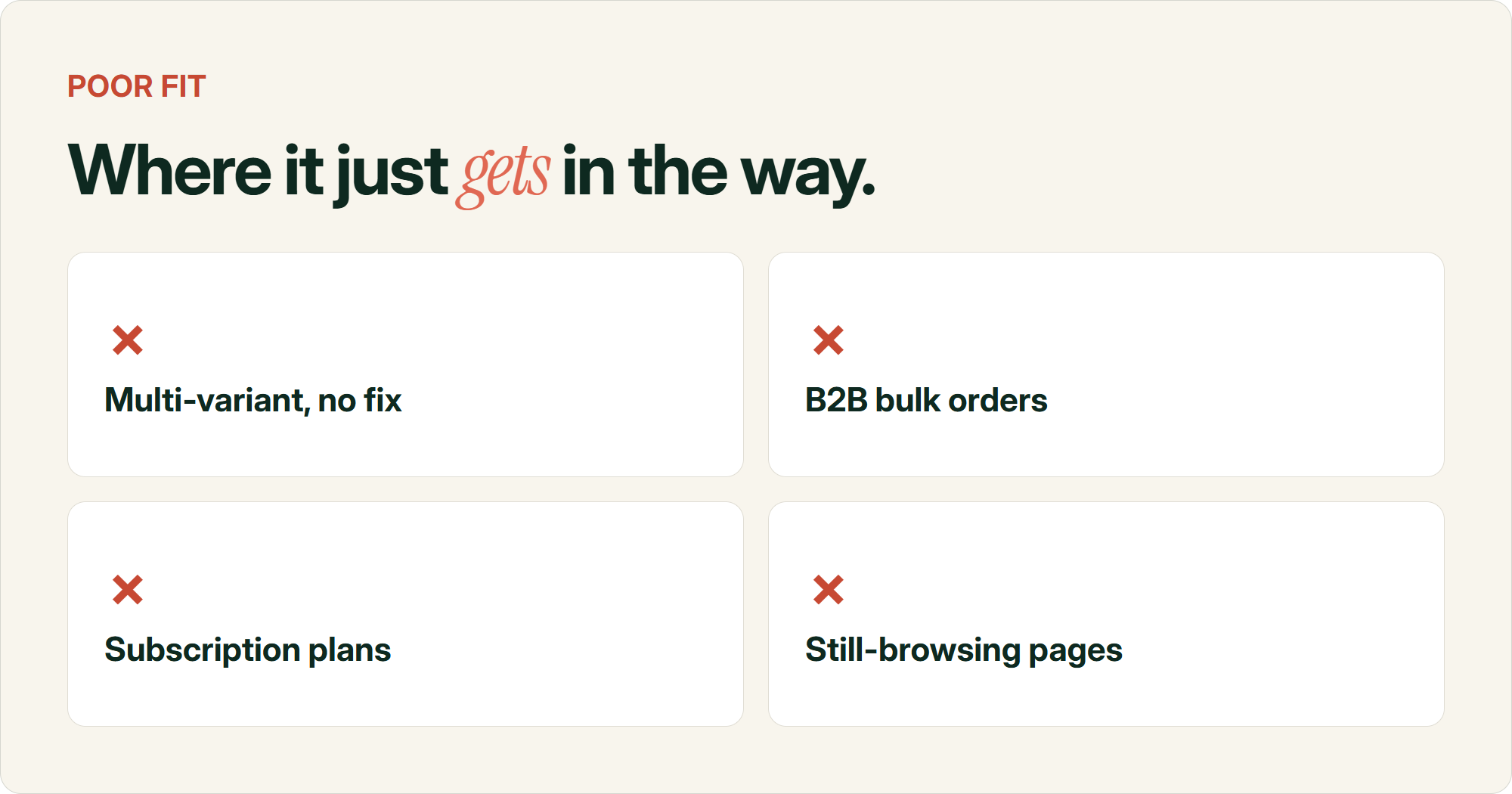
🎽 Multi-dimension variant products without a visual fix Size, colour, sometimes fabric on top of that. If you can't fit a clean, tappable version of that decision into the bar, you're building a button that promises something it can't deliver.📦 B2B or bulk order flows A single-item sticky button doesn't match how these buyers purchase. They're assembling a multi-line order, not making one quick decision.🔁 Subscription products Plan and frequency selection doesn't reduce down to a single persistent button. Most off-the-shelf sticky cart apps aren't even built to handle it.🏠 Homepage and category pages This is the page-type finding from earlier. If the shopper's still orienting themselves, a persistent buy button competes with the thing they're trying to do.
Notice the pattern. None of this is really about the product category itself.
A $2,000 ring can be a great sticky add to cart candidate. A $40 t-shirt can be a bad one. It comes down to whether the variant decision fits cleanly inside the bar, not the price tag or the vertical.
The actual rule
Before shipping a sticky add to cart button, ask whether it lets the customer complete the entire purchase decision without leaving it. If they still have to scroll away to pick a variant, check a size chart, or read something the bar hid from them, you've built a floating button, not a shortcut.
That last bit matters more than people give it credit for. Nielsen Norman Group's research on sticky headers frames any persistent element as a permanent tax on screen space. It only earns that space back if it's genuinely reducing effort. If your sticky bar is covering a size chart, fighting with a chat widget for the same corner of the screen, or showing a price that doesn't match the variant someone's looking at, it's costing you more than it's giving back.
We've seen the technical version of this go wrong too. Stores where the sticky bar isn't properly synced to the main product form, so it shows the wrong price, or lets someone add to cart without picking a required option. That's a bug wearing a strategy costume, not a strategy problem.
If your product pages already have a lot going on, it's worth checking whether you're bleeding people out of the funnel before you even get to the add to cart decision. This guide on cart abandonment covers the bigger picture beyond just the button itself.
Common questions about sticky add to cart buttons
What is a sticky add to cart button?
It's a persistent add to cart bar or button that stays visible on a product page as the customer scrolls, usually appearing once the main add to cart button scrolls out of view. It typically sits at the bottom of the screen on mobile and along the side or bottom on desktop.
Do sticky add to cart buttons increase conversion rate?
Sometimes, not always. Practitioner-run tests put the win rate somewhere between 12.5% and 27%, which is close to typical A/B test hit rates rather than a guaranteed lift. Whether it works depends on whether the bar actually removes friction from the purchase, not just whether it exists.
Why did my sticky add to cart test show no lift?
The most common reason is a missing or incomplete variant selector. If the customer still has to leave the sticky bar to choose a size or colour, you haven't shortened the path to purchase. Check whether the bar can complete the entire decision on its own.
Should sticky add to cart buttons include variant selectors?
Yes, if the product has variants. But keep them visual and tappable, like size buttons or colour swatches, rather than dropdown menus. A dropdown still asks the customer to stop and think, which defeats the point of a sticky, low-friction button.
Does sticky add to cart work better on mobile or desktop?
Mobile tends to show a bigger lift in add to cart clicks specifically, since smaller screens push the native button out of view faster. Desktop tests have shown stronger completed order lifts in some cases though, so it's worth testing both rather than assuming one wins.
Where should I avoid using a sticky add to cart button?
Homepages and category or listing pages, where shoppers are still browsing rather than deciding. Also worth avoiding, or at least testing carefully, on subscription products, B2B bulk order flows, luxury pages where an aggressive buy bar clashes with the brand and anything with variant selection too complex to fit cleanly in the bar.
Sources
- A sticky CTA: guaranteed conversion uplift? (Online Dialogue)
- Sticky Add-To-Cart buttons are a scam (Samuel Hess, LinkedIn)
- Sticky Headers: 5 Ways to Make Them Better (Nielsen Norman Group)
- Sticky Add to Cart Button Example: Actual A/B Test Results (Growth Rock)
- How and When to Use a Sticky Add to Cart Button (The Good)