 Talk to a human
A/B Test Prioritization: The Tier 1, 2, 3 Framework

Every time I look at a new client's testing history, I get excited... before I get disappointed.
Excited because they've actually done it. Most stores never run a single controlled test in their life. These guys built a programme, picked a tool, shipped a handful of experiments on their own initiative.
Then I open the list of what they actually tested.
Button colours. A trust badge. Maybe a headline swap on the homepage.
I'll ask if they've ever tested their price. Or their free shipping threshold. Or a bundle, or an upsell. Usually I get a vague answer, something like "kind of" or "we looked into it," which is code for no.
That's the bit that bugs me. None of those UI changes touch what a customer actually pays or gets in return, and those are the changes that move unit economics the fastest. They also happen to be the ones you can prove with the least traffic, which matters a lot if you're not running millions of sessions a month.
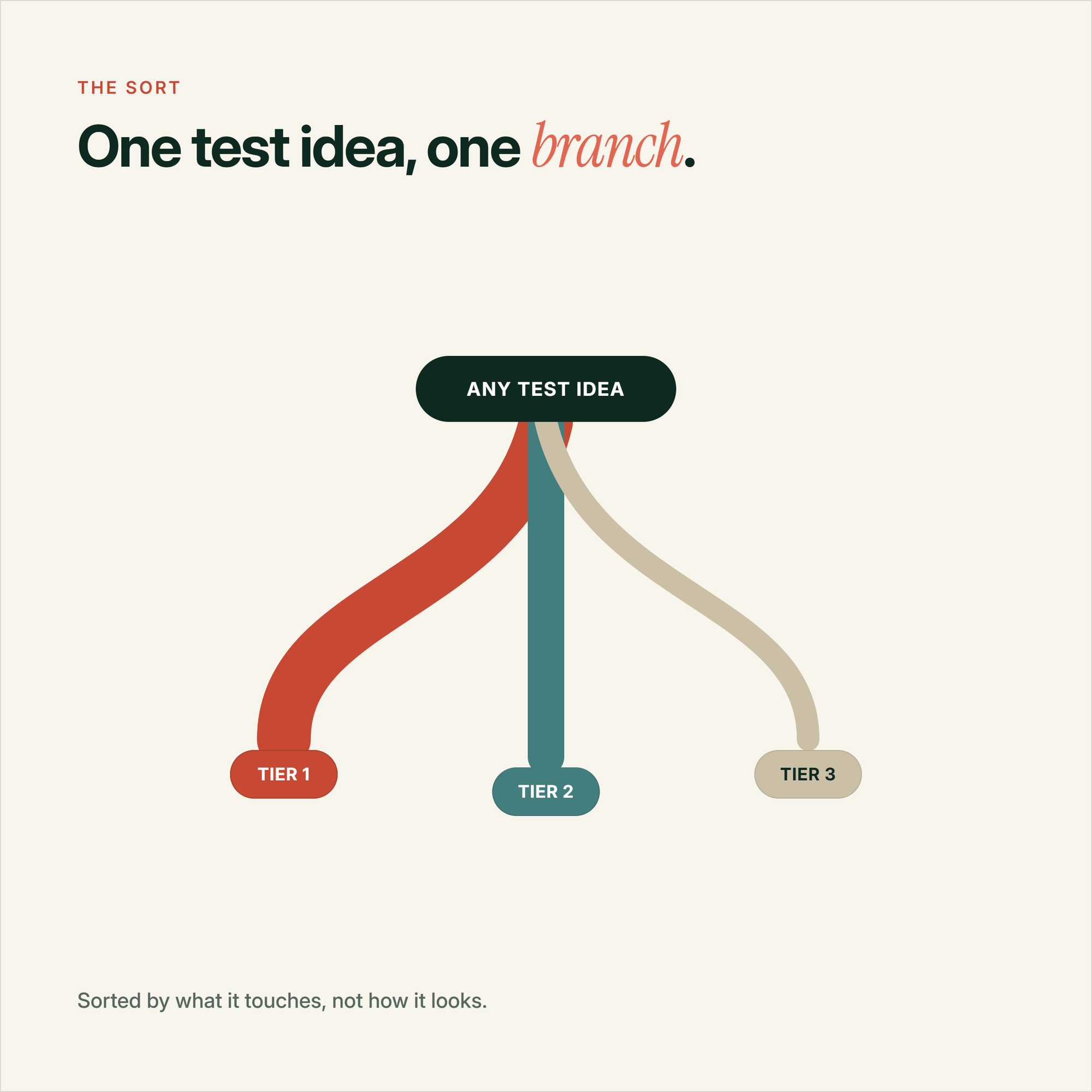
So a while back I stopped handing people a best practice checklist and built something closer to a filing system instead: three tiers with a simple rule for sorting any test idea into one of them, and a reason to run them together instead of just the easy one.
The rule for sorting a test into a tier
Forget how big the change looks on screen. That's not what separates the tiers.
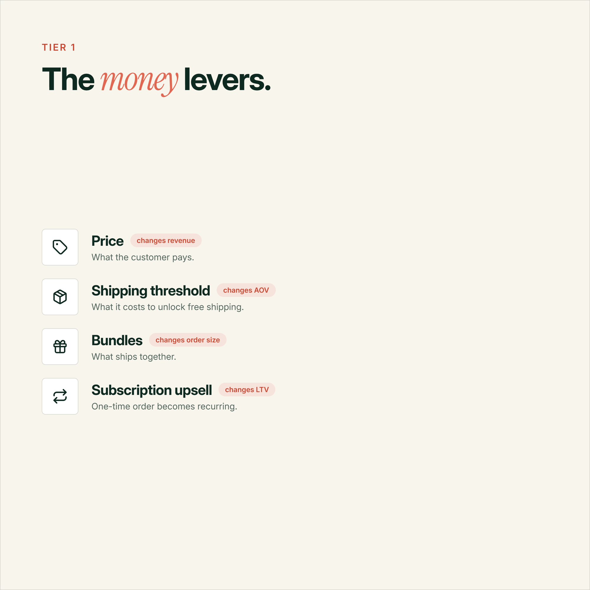
The actual question is simple. Does it change what the customer pays or gets in return? That's Tier 1. Does it change how they move through the page or reach checkout, without touching the offer itself? Tier 2. Everything else, colours, copy, a single badge, a single image, sits in Tier 3.
For a while I genuinely thought I'd come up with this myself (I even came up with a cool name - the Triple T methodology, or "Tiered Testing Triage"). Then I went and dug through how other CRO teams think about test size, and it turns out I wasn't first to the idea at all. konversionsKRAFT calls it the Golden Circle, the idea that a test should be exactly as big as the hypothesis needs, not maximised for its own sake. CXL has been making basically the same argument from the opposite direction for years, warning people off redesigns that aren't grounded in a real reason. GoodUI backs the size argument up with actual test data rather than just theory. Invesp has been saying something similar too, just framed around the web getting harder to move with small tweaks.
Go too small and the change never reaches the customer's actual decision. Go too big without a reason and you're just doing a redesign with extra steps.
And redesigns without a reason have a bad track record. The oft cited stat is that roughly 8 in 10 full site redesigns fail to lift conversion, mostly because they're driven by what a designer wants the site to look like rather than what the data says is broken. Marks and Spencer's full site relaunch reportedly dropped sales by 8%. Bigger only works when there's a reason behind it.
Tier 1 Changes what the customer pays or receives. Price, shipping threshold, bundles, subscriptions, checkout model.Tier 2 Changes how the customer moves through the page or gets to checkout. Navigation, urgency, content blocks, form length.Tier 3 Surface changes only. Button colour, CTA copy, a badge, an image. No change to the offer or the path.
Tier 1: the tests almost nobody runs
This is the tier I asked about earlier. Price. Shipping threshold. Bundles. Subscription upsells. Guest checkout versus forced account creation.
None of it is a UI job. Most of it just needs a testing tool that can swap a price or a threshold, and the nerve to actually run it.
And the effect sizes are the reason I keep pushing people towards it. Baymard's checkout research puts the ceiling for a properly researched checkout redesign at up to 35% conversion lift, and forced account creation is one of the top reasons people give for actually abandoning a cart. The famous "$300 million button" story, where a retailer added guest checkout and reportedly added $300 million in revenue over a year, gets thrown around a lot and I can't verify the original numbers. But the direction matches Baymard's independent research, so I'm comfortable treating it as directionally true even if the exact figure is fuzzy.
I like a cleaner example. SiO Beauty added a single button to their side cart that let a one time purchase get upgraded into a recurring subscription order. One button. New economics on every order that used it. Subscription revenue jumped 16.5%.
6.6% Median lift, isolated single-element tests23% Median lift, bundled high-probability tests
That gap is from GoodUI's own test corpus, 159 isolated tests against 26 bundled ones. Roughly 3.5 times the typical effect. It's the closest thing to hard data I've found on the question, even if it's not a universal law.
There's also a traffic argument for Tier 1 that I think gets missed. Bigger effects need less traffic to prove, not more.
~15,000 Visitors per variation to detect a 20% lift~2,600 Visitors per variation to detect a 50% lift
That's from a breakdown of A/B testing maths for small stores, and it's roughly six times less traffic for a lift two and a half times bigger. If you're the kind of store that can't get a button colour test to significance in under a business quarter, a well chosen Tier 1 test might resolve in a couple of weeks. We wrote more on picking tests that actually move revenue if you want the full version of that argument.
One reason Tier 1 keeps paying off is that the web has gotten harder to squeeze. Invesp's Khalid Saleh has pointed out that back in 2006, A/B tests succeeded over 60% of the time, because most sites were badly designed and any change helped. Today that number sits somewhere between 12% and 25%. Sites are more polished across the board, so small tweaks increasingly test for effects that were never there to begin with.
60%+ A/B test success rate, back in 200612-25% Typical success rate today
Which is a decent argument for spending your test slots on the mechanisms, not the paint.
Where to start
If you've never run a Tier 1 test, start with a free shipping threshold. It's the fastest to build, the easiest to reverse and it goes straight at average order value rather than conversion rate alone.
Tier 2: the middle ground everyone underrates
Tier 2 is where I'd put a navigation rework, urgency messaging on a product page, a new comparison table, a shorter checkout form. It changes how someone moves through the site without touching the offer.
The cleanest single-variable example I've found is a CXL study where they added urgency messaging and delivery clarity to a product page and got a 27.1% lift in revenue per visitor. One change, one metric, disclosed methodology. That's rare.
Most of what gets published as a Tier 2 case study isn't that clean though. A lot of the vendor libraries bundle three or four changes into one headline number, a new hero and a redesigned cross-sell module shipped together as one variant, and then report a single lift. You genuinely can't tell which part did the work.
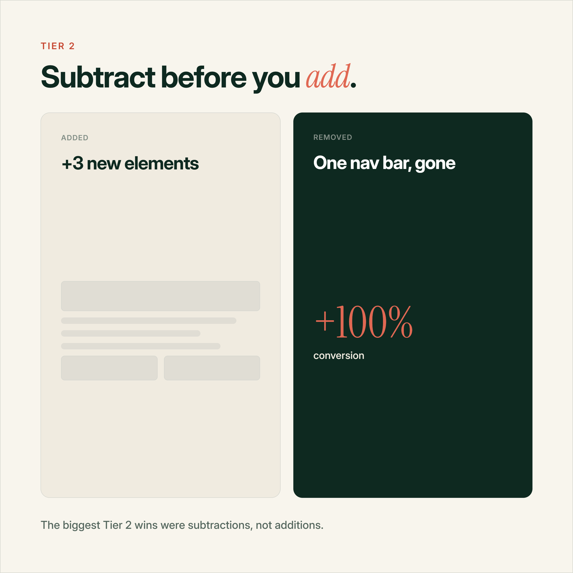
The exception that stood out to me was a store that just removed its top navigation bar from a wedding registry landing page. Nothing added, nothing redesigned. Conversion doubled, from 3% to 6%, according to VWO's case study. No sample size disclosed, so treat it as a data point rather than gospel, but it fits a pattern I kept seeing across the research. The biggest Tier 2 wins are almost always removals, not additions. Taking out a confusing sub-header, a forced login step, an unnecessary form field. Adding something rarely does as much as taking away something that was in the way.
Tier 3: the tier most testing programmes never leave
This is where almost every self-run programme I've audited starts and, more often than not, stays. Button colour. CTA wording. A trust badge. A product image swap.
These still have value. But the results are all over the place, and most of the spread has nothing to do with the element you actually changed.
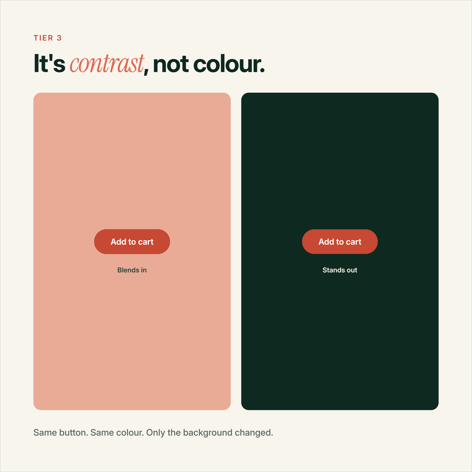
Take button colour. CXL went back through the classic "red button beats green button" studies and found the real driver wasn't colour at all, it was contrast against the rest of the page. Green loses to red mostly when green is already the brand colour and blends into everything else. Swap the framing and the "colour test" stops meaning anything.
Trust badges are similar. A well run test can add 12% conversion on a site people don't already trust. Run the same test on an established brand and you're often looking at 1-3%, sometimes not even statistically significant. The badge isn't the variable. How much the visitor already trusts you is the variable, and a badge can't manufacture trust that isn't there.
Common mistake
Running a full year of Tier 3 tests and calling it a testing programme. It feels productive because you ship variants constantly, but if none of them touch price, offer or path, you're mostly testing noise against noise.
None of this means skip Tier 3. It means don't let it be the whole programme. For more of the classic Tier 3 style plays, we've got a longer list of conversion tactics worth working through once the bigger levers are covered.
Why we run all three tiers at once
Internally we don't run a queue of Tier 1 tests, then Tier 2, then Tier 3. We run a mix, live, at the same time.
The reason comes back to that traffic maths from earlier. Tier 1 tests tend to reach significance fastest because the effect, when there is one, tends to be bigger. So we'll have one or two of those running as the headline experiment. In the background, Tier 2 and Tier 3 tests keep ticking along, slower and less dramatic, but they're not blocked waiting on the big swing to finish.
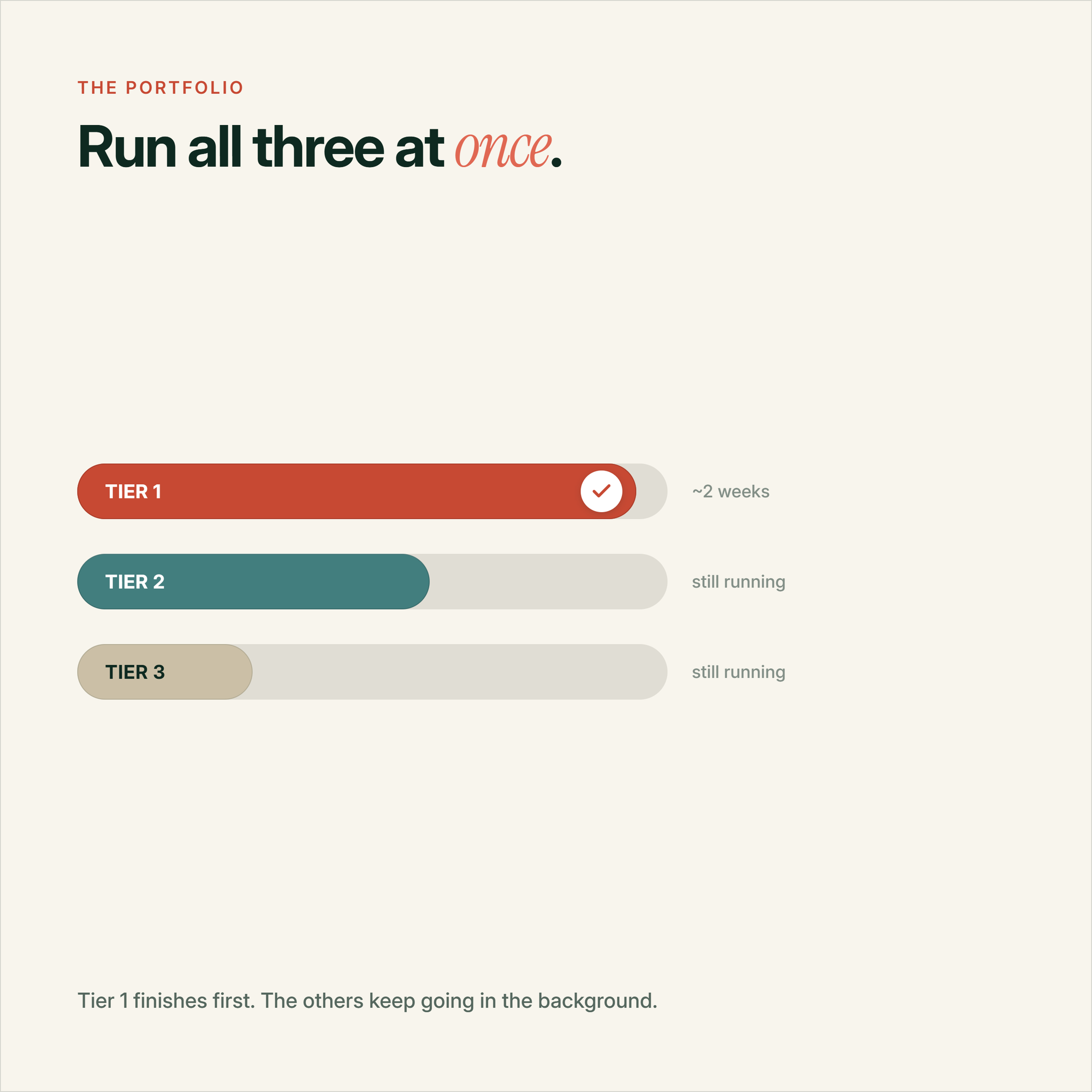
It also protects you from the worst version of "go big or go home" thinking, which is putting all your eggs in one aggressive pricing test and having nothing else running if it comes back flat. A mix means you're never fully dependent on one bet. We run a lot of these concurrently rather than one at a time, and we've written before about running parallel tests on Shopify if you want the mechanics of how that actually works without them interfering with each other.
I think that's the real value of having tiers at all. Really, it's a portfolio more than a classification exercise. A couple of aggressive bets that could resolve in weeks, sitting alongside the steadier stuff that keeps the pipeline moving either way.
Common questions about A/B test prioritization
What's the difference between a Tier 1 and Tier 3 A/B test?
A Tier 1 test changes what the customer pays or receives, things like price, shipping threshold or bundles. A Tier 3 test only changes the surface, button colour, copy or a badge, without touching the offer itself. Tier 1 tests tend to move the needle faster because the underlying effect is usually bigger.
How long should I run a Tier 1 pricing test?
Give it at least one full business cycle, generally 2-4 weeks, so purchasing patterns have time to settle rather than reacting to a single pay cycle or promotional period. Because Tier 1 effects tend to be larger, you'll often see a readable signal well before you would on a comparable Tier 2 or Tier 3 test.
Can I run Tier 1, Tier 2 and Tier 3 tests at the same time?
Yes, and it's generally the better approach. Microsoft's own experimentation research found that interactions between concurrent tests happen at roughly the rate you'd expect from random chance, so running a mix doesn't meaningfully distort your results in most setups.
Why do UI tests like button colour rarely move the needle?
Because the effect people attribute to the colour is usually driven by contrast against the rest of the page, not the colour itself. A button that already stands out won't gain much from a colour swap, while an invisible button might, for reasons that have nothing to do with which colour won.
What should I test first if I don't have much traffic?
Start with a Tier 1 change, ideally your free shipping threshold or a bundle offer. The effect sizes tend to be large enough to resolve in a few weeks rather than months, which matters a lot more than traffic volume when you're picking your first test.
Do bundled or redesign tests always outperform single element tests?
No. GoodUI's own data shows bundled tests outperform isolated ones on average, but the biggest single outliers in the case studies I've gone through were simple removals, cutting a navigation bar or a form field, not additions. Removing friction tends to punch above its size regardless of which tier it technically sits in.
Sources
- GoodUI: Is It Correct To Make Multiple Design Changes In A Single Test Variation?
- Baymard Institute: Current State of Checkout UX
- CXL: Urgency on an Ecommerce Product Page
- CXL: Which CTA Button Colour Converts Best?
- konversionsKRAFT: Der goldene Zirkel der Conversion-Optimierung
- Invesp: How to Analyze A/B Test Results & Statistical Significance
- VWO: Navigation Menu Case Study
- Mantas Digital: A/B Testing for Small eCommerce Stores